I build brands and lead design across motion and identity.
CREATIVE LEADERSHIP AND HANDS-ON CRAFT BY LEO JUAREZ / PERMMA.
Highlights Reel
Featured Work
Art Direction
Guiding creative strategy across brand, motion, and storytelling. From first concept to final delivery.
Branding
Building brand systems, visual identities, and guidelines that scale across global platforms.
Motion Design
Crafting 2D and 3D title sequences, broadcast packages, and animated campaigns end-to-end.
Product Visualization
Delivering high-end 3D renders and animations that showcase products with clarity and impact.
VISUALS AND MOTION
© 2026 Leo Juarez / Permma

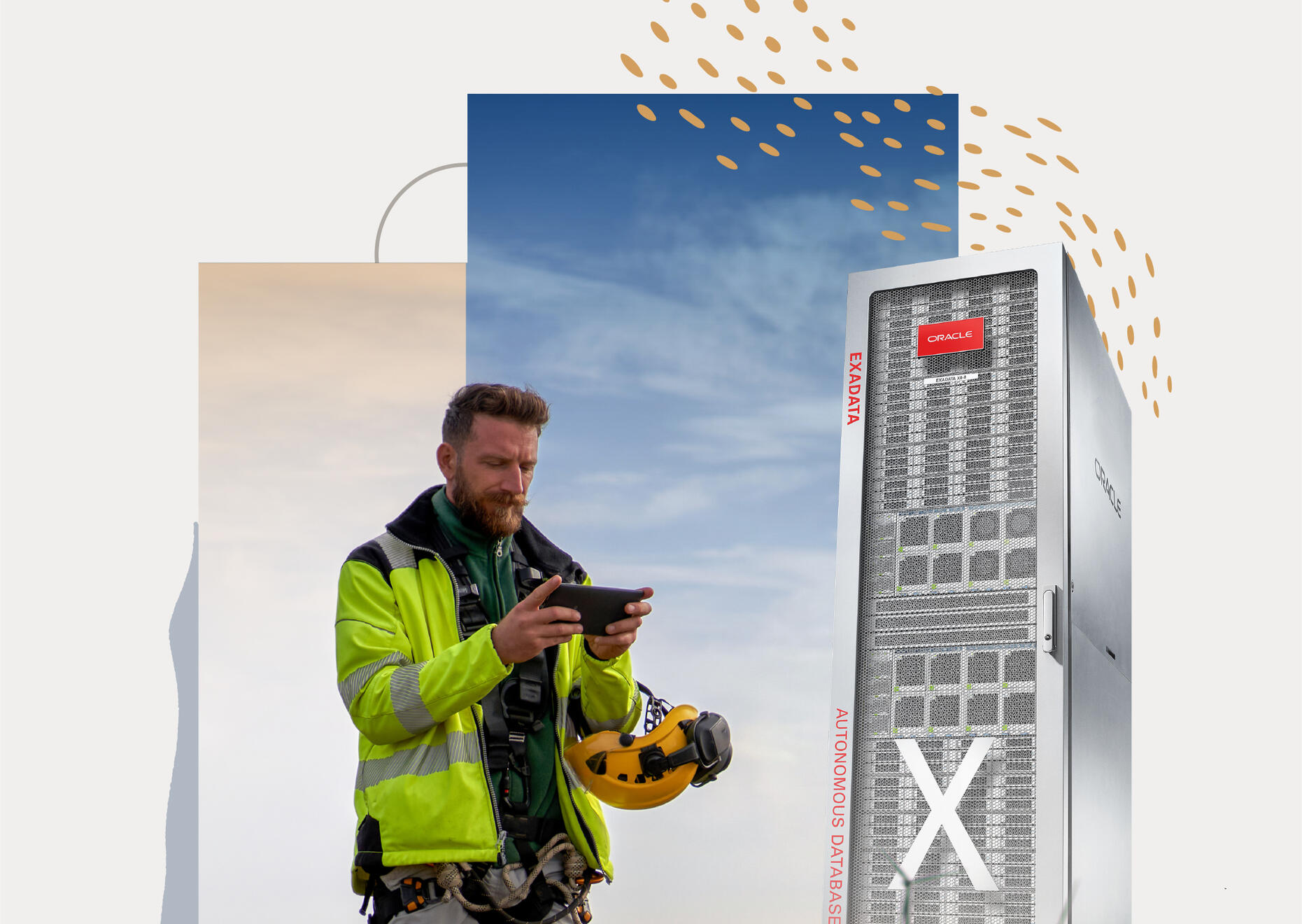
Lead brand and motion designer with over a decade of experience building visual systems. Formerly Senior Designer at Oracle.My work spans brand identity and motion design, from defining scalable brand systems to executing campaigns across digital and physical touchpoints.I work hands-on and at a leadership level, bridging strategy and execution to create design that scales across teams, products, and platforms at both startup and enterprise scale.Based in California, partnering with studios, in-house teams, and founders.
Other Work
Branding
Broadcast
Motion
Campaign
Oracle
Developers
Community
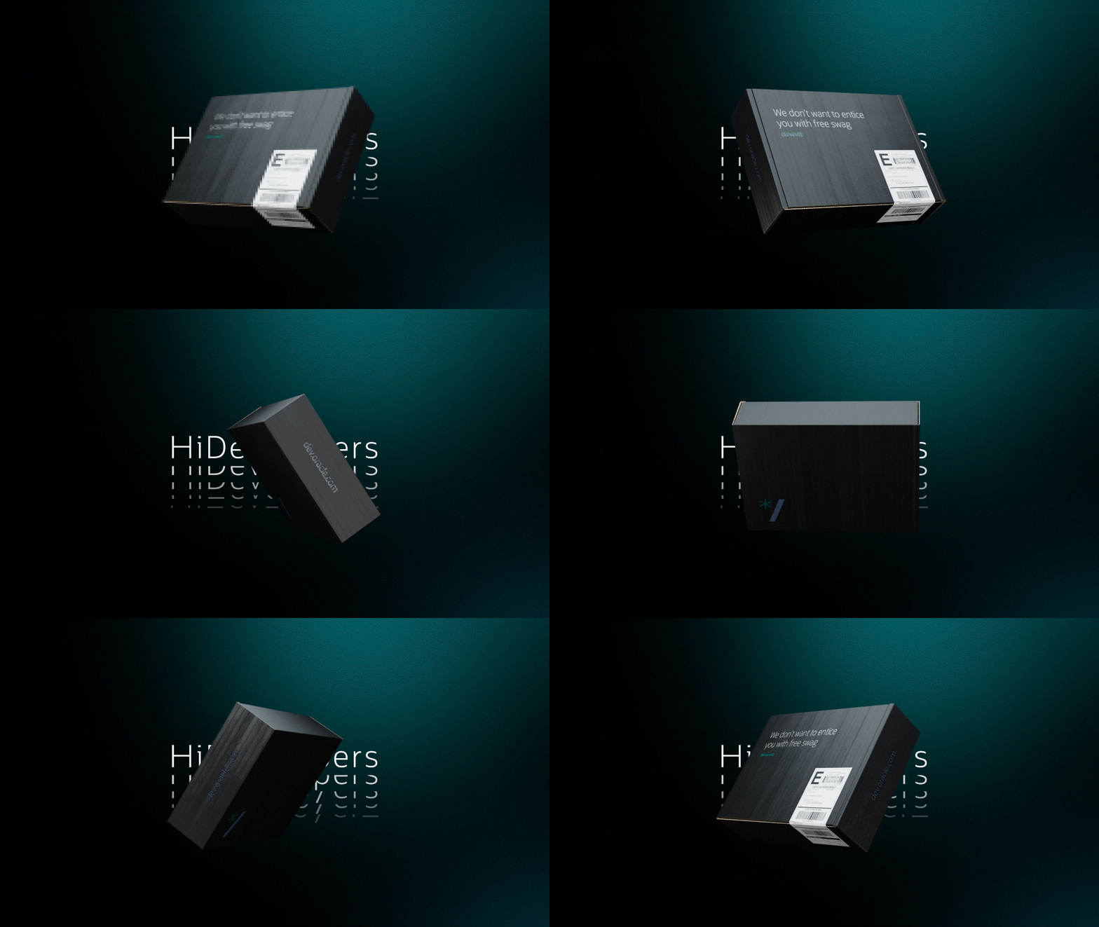
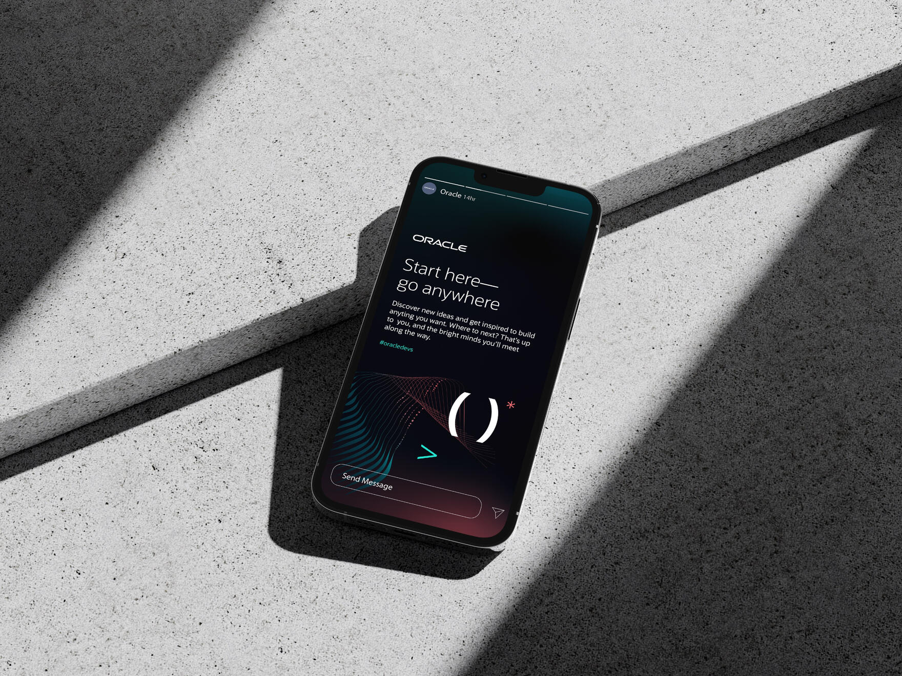
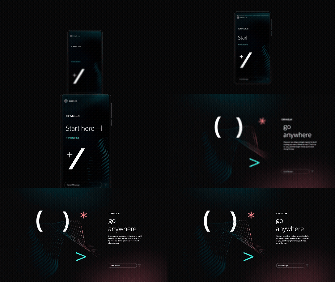
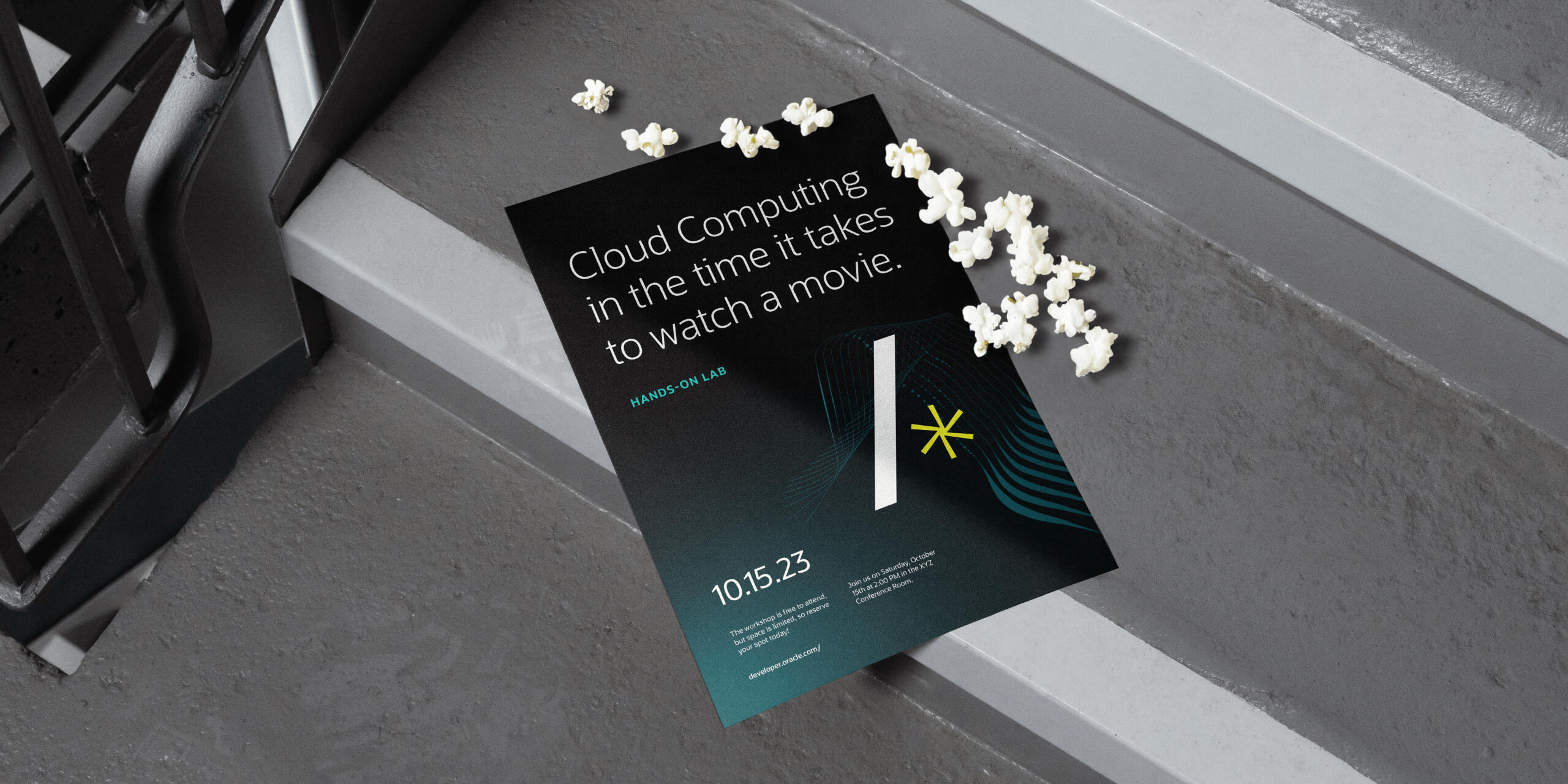
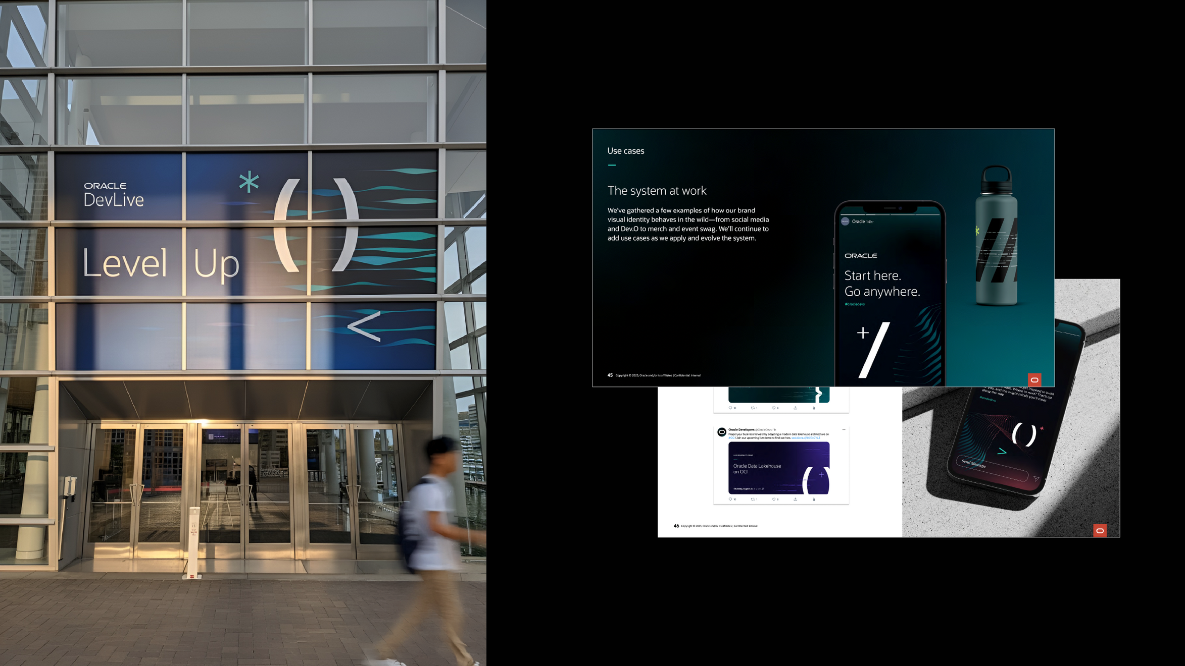
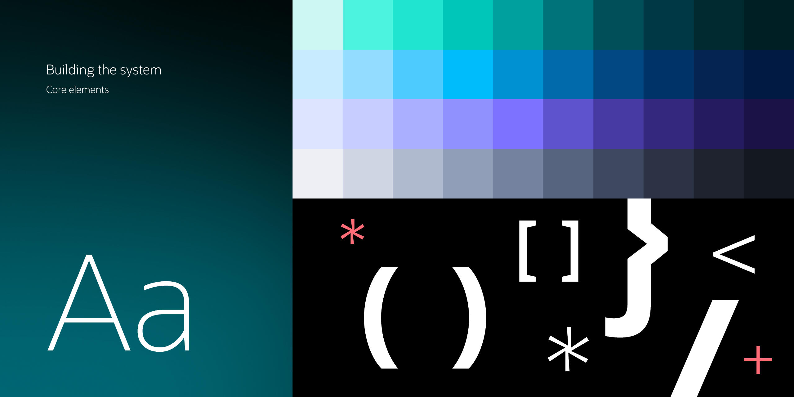
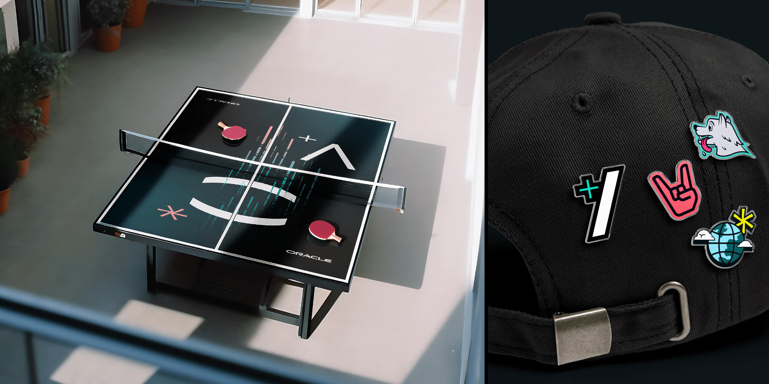
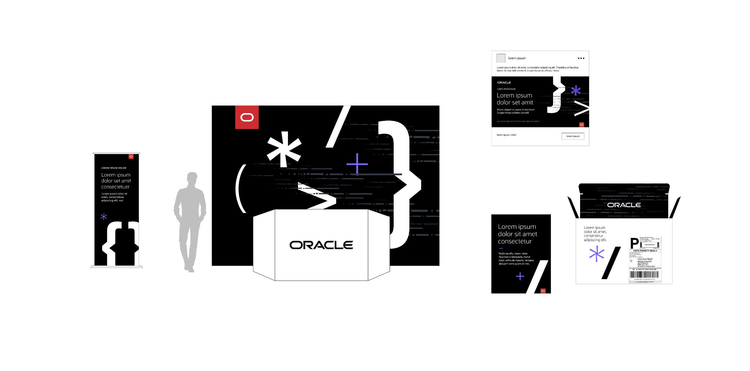
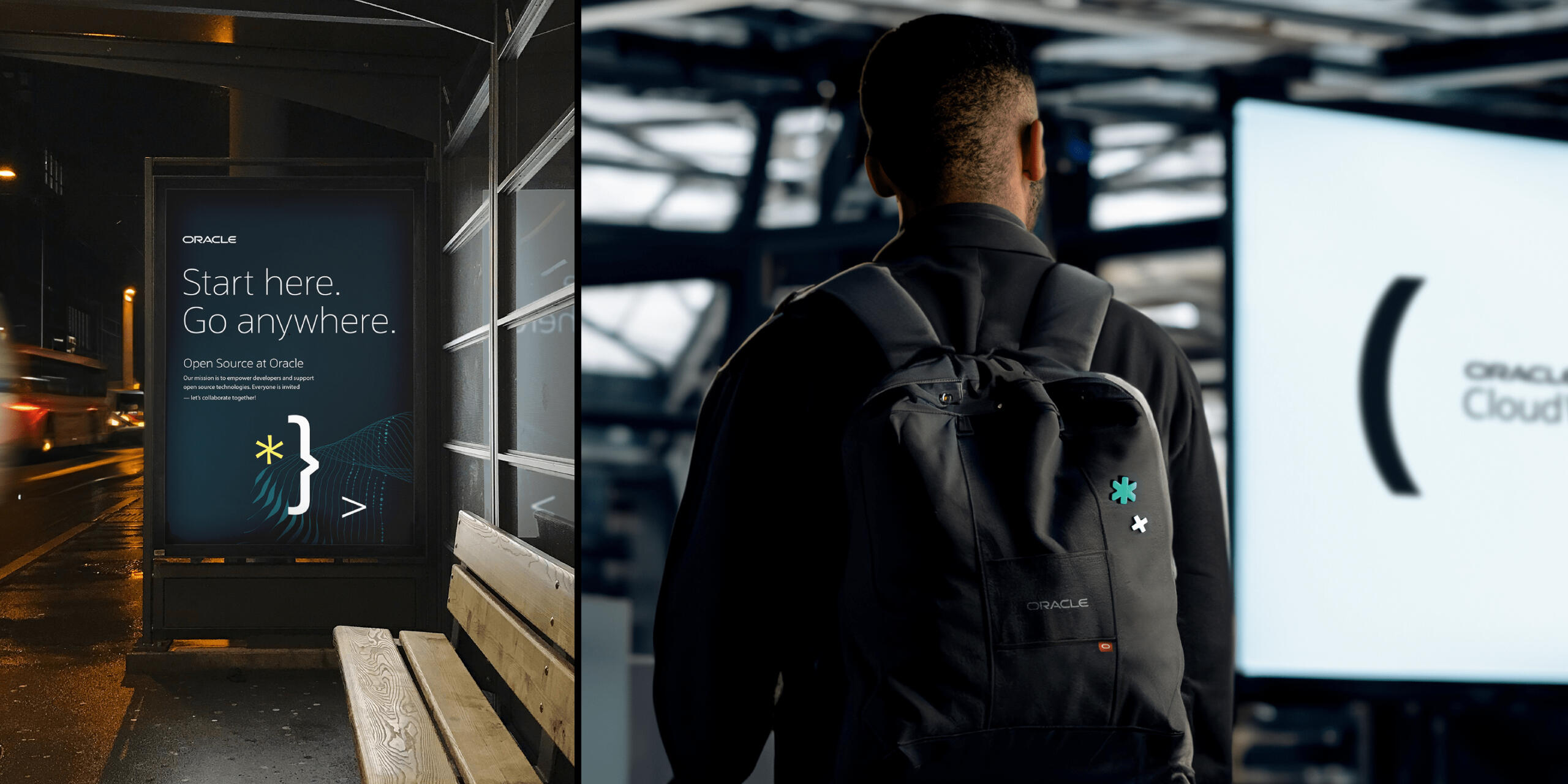
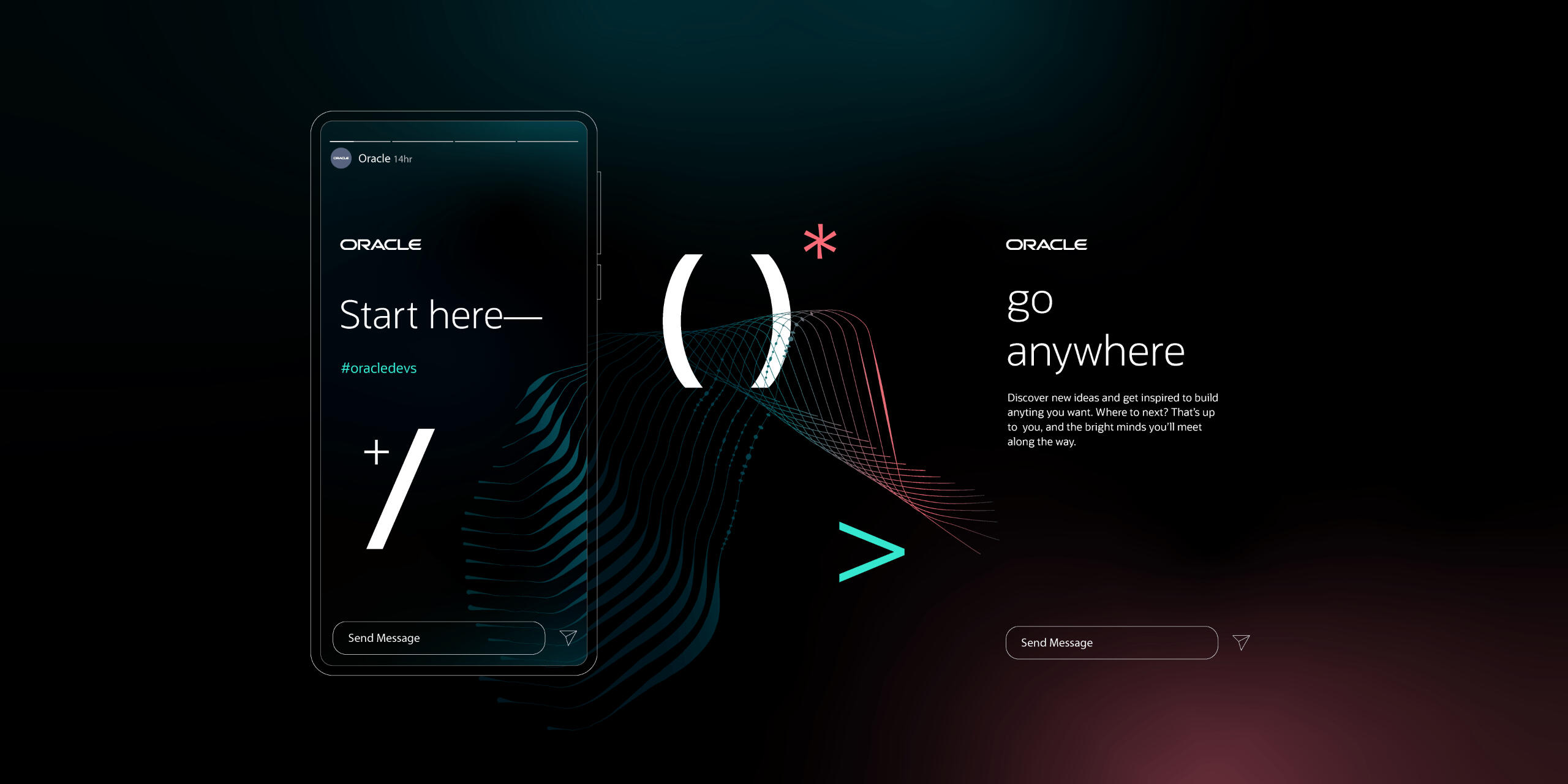
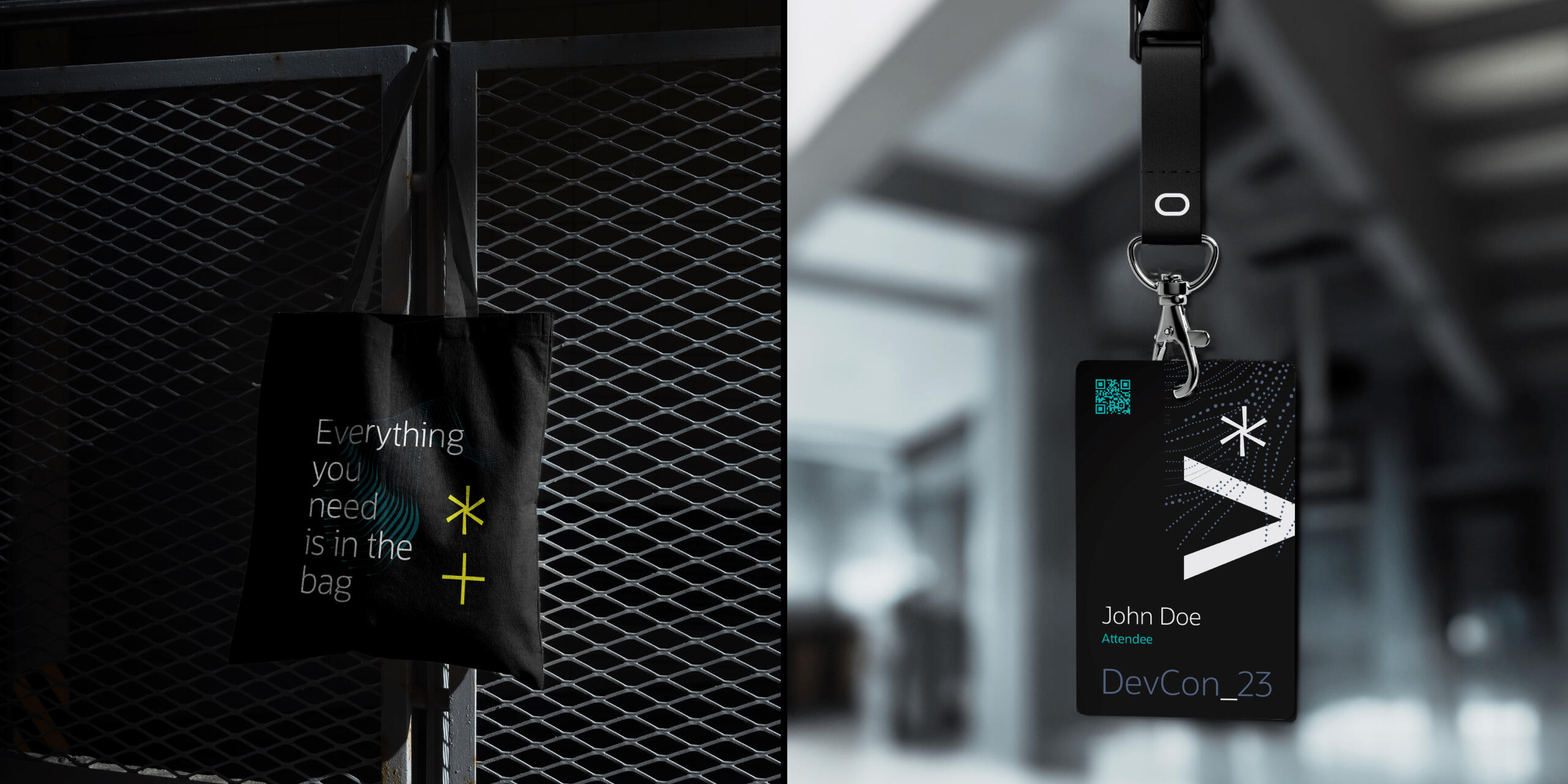
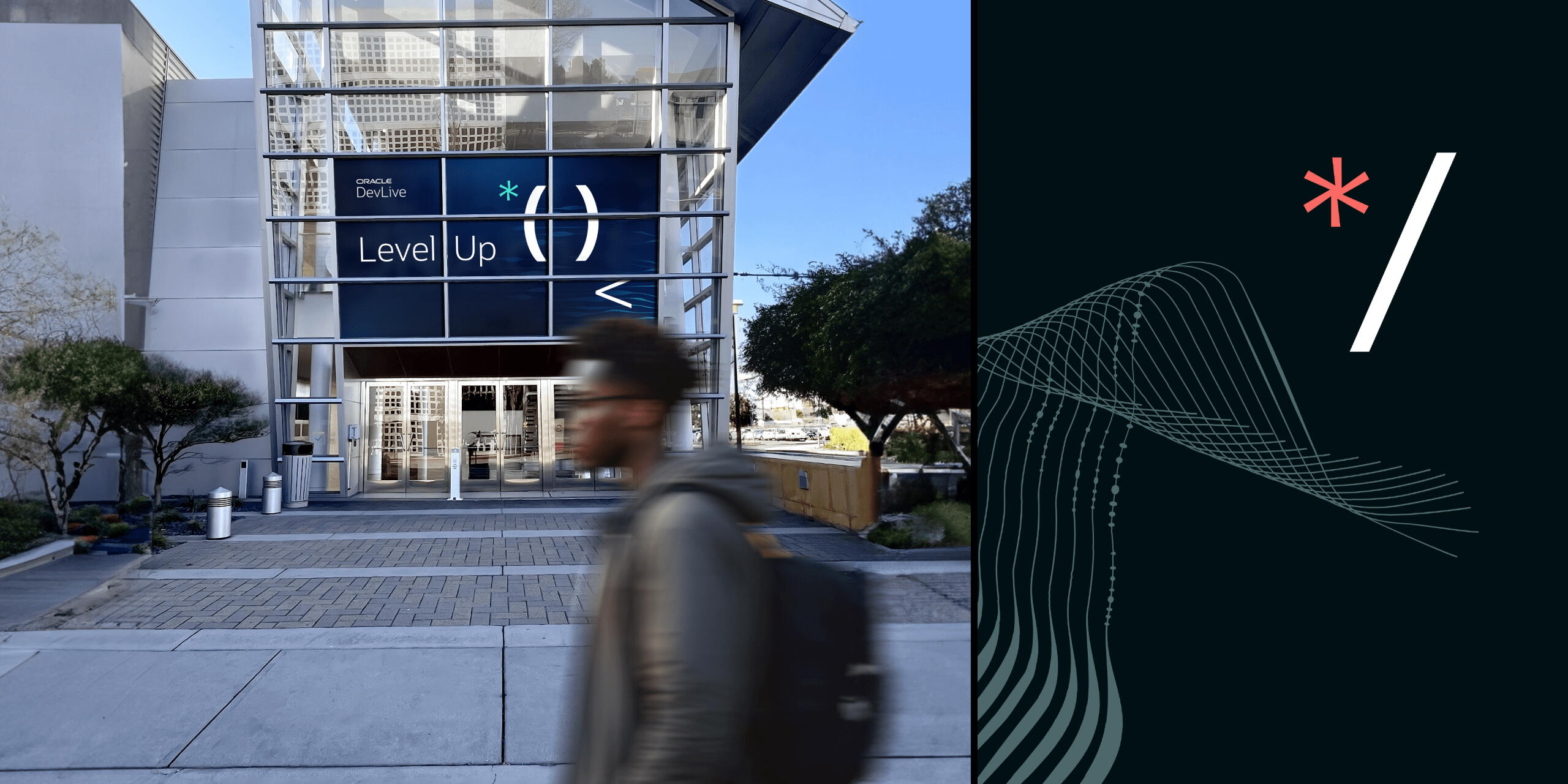
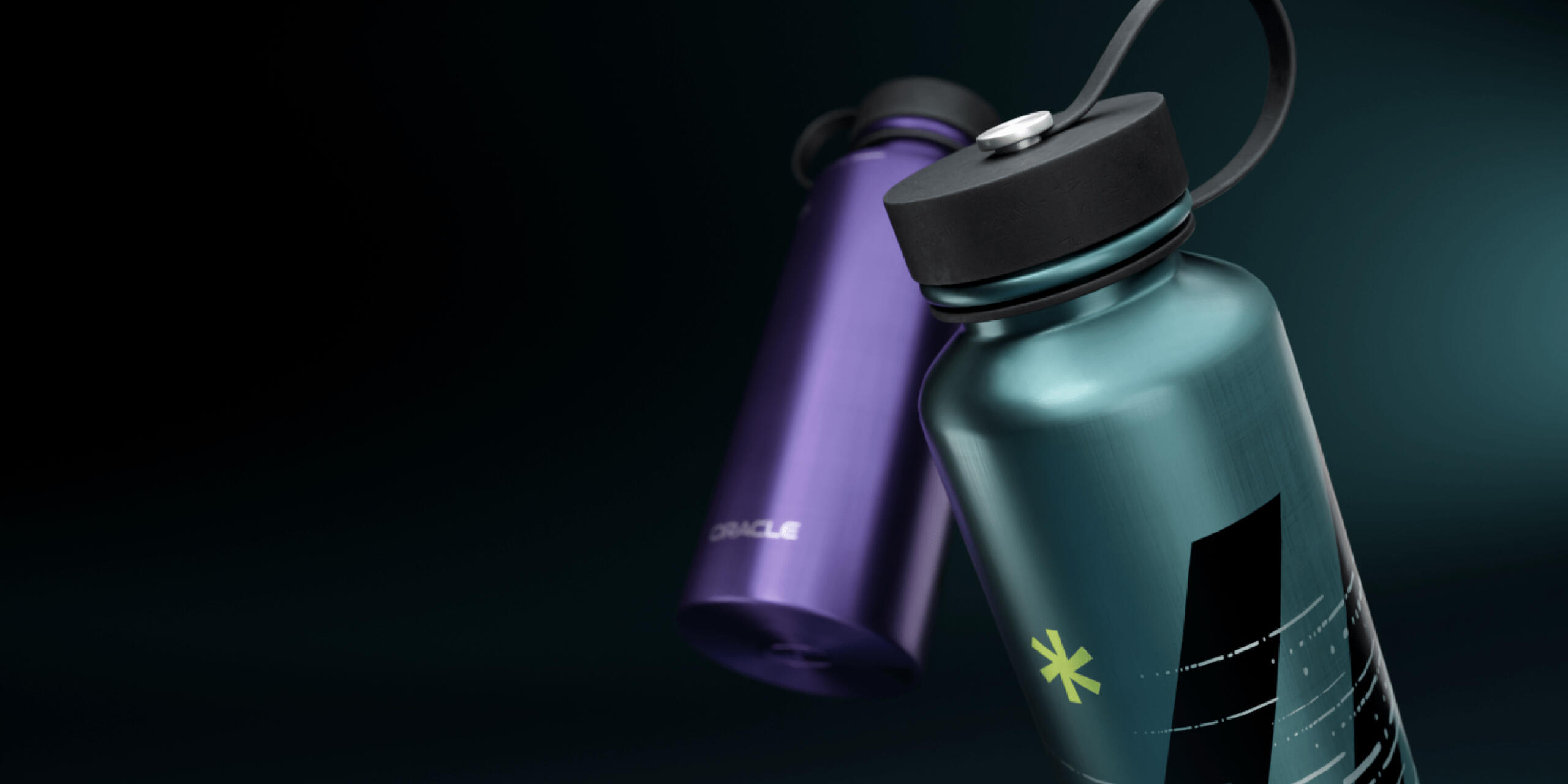
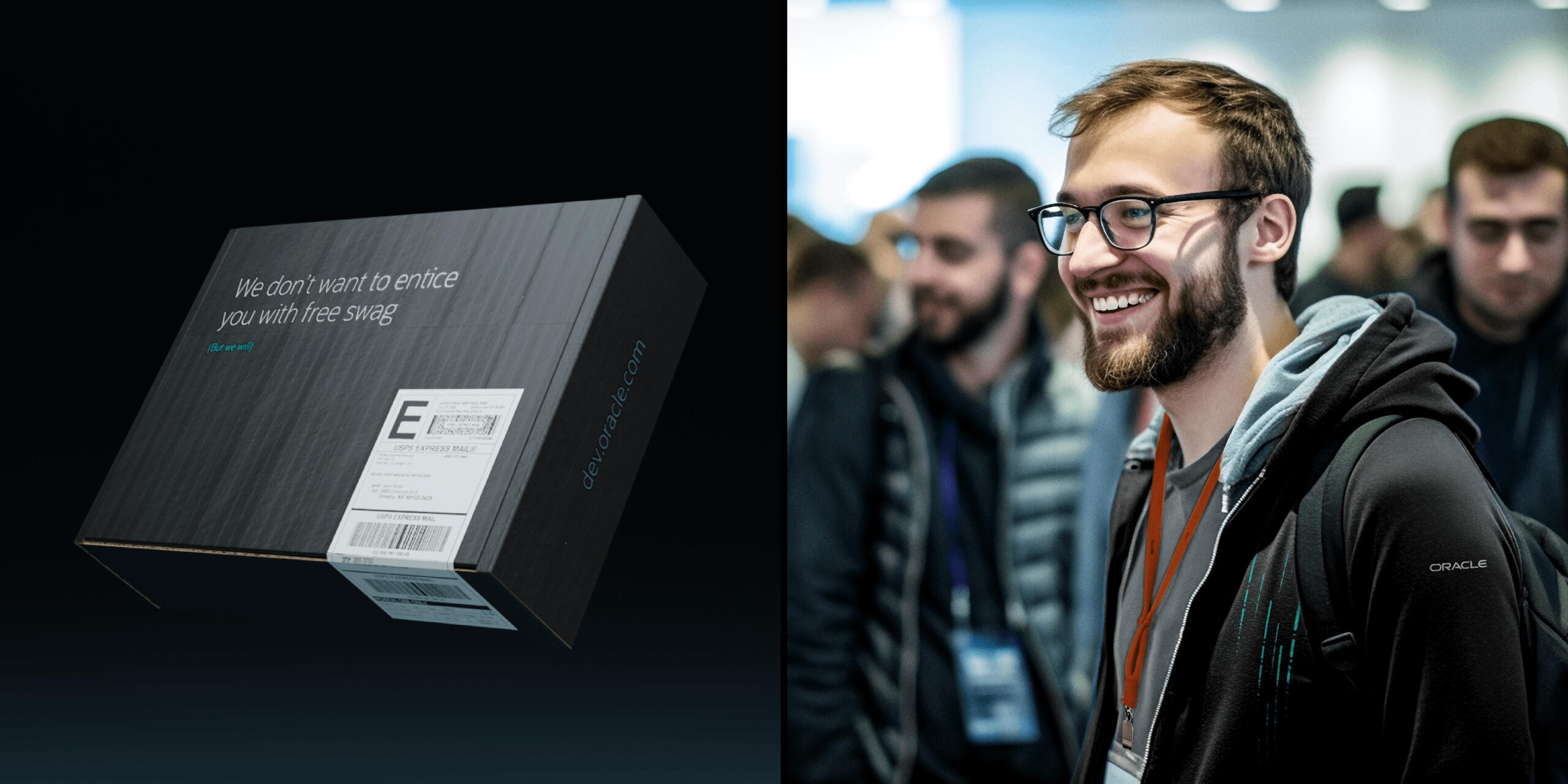
Oracle’s developer community needed more than visuals — it needed an identity that felt like home for a new generation of builders.The task was to evolve Oracle’s presence to resonate with developers who valued transparency and community. The old corporate voice didn’t connect. The challenge was to design a brand system that felt authentic, approachable, and visually aligned with developer culture.I led the design effort, building a system that wove in coding symbols, data-inspired textures, gradients, and dark-mode palettes. The identity expanded across campaigns, events, and digital platforms.The result was a brand that empowered Oracle to connect with developers on their own terms. A supportive, modern, and collaborative identity that continues to grow with the community it was designed for.
Creative Director: Aaron Feiger, Andre Martin
Lead Designer: Leo Juarez / PermmaMotion Graphics and Illustrations: Leo Juarez / Permma
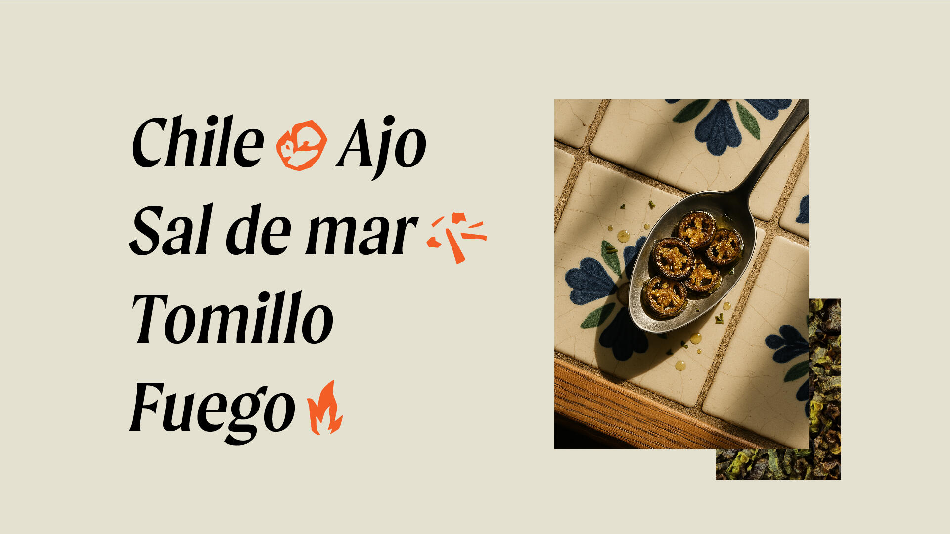
Chile
Fuego
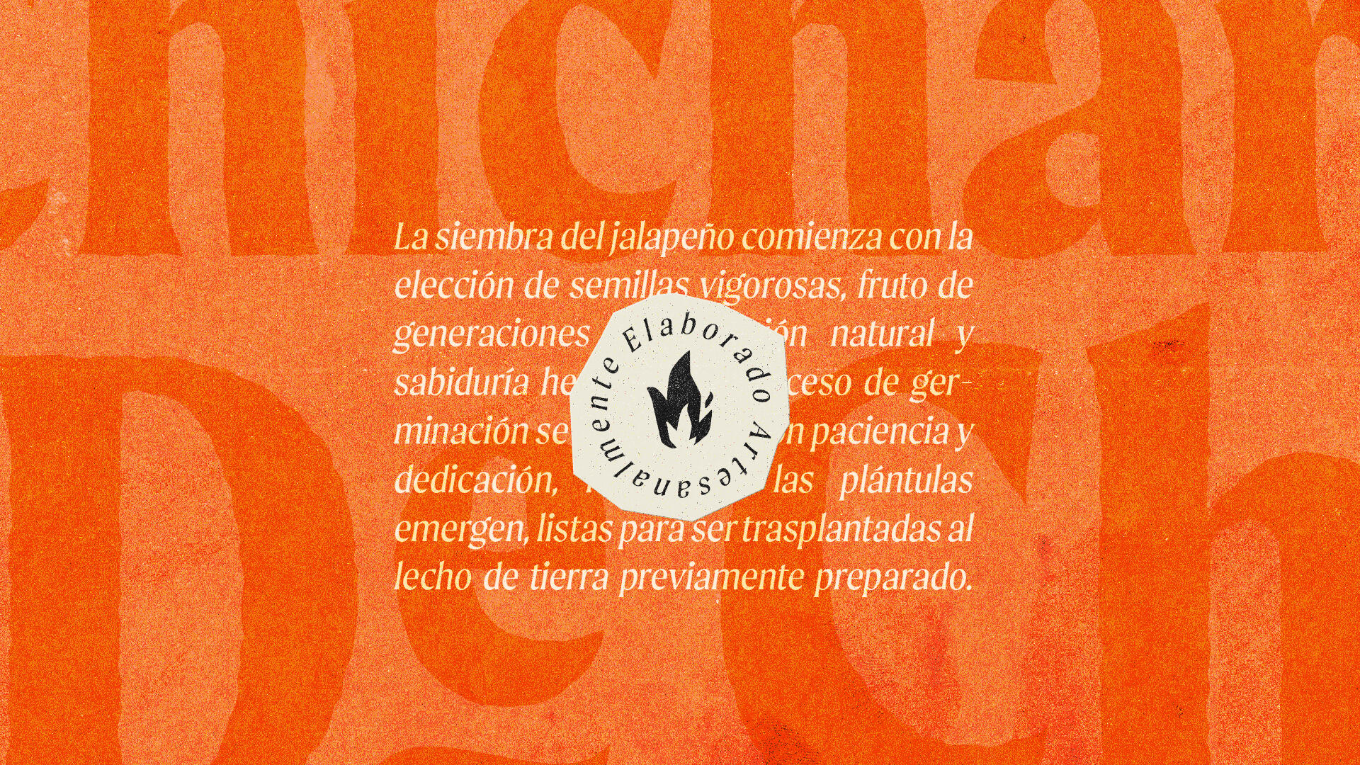
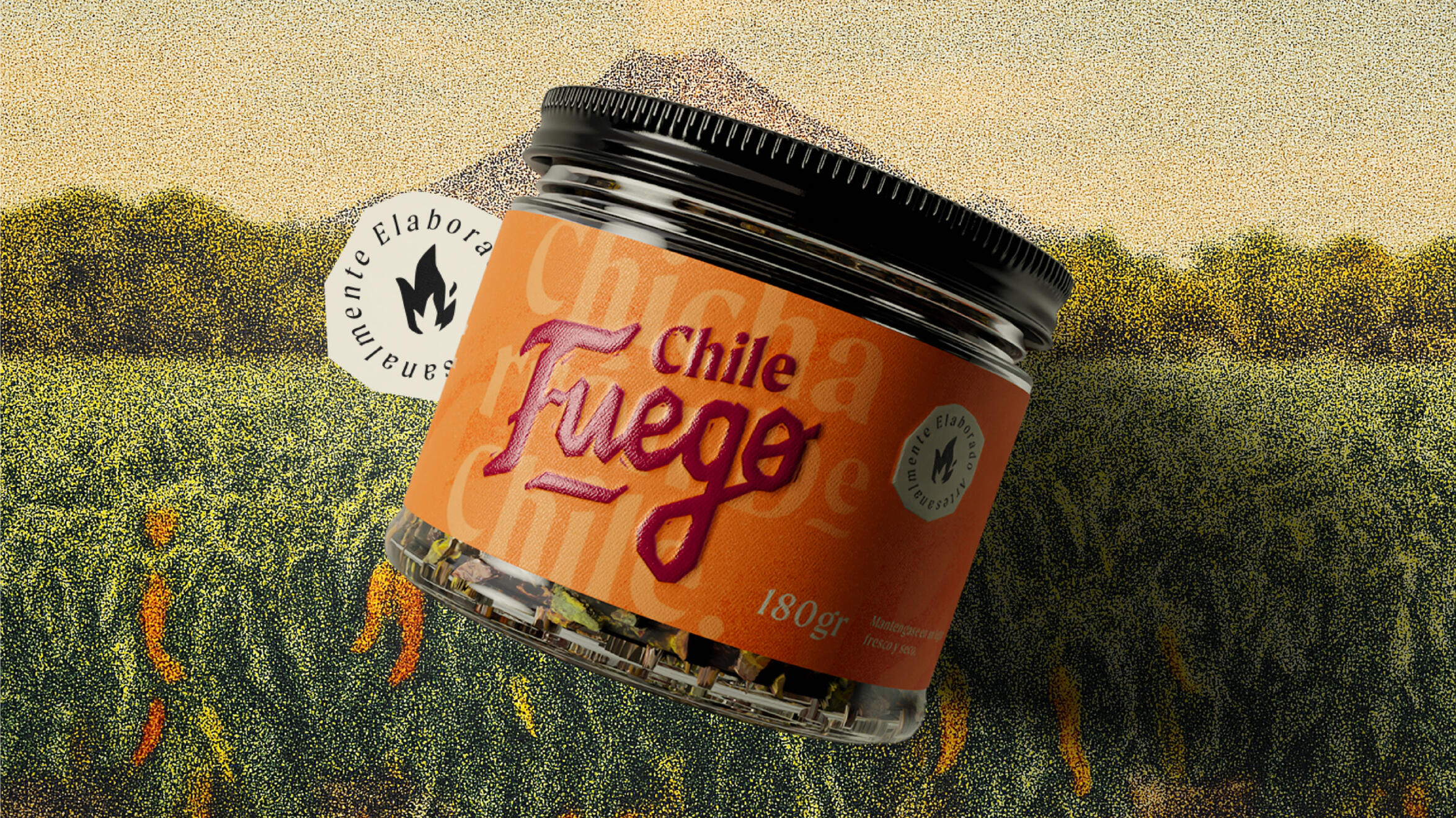
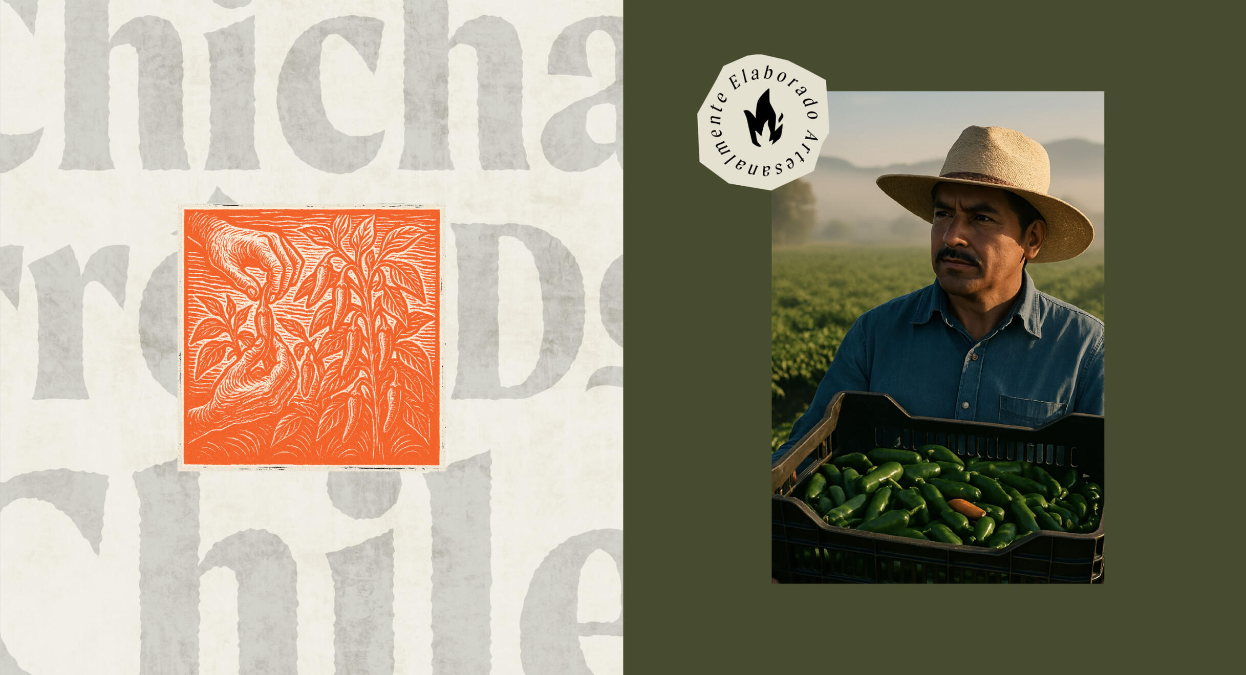
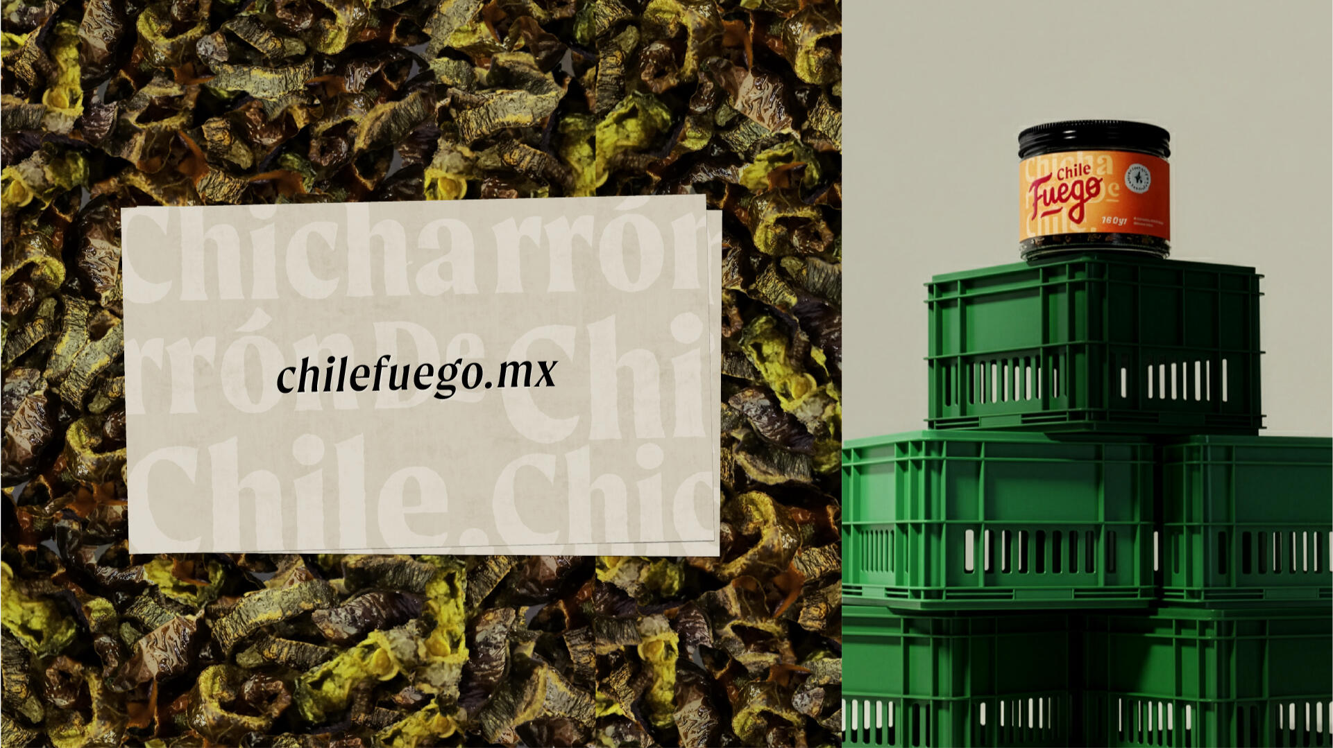
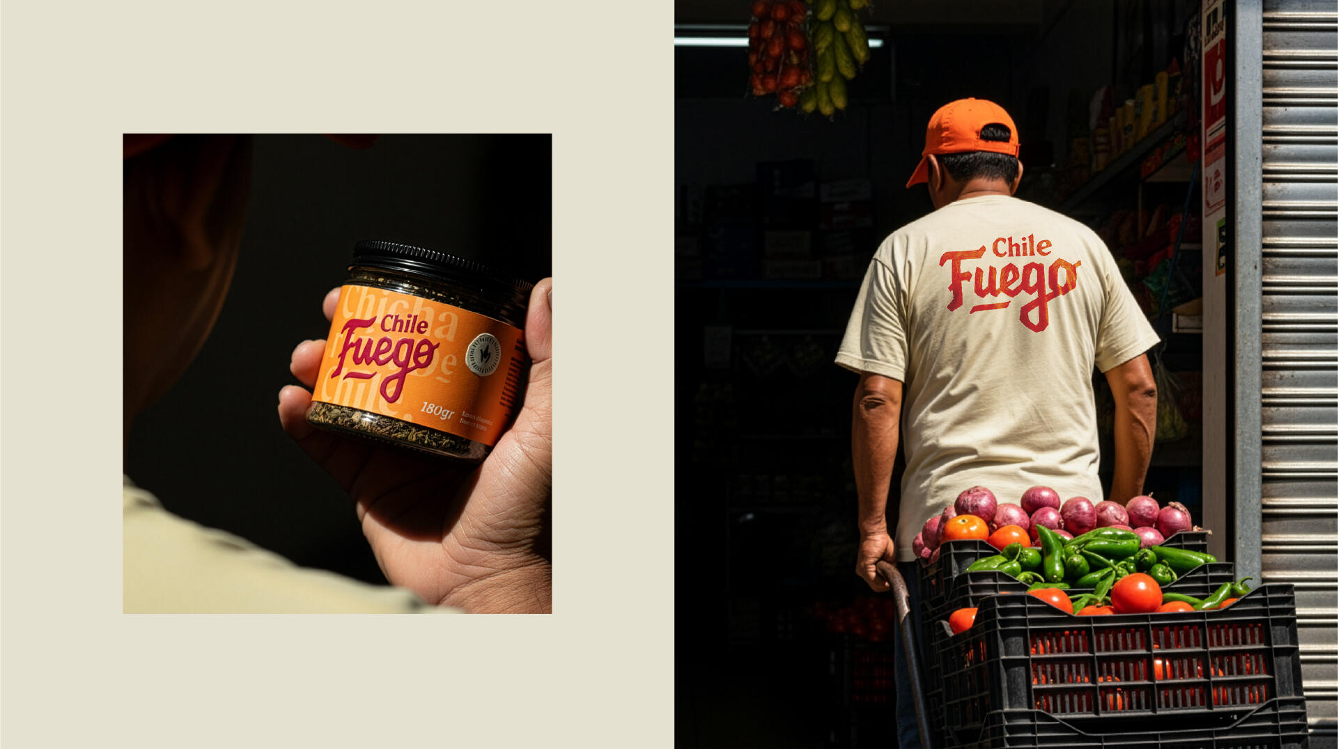
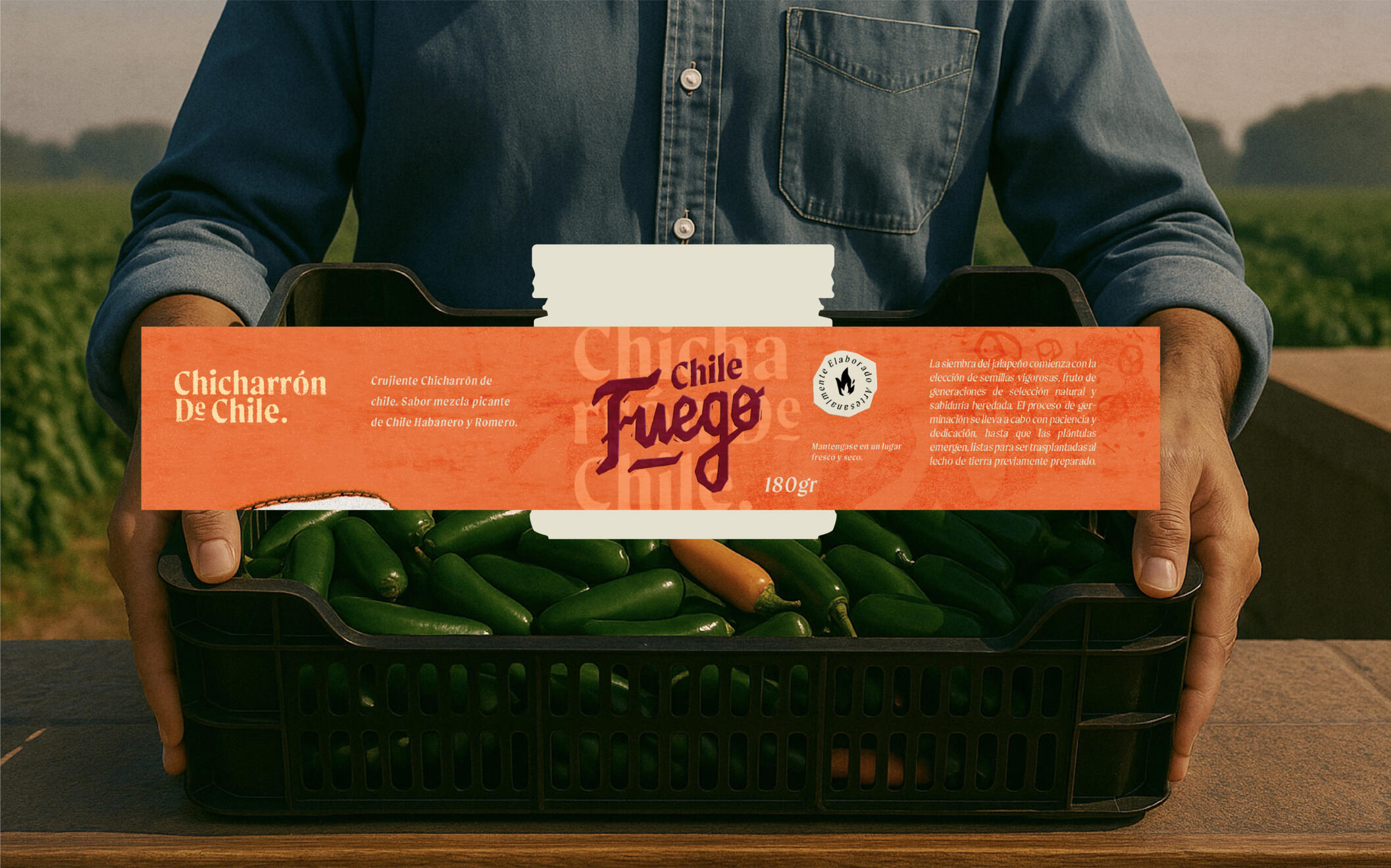
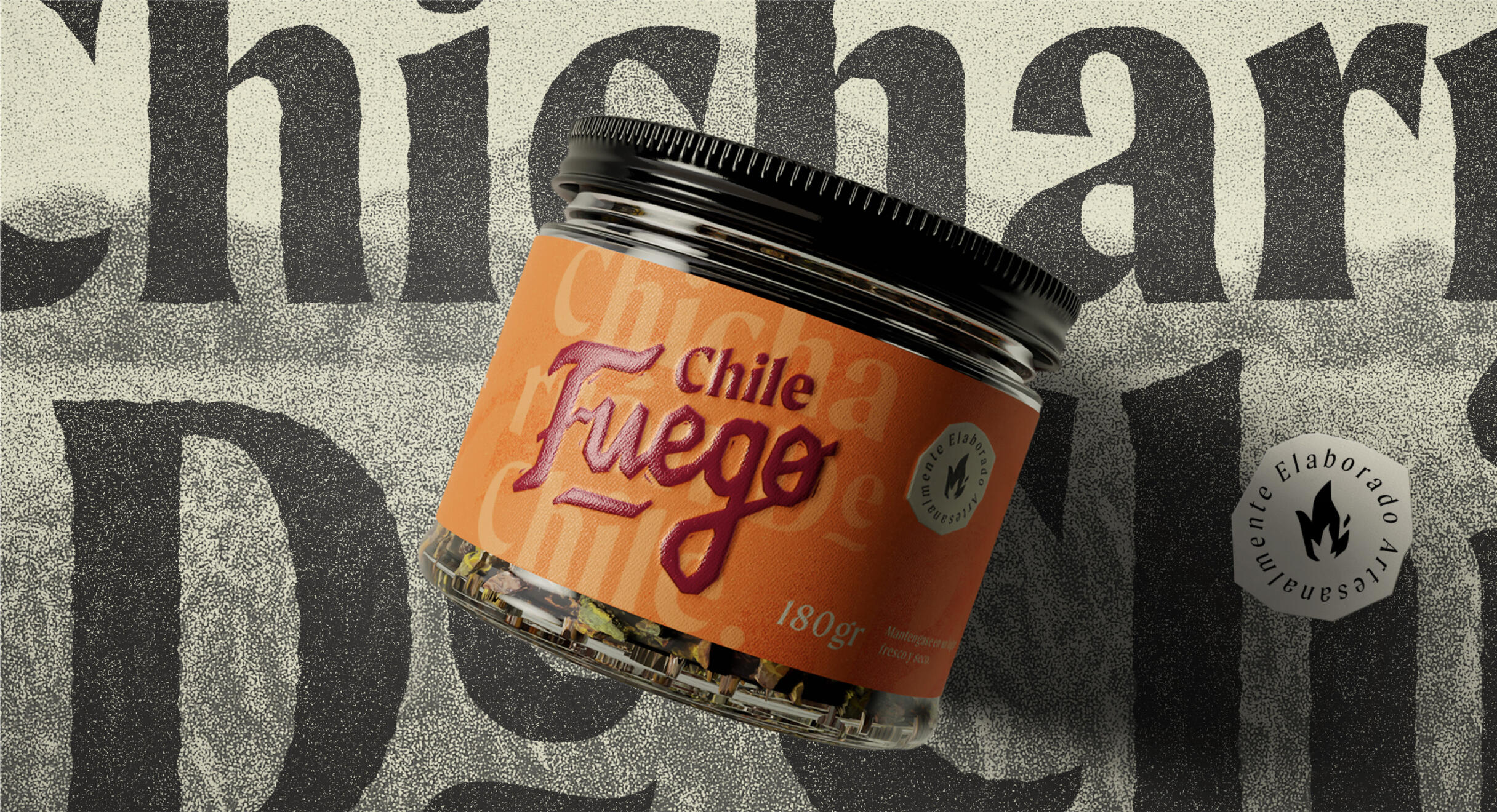
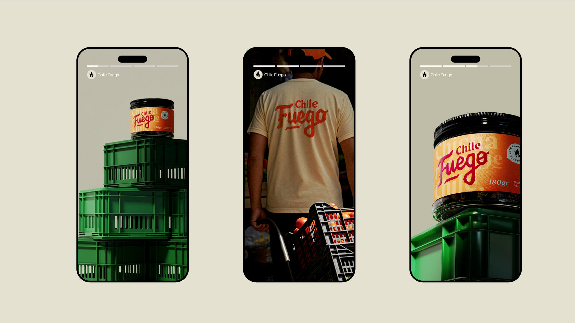
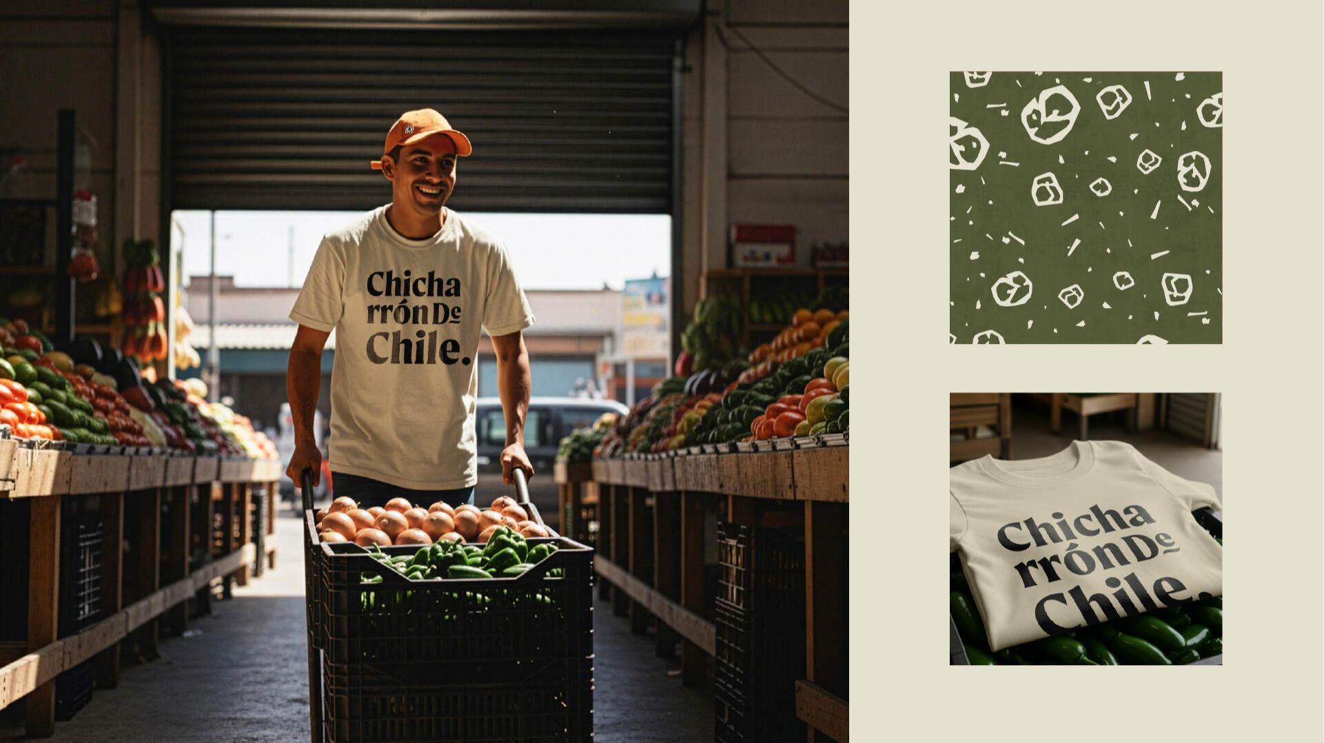
In Mexico, chile isn’t just an ingredient — it’s part of everyday culture. Chile Fuego, a small-batch snack brand built around roasted jalapeños, set out to capture that intensity and share it with a wider audience. The product was rooted in tradition, but it needed a brand and packaging system bold enough to stand out on modern shelves.The challenge was to design an identity that honored its origins while amplifying its fiery character. Through expressive lettering, rustic textures, and 3D product visualization, the brand brings the heat and heritage of the snack to life. Every element of the design turns the bold flavors into a visual experience, so the story begins the moment you see the package.
Creative Director: Leo Juarez / Permma
3D Product Visualization: Leo Juarez / Permma
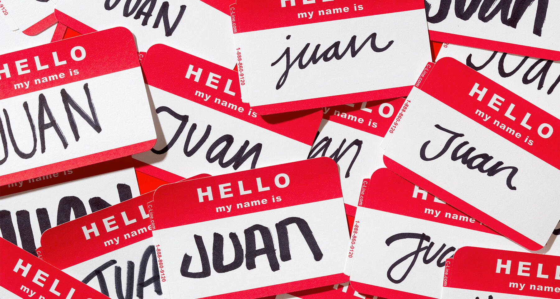
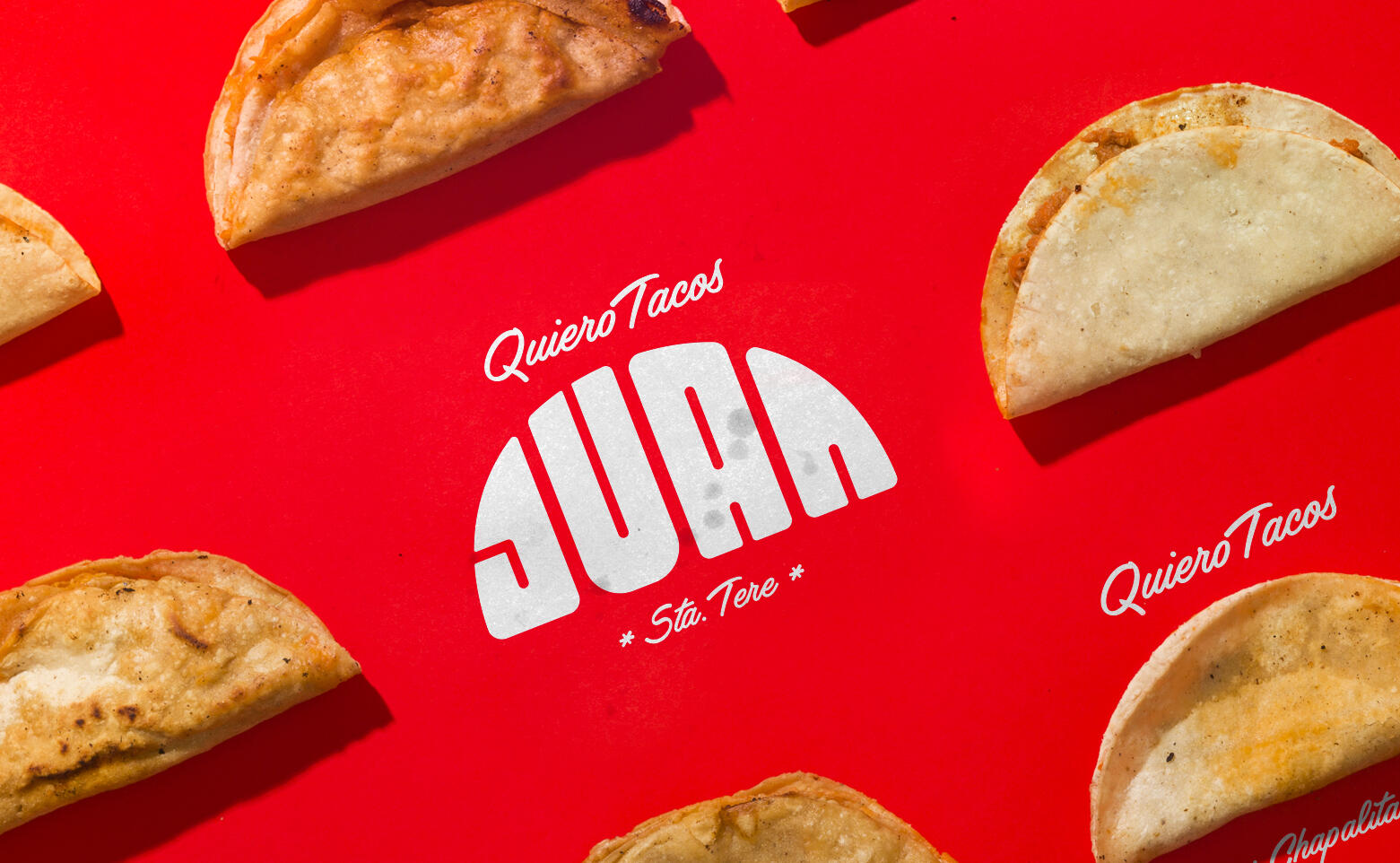
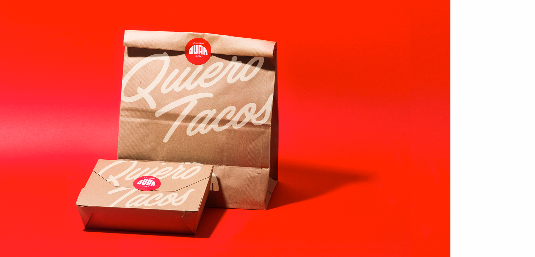
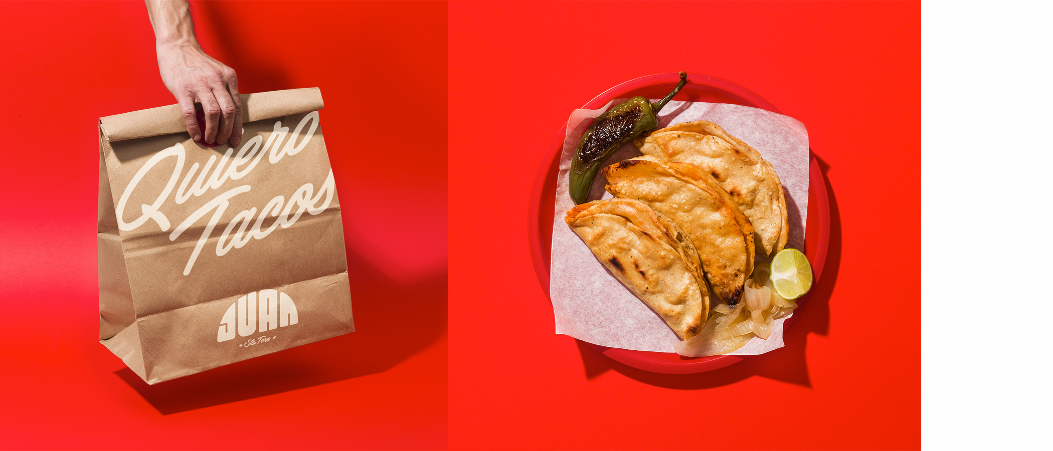
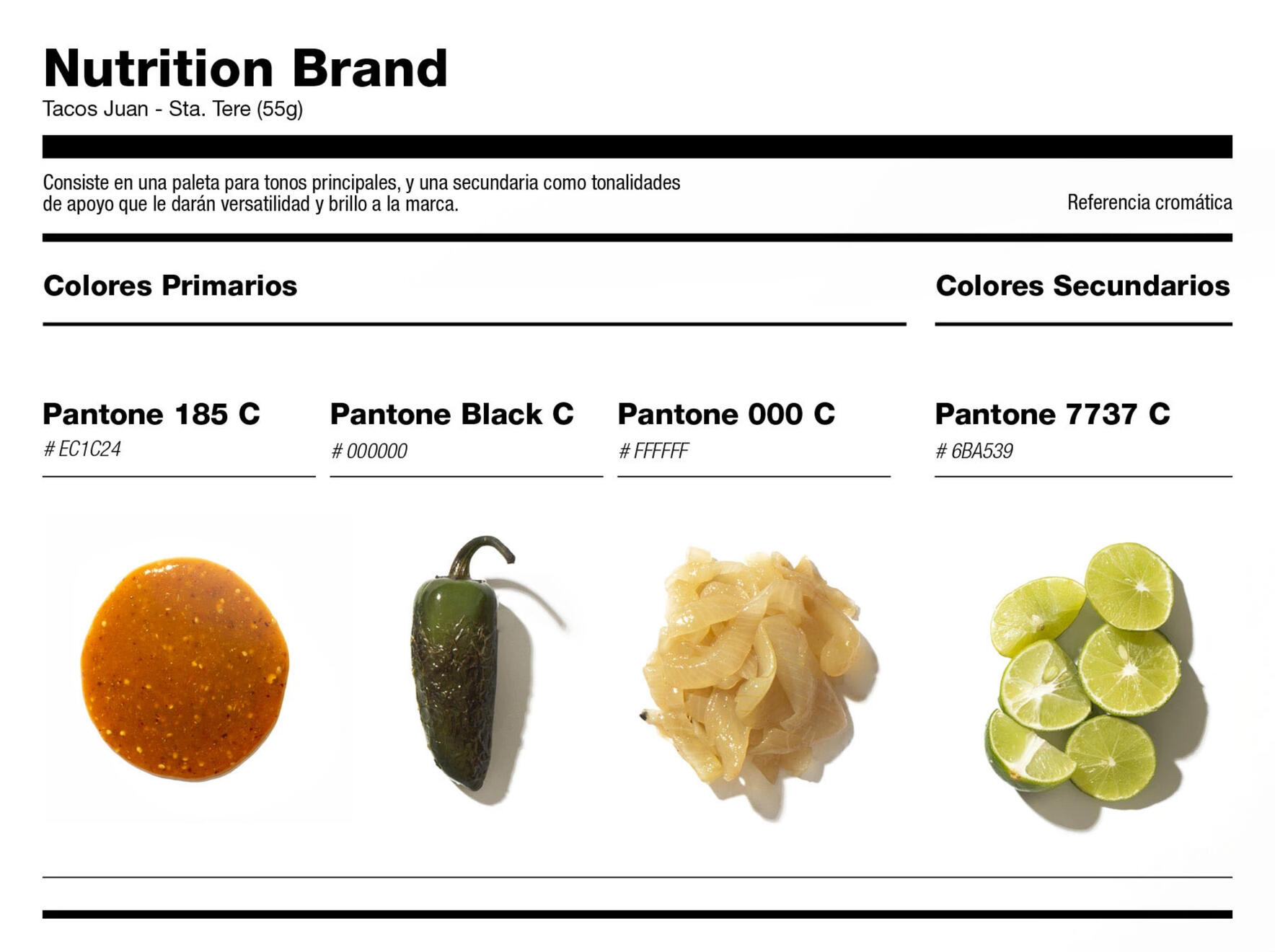
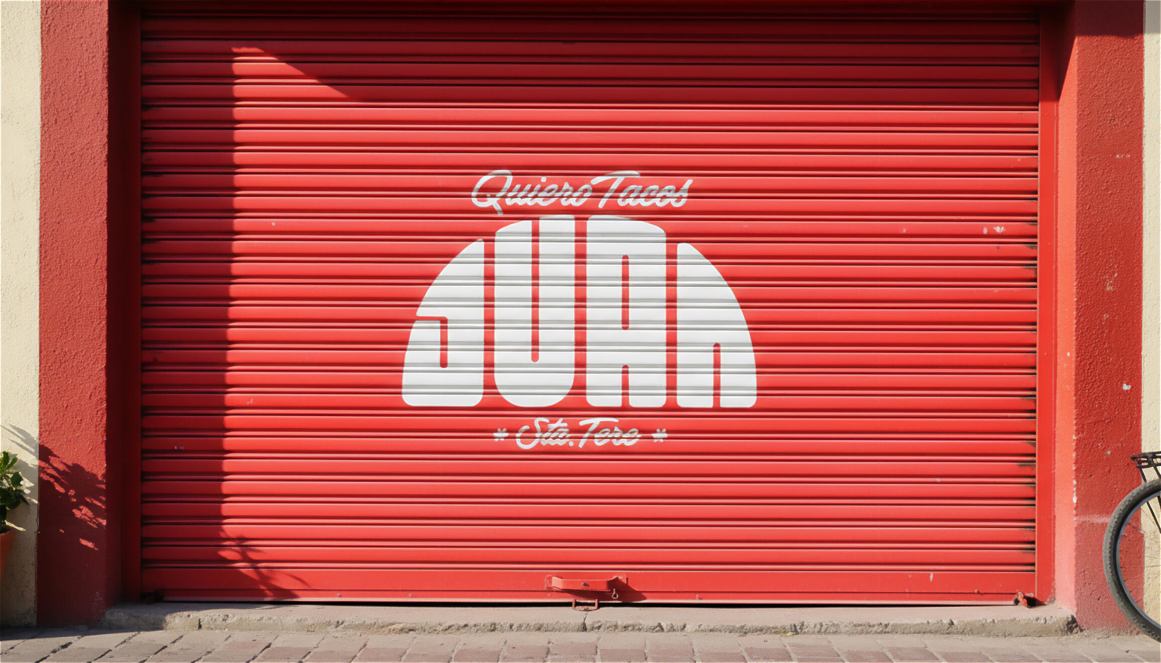
TACOS JUAN
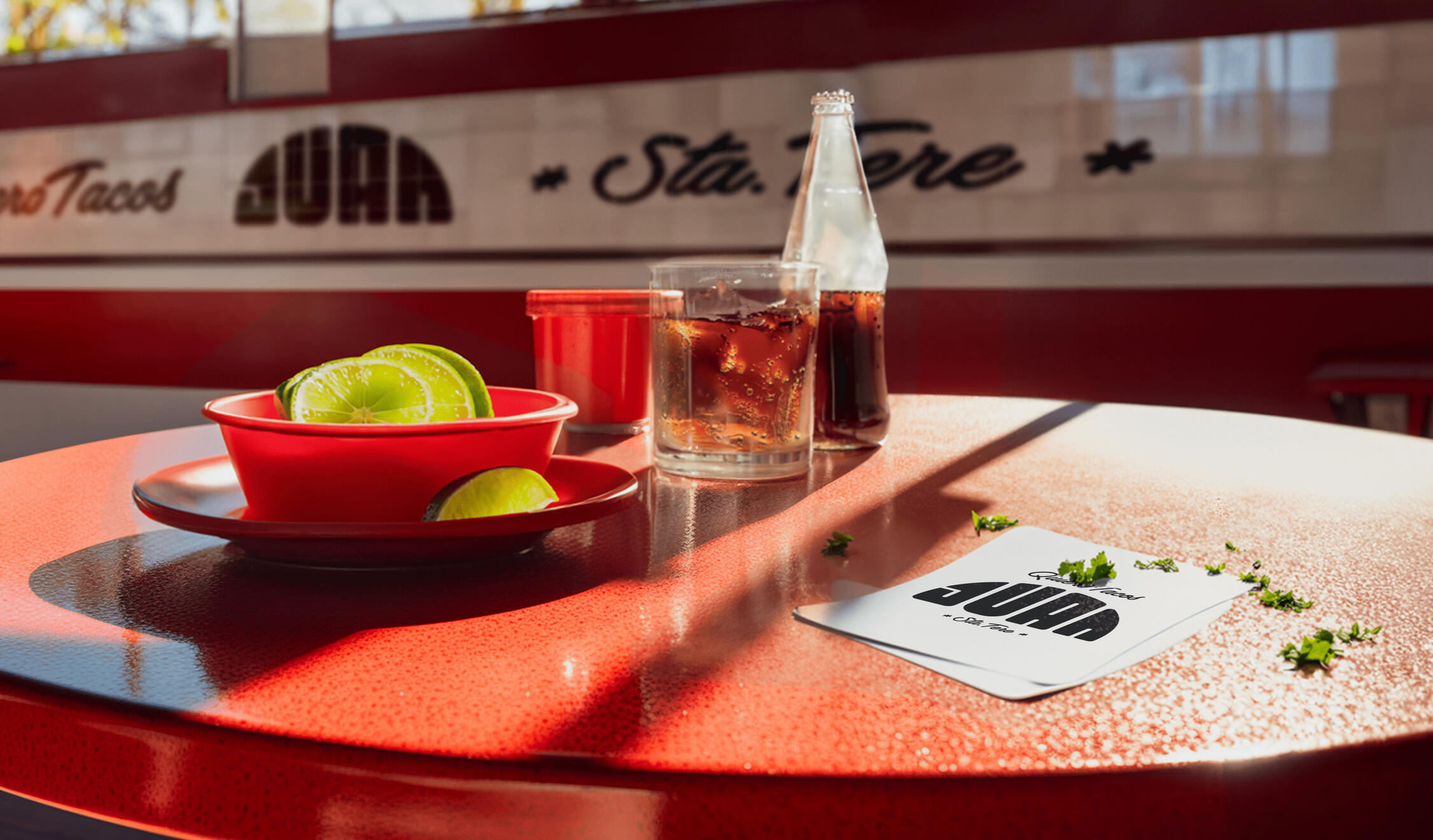
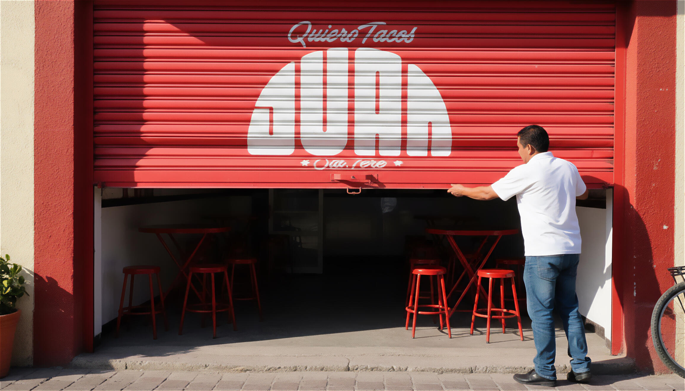
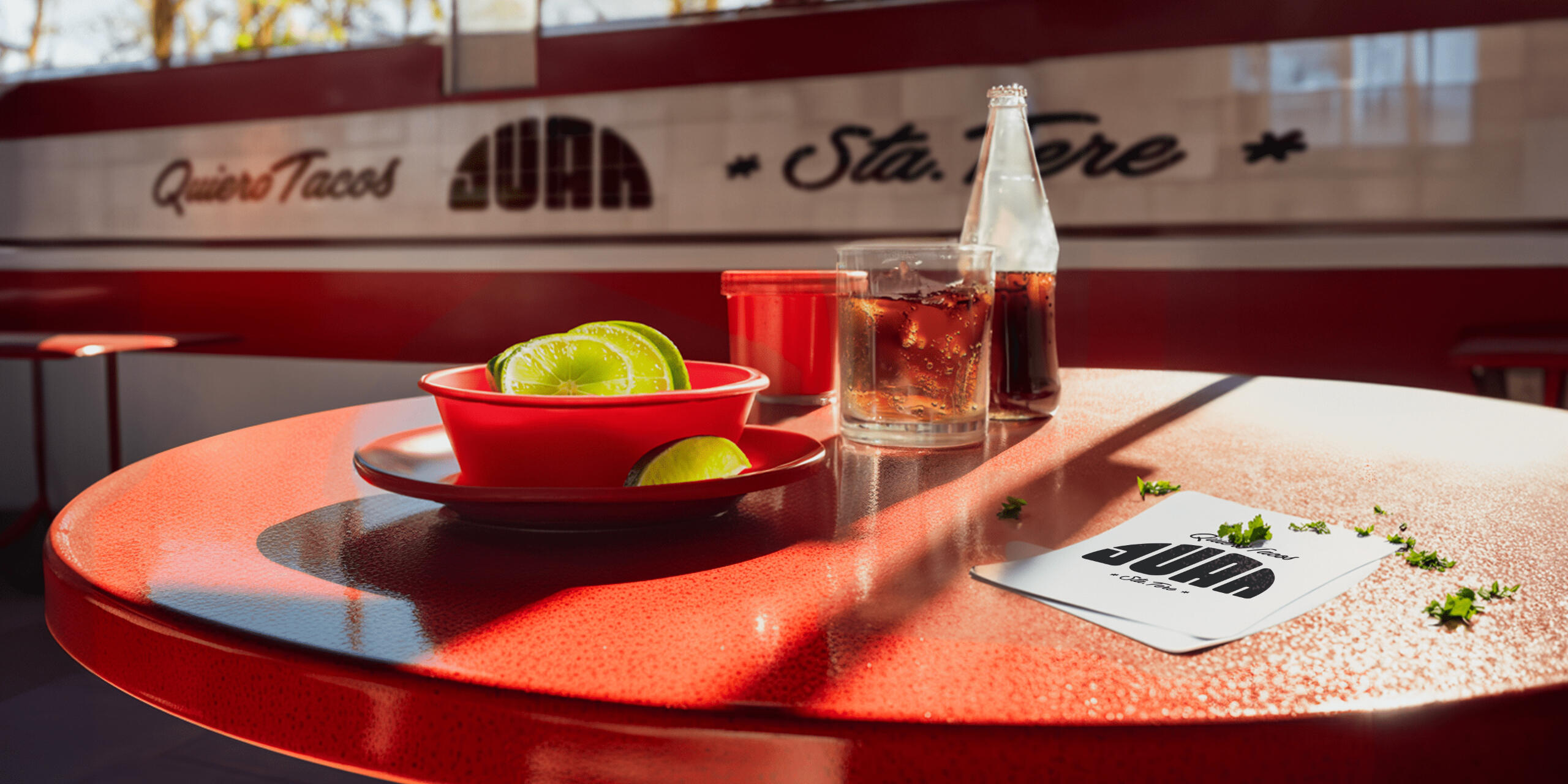
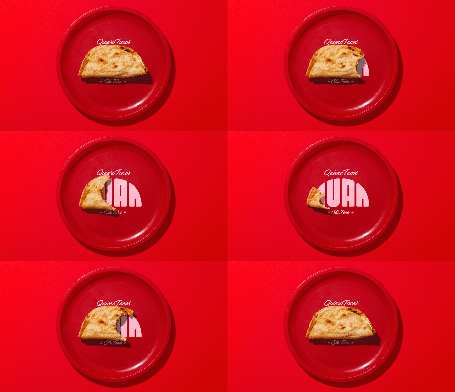
In Guadalajara’s historic Santa Tere neighborhood, food is more than sustenance, it’s community. Tacos Juan wanted a brand identity that captured the vibrancy of its streets while honoring its roots as a family taquería.I developed a playful yet timeless identity that blended hand-drawn lettering, bold color, and cultural motifs, supported by 3D visualizations and promotional assets. The design was built to work both in physical signage and digital channels, giving the brand a flexible and distinctive presence.
The result is a brand that feels as alive as the neighborhood itself: rooted in heritage, but crafted for today’s audience.Creative Director: Leo Juarez / Permma
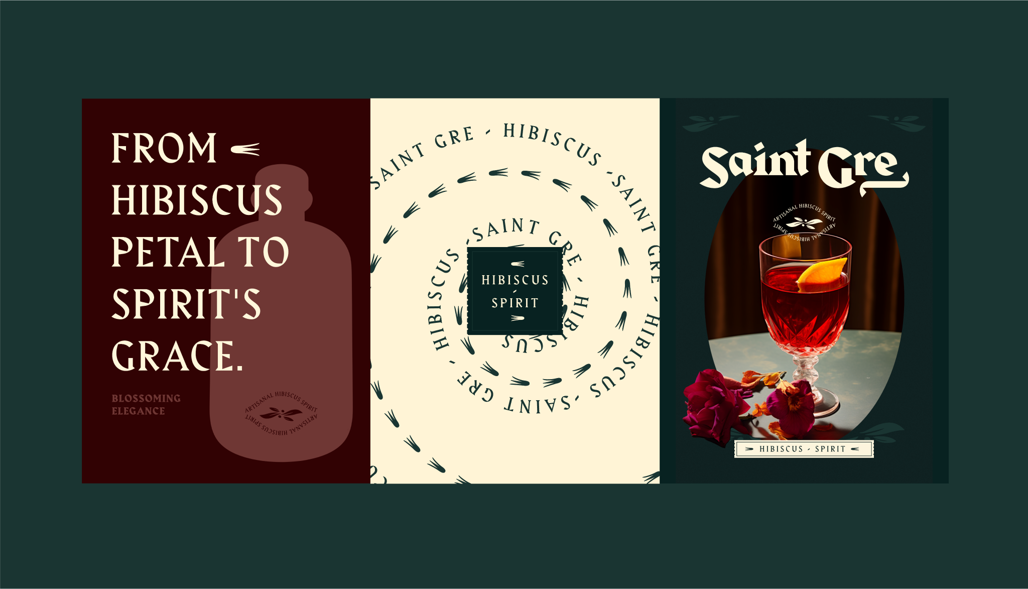
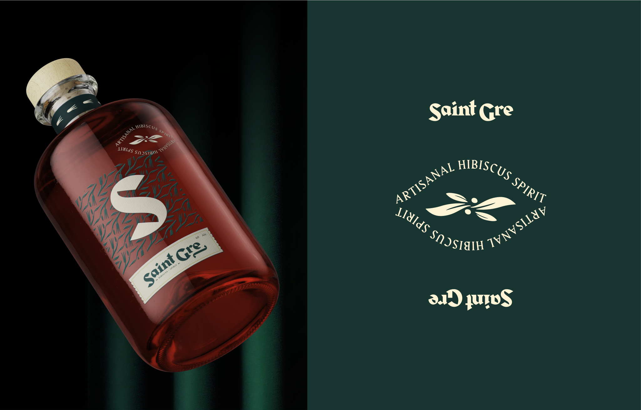
Saint Gre
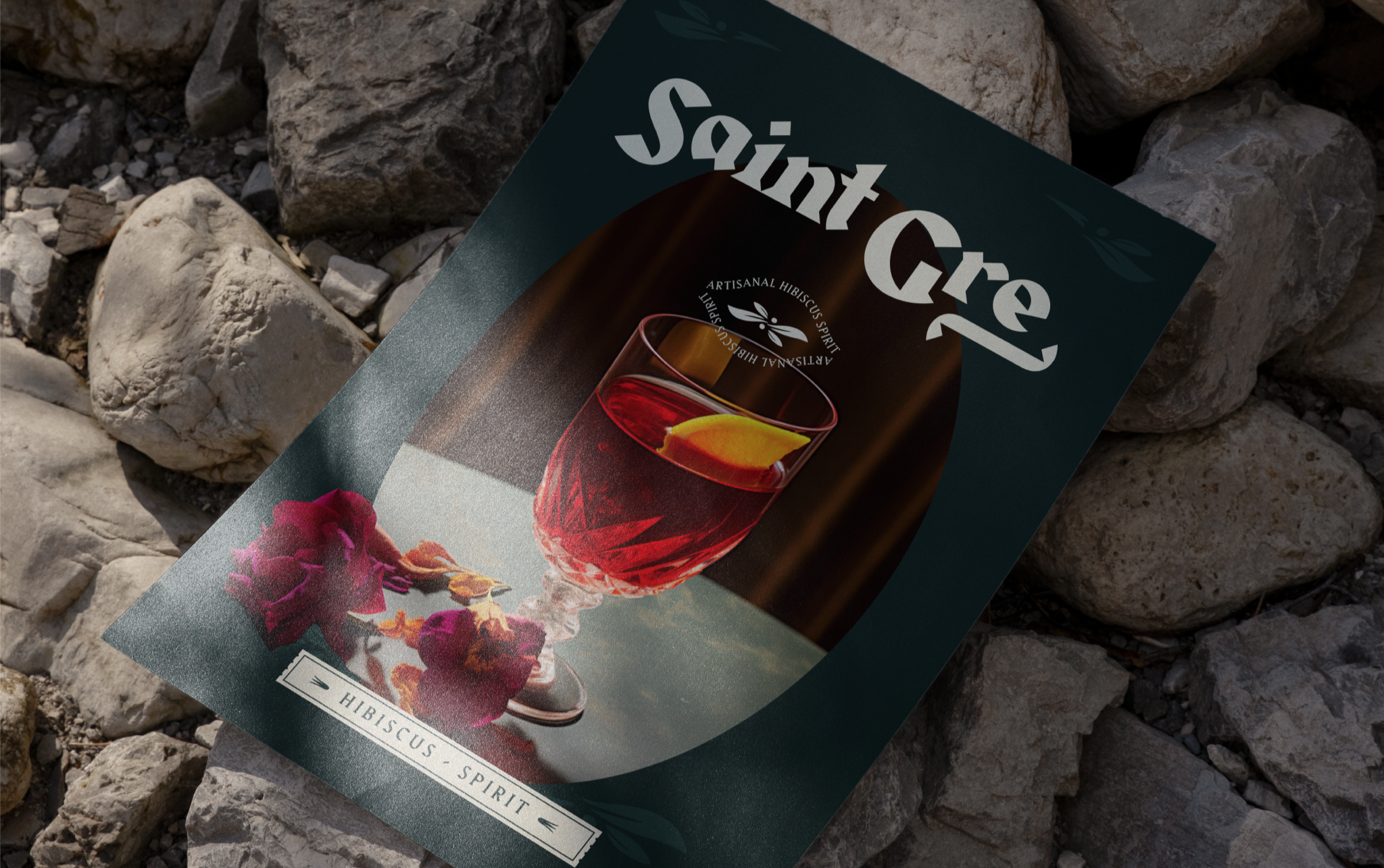
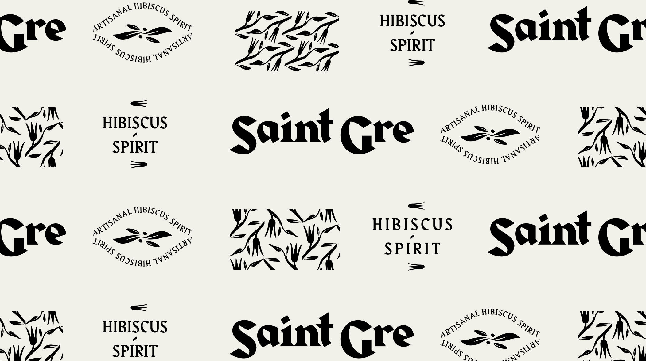
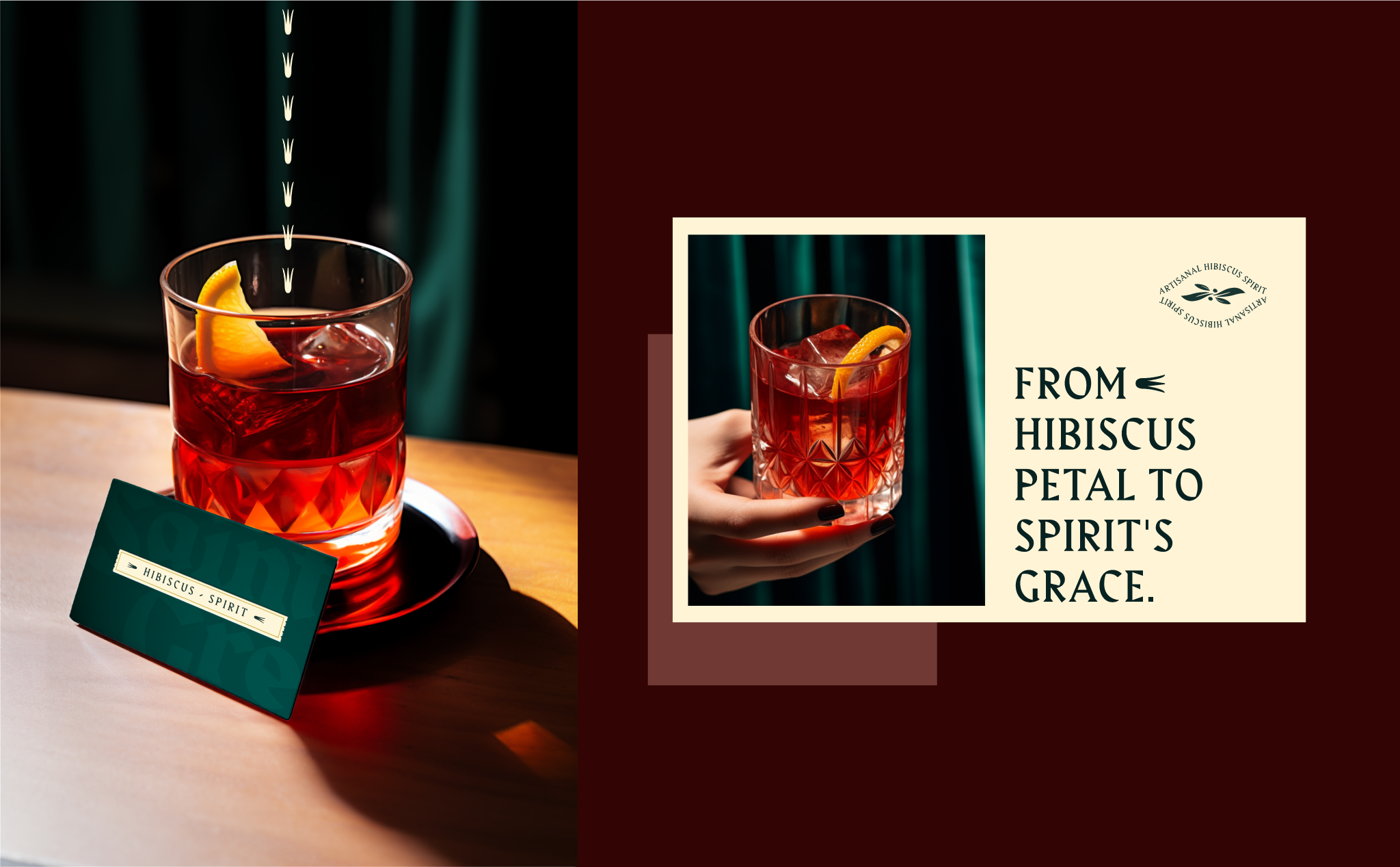
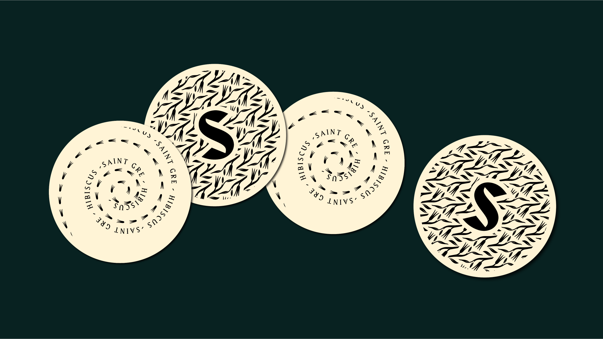
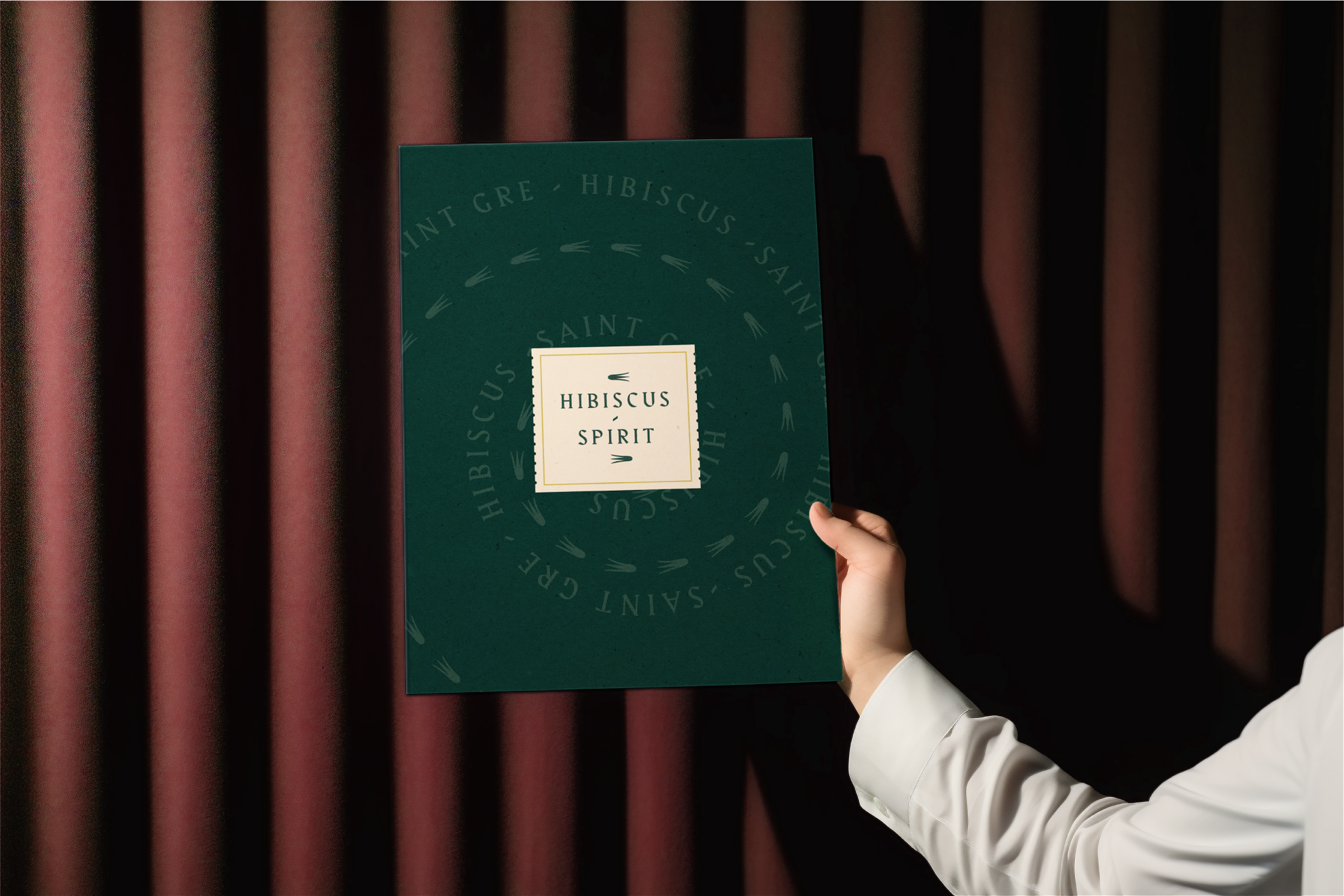
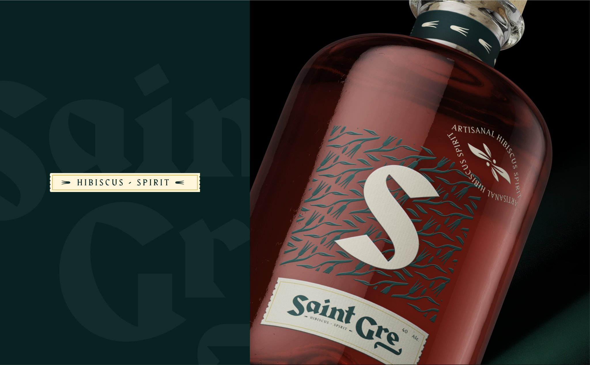
Saint Gre is a premium hibiscus liqueur crafted to bring a modern elegance to traditional flavors. The challenge was to design a brand and packaging system that honored its artisanal roots while appealing to a contemporary audience seeking sophistication and authenticity.The identity leans into the bold, natural richness of hibiscus, combining deep color palettes with refined typographic treatments and glass details that emphasize craft and quality. The bottle itself becomes a statement piece—both inviting on the shelf and memorable in the hand.
Creative Director: Leo Juarez / Permma
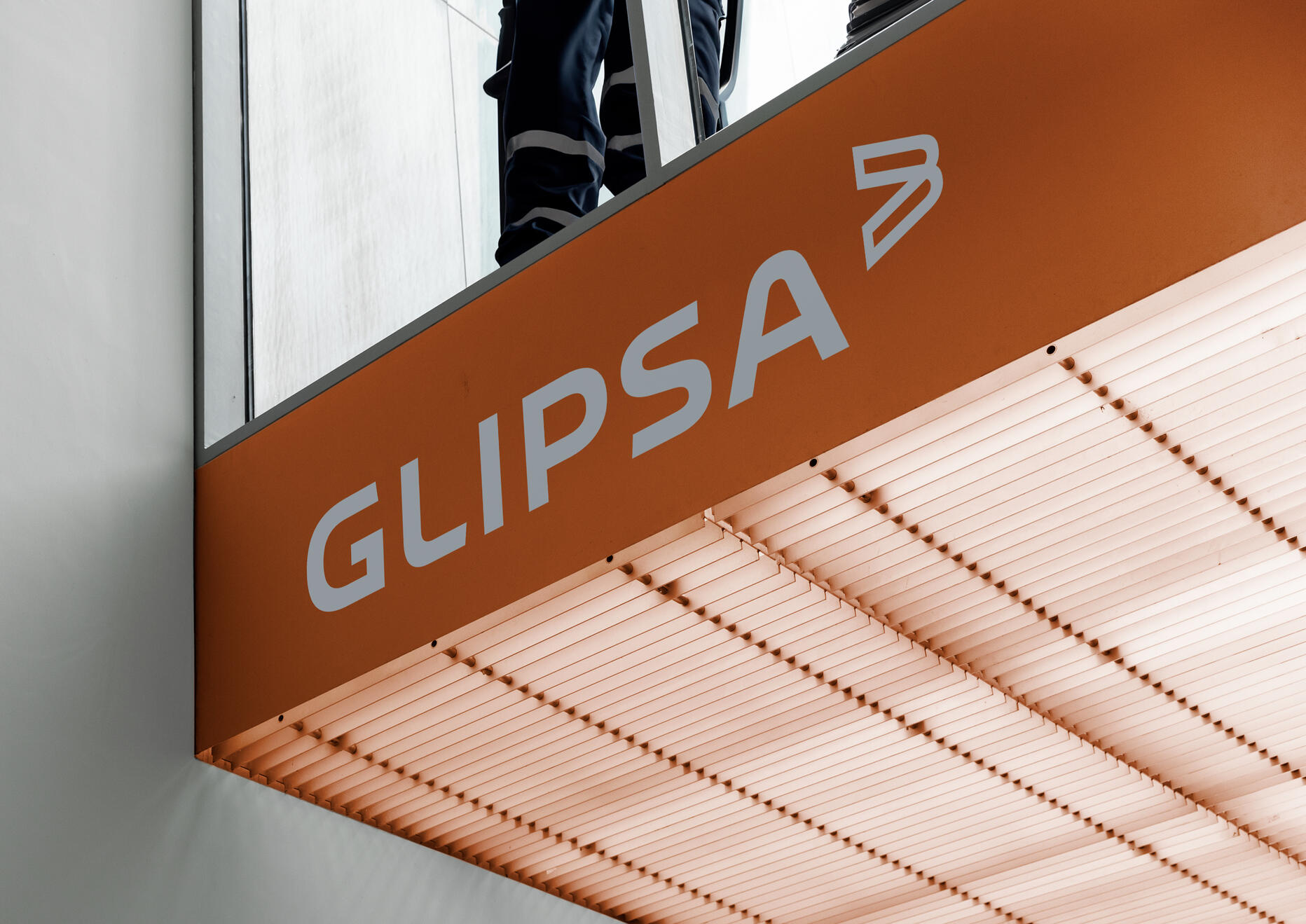
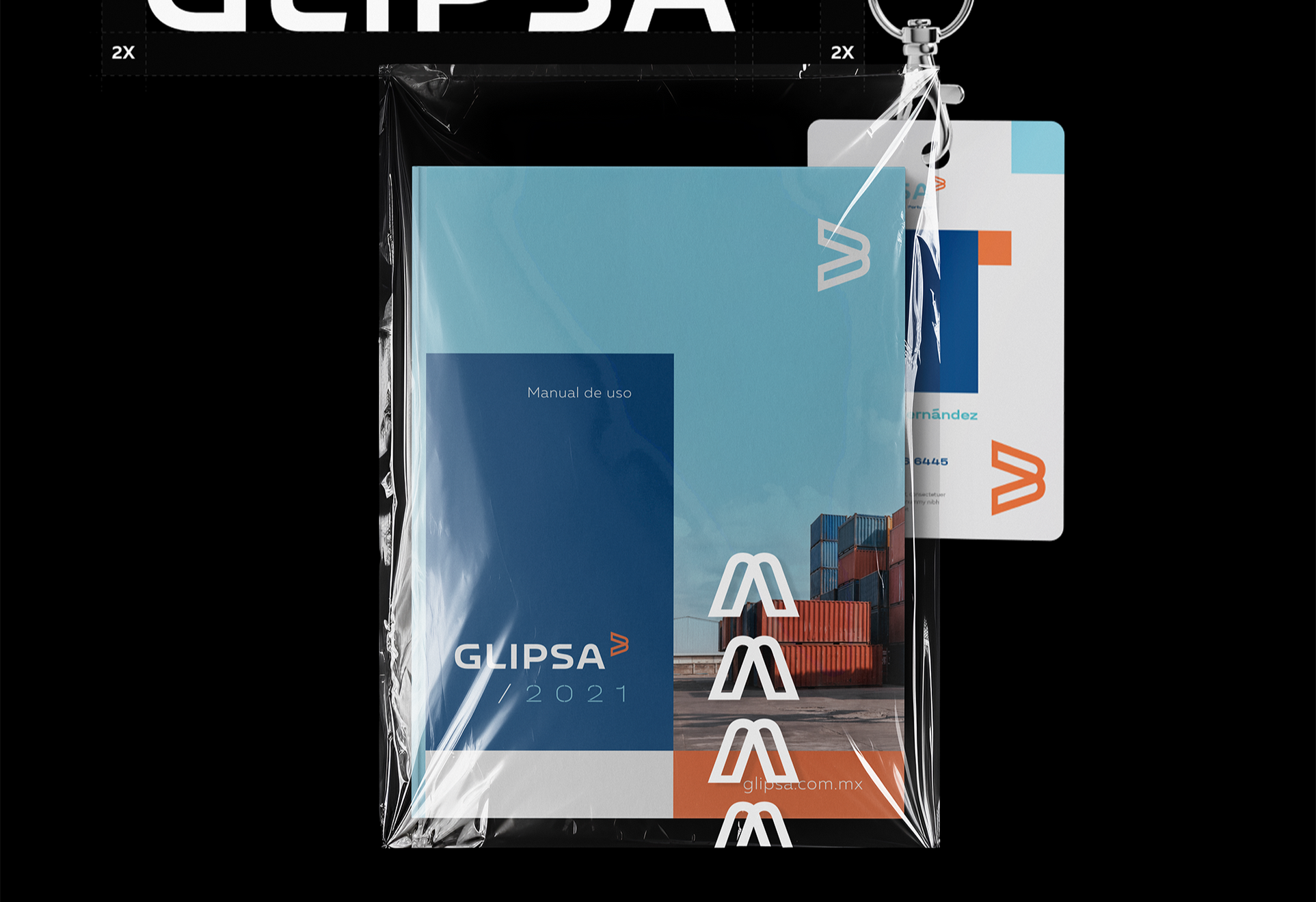
Glipsa
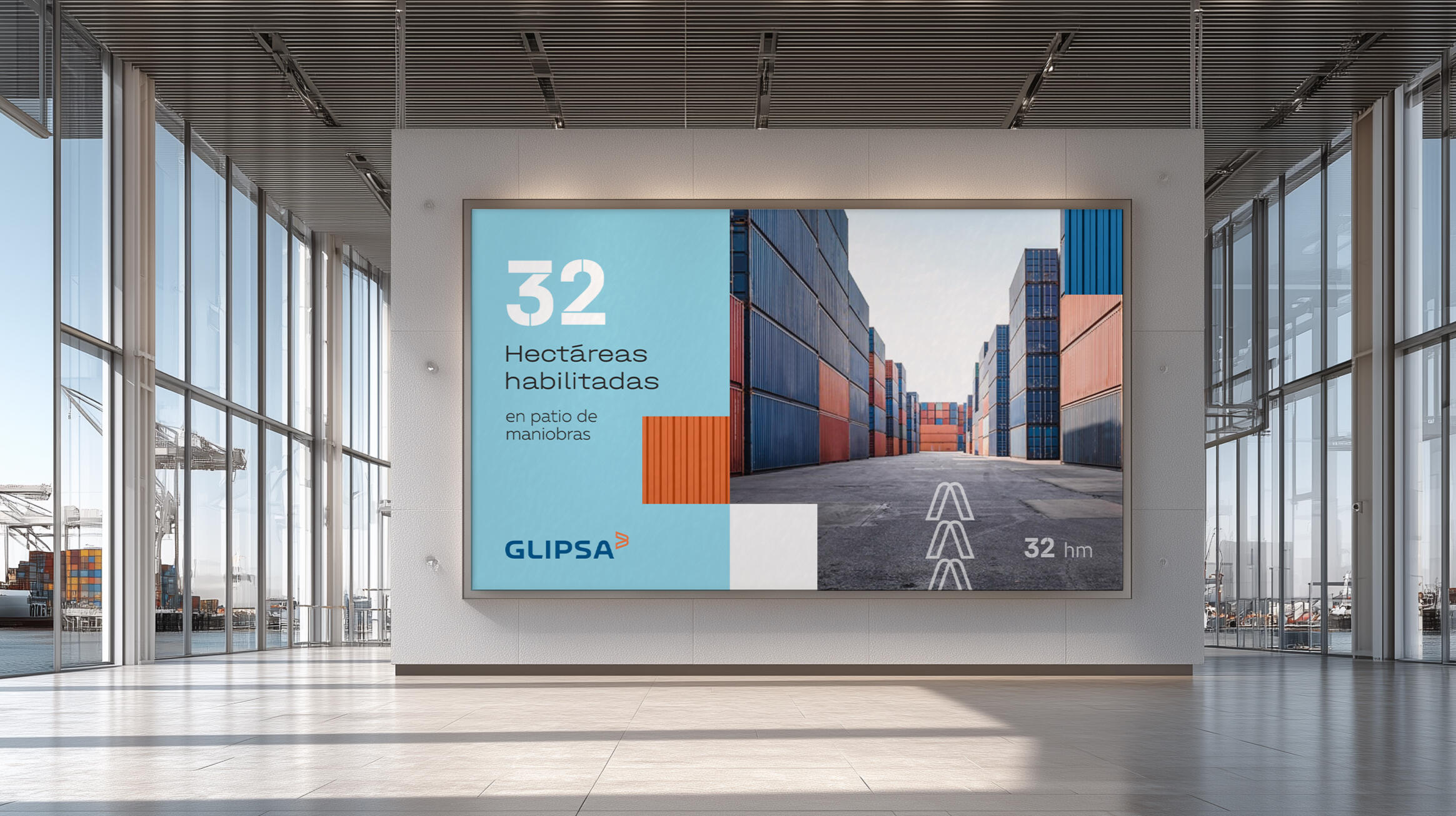
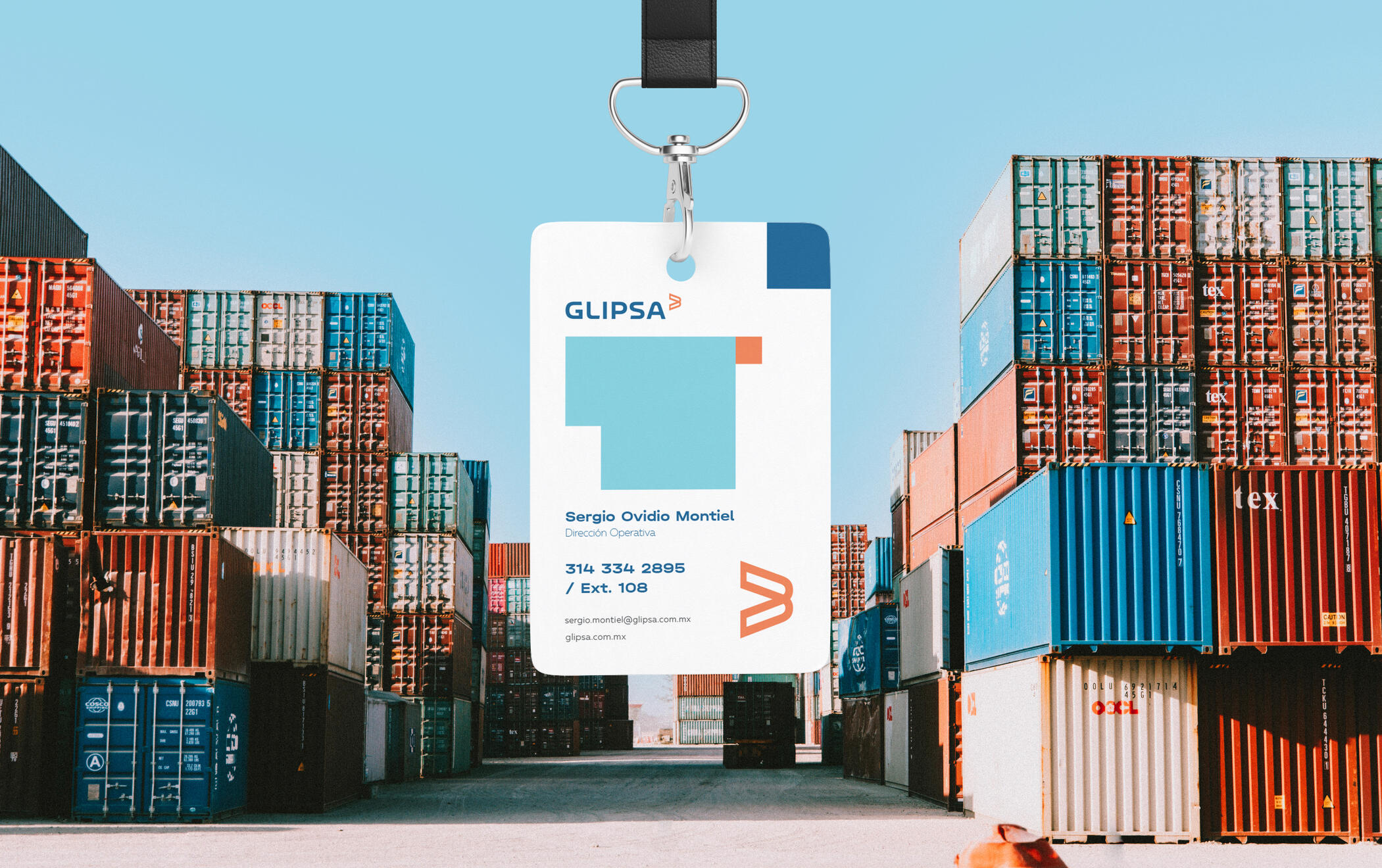
Glipsa is a logistics company based in Manzanillo, Colima, strategically positioned at one of Mexico’s most important ports. The challenge was to develop a brand system that clearly communicated efficiency, reliability, and the advantage of having every logistics solution in one place.The identity is built around clarity and strength, reflecting Glipsa’s unique infrastructure—direct access to port operations and the only on-site rail connection capable of moving containers straight from ship to warehouse. A restrained color palette, structured layouts, and confident typography reinforce precision and control, positioning Glipsa as a seamless, end-to-end logistics partner rather than just another service provider.
Creative Director: Leo Juarez / Permma
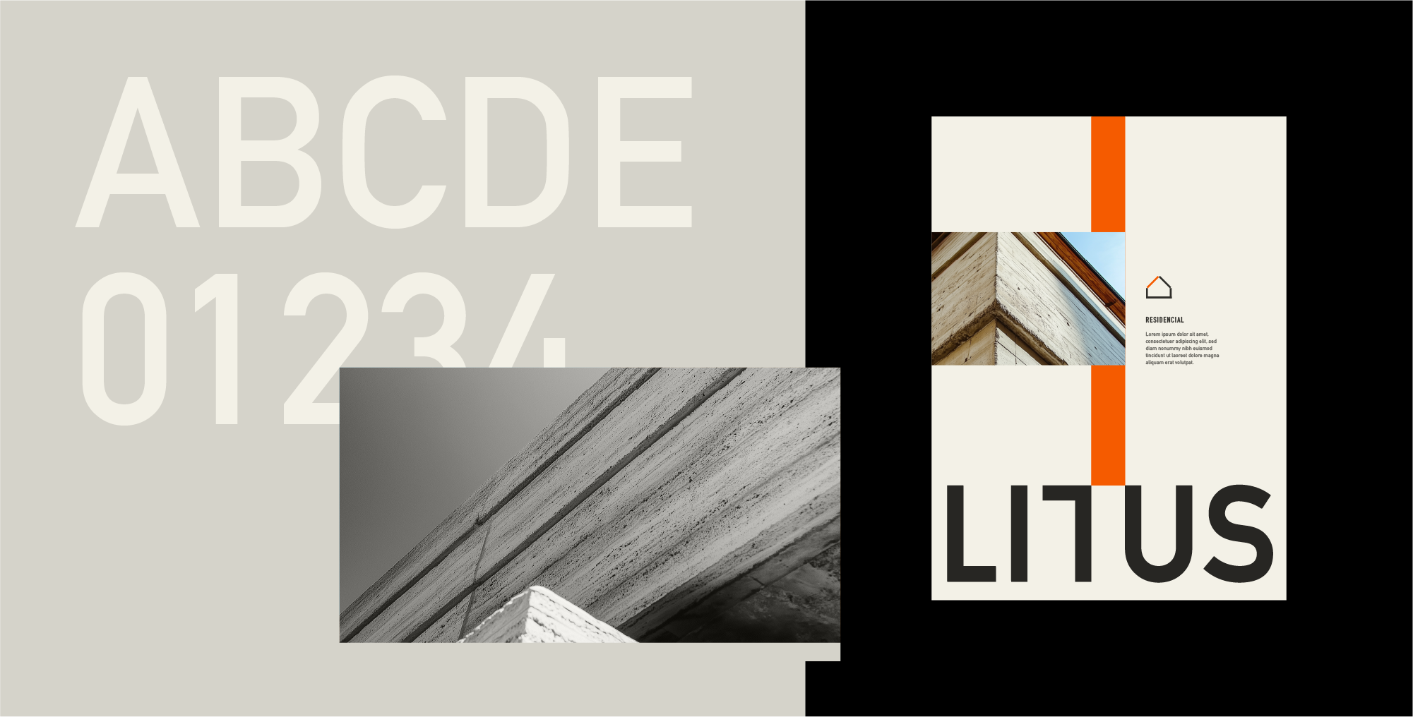
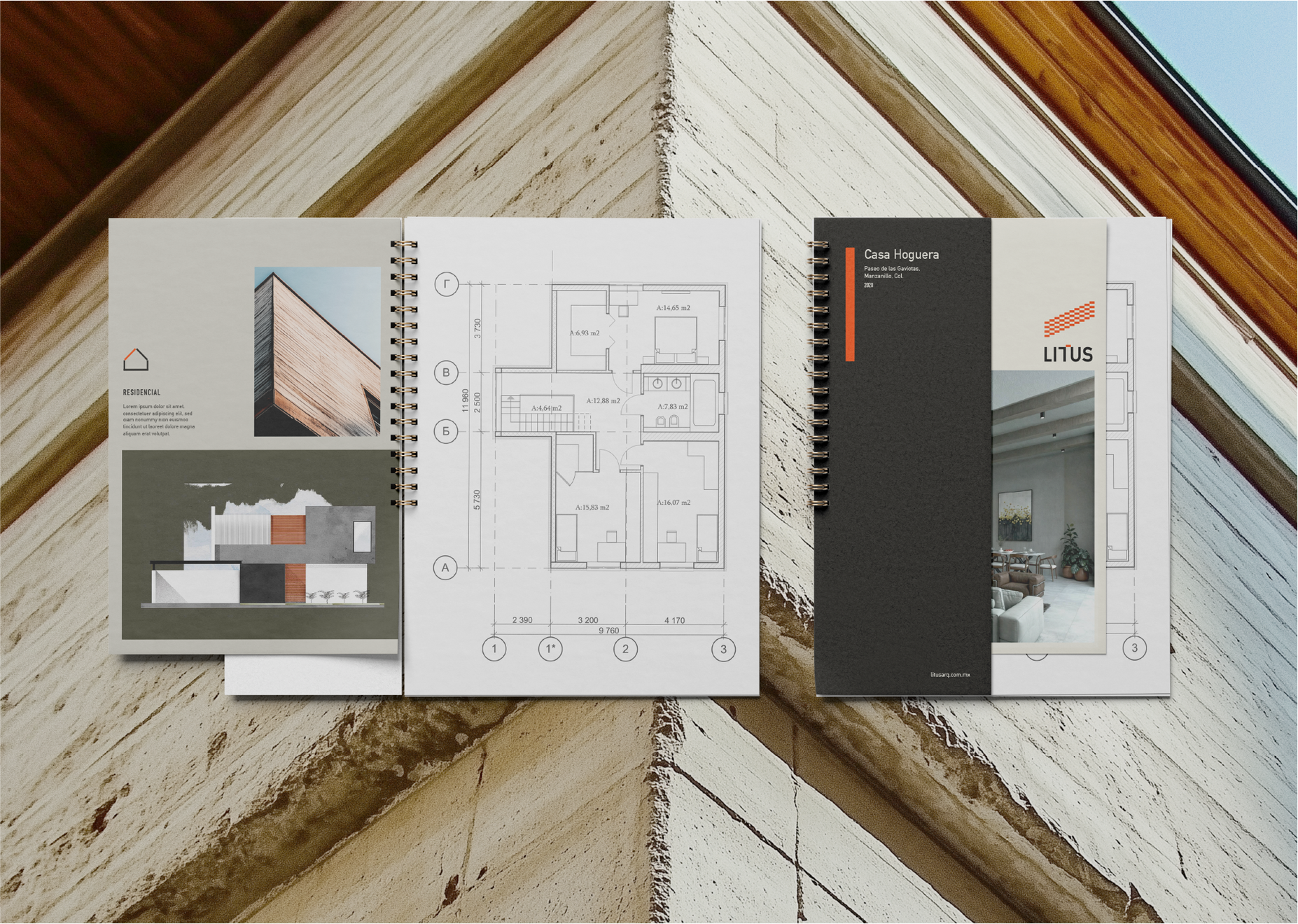
Litus Architecture
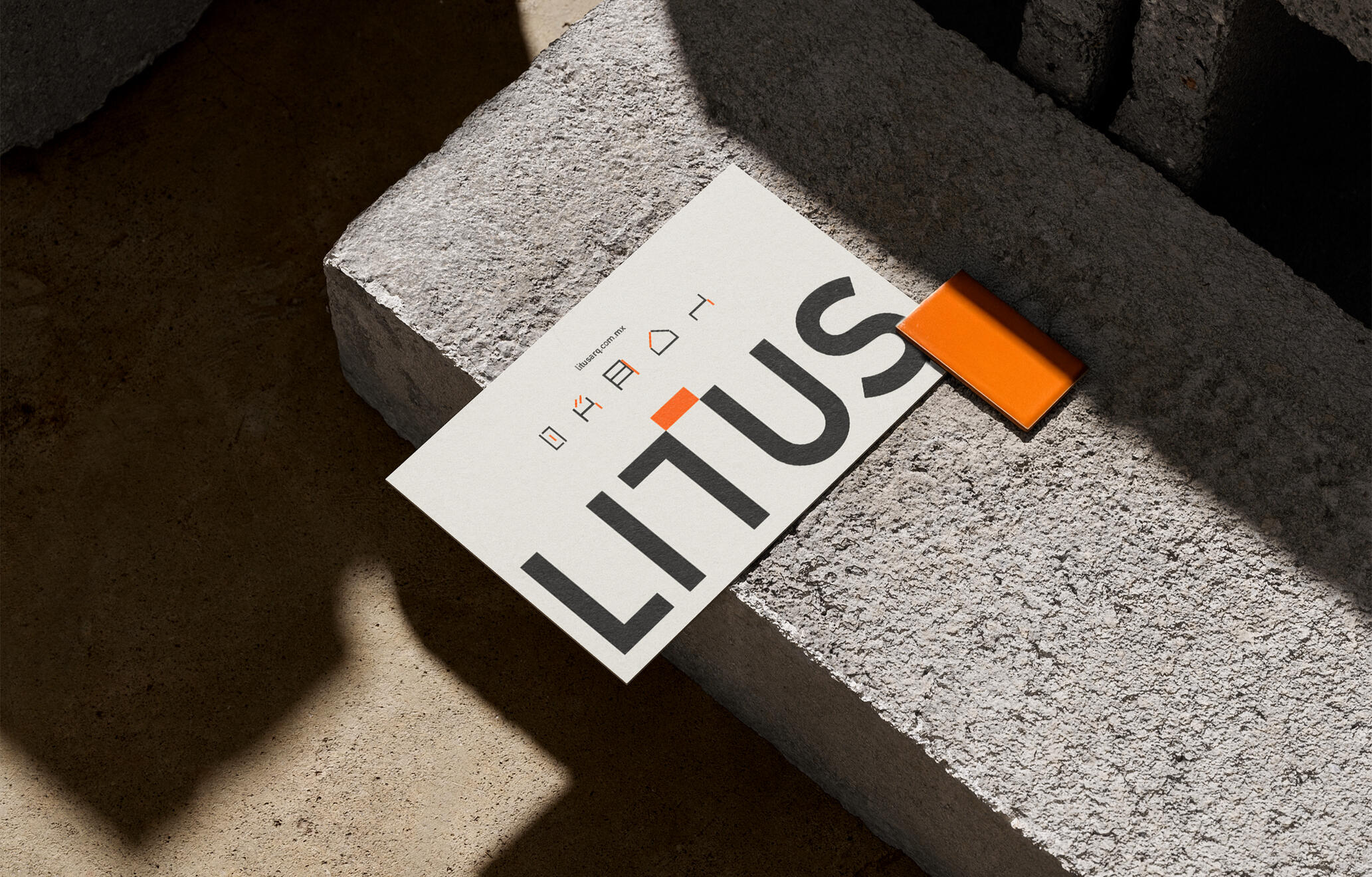
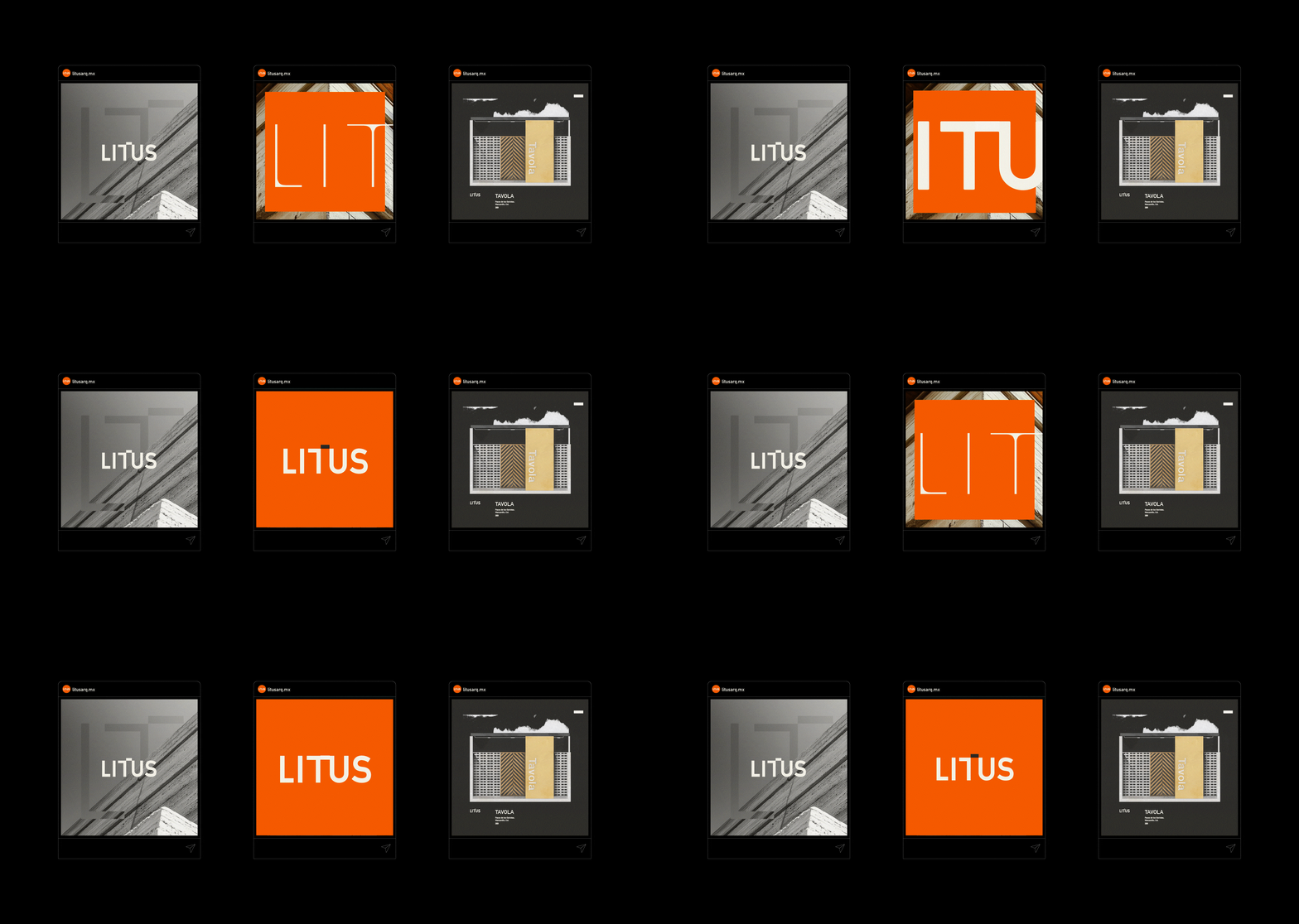
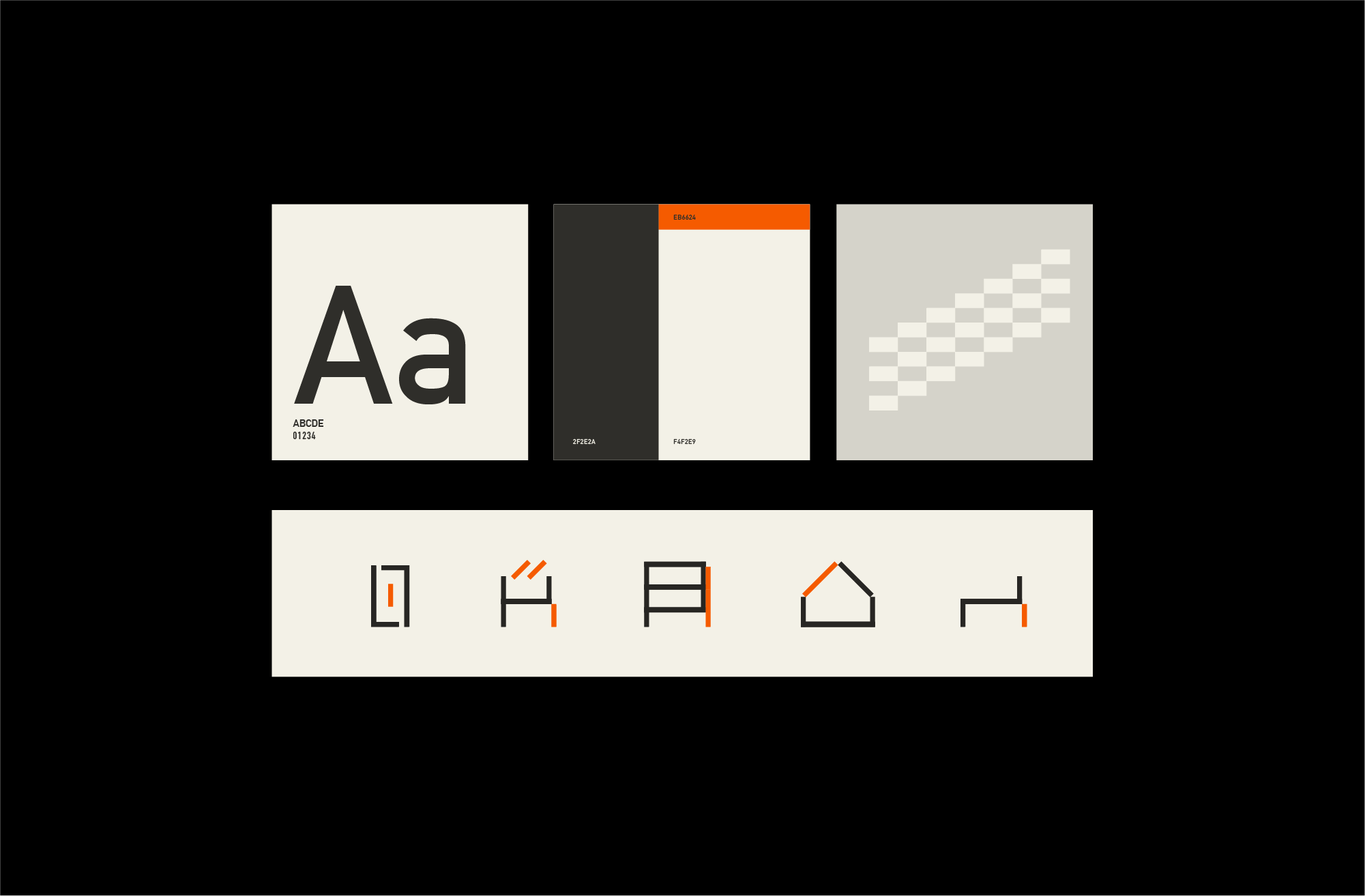
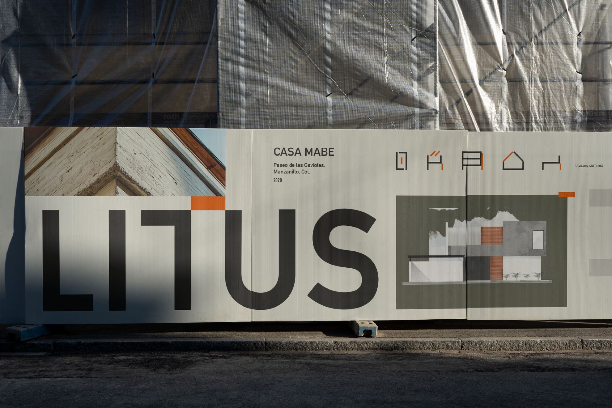
Brand identity for a contemporary architecture firm grounded in material honesty and structural clarity. The system is built around a modular logotype and custom icon set that reflect the firm’s focus on residential and commercial development.Typography, layout, and grid patterns draw directly from architectural principles—balanced by a restrained palette and a single, confident orange accent. The brand extends across printed materials, technical documentation, and digital applications with a unified, flexible system.Creative Direction: Leo Juarez / Permma
Isla Soledad
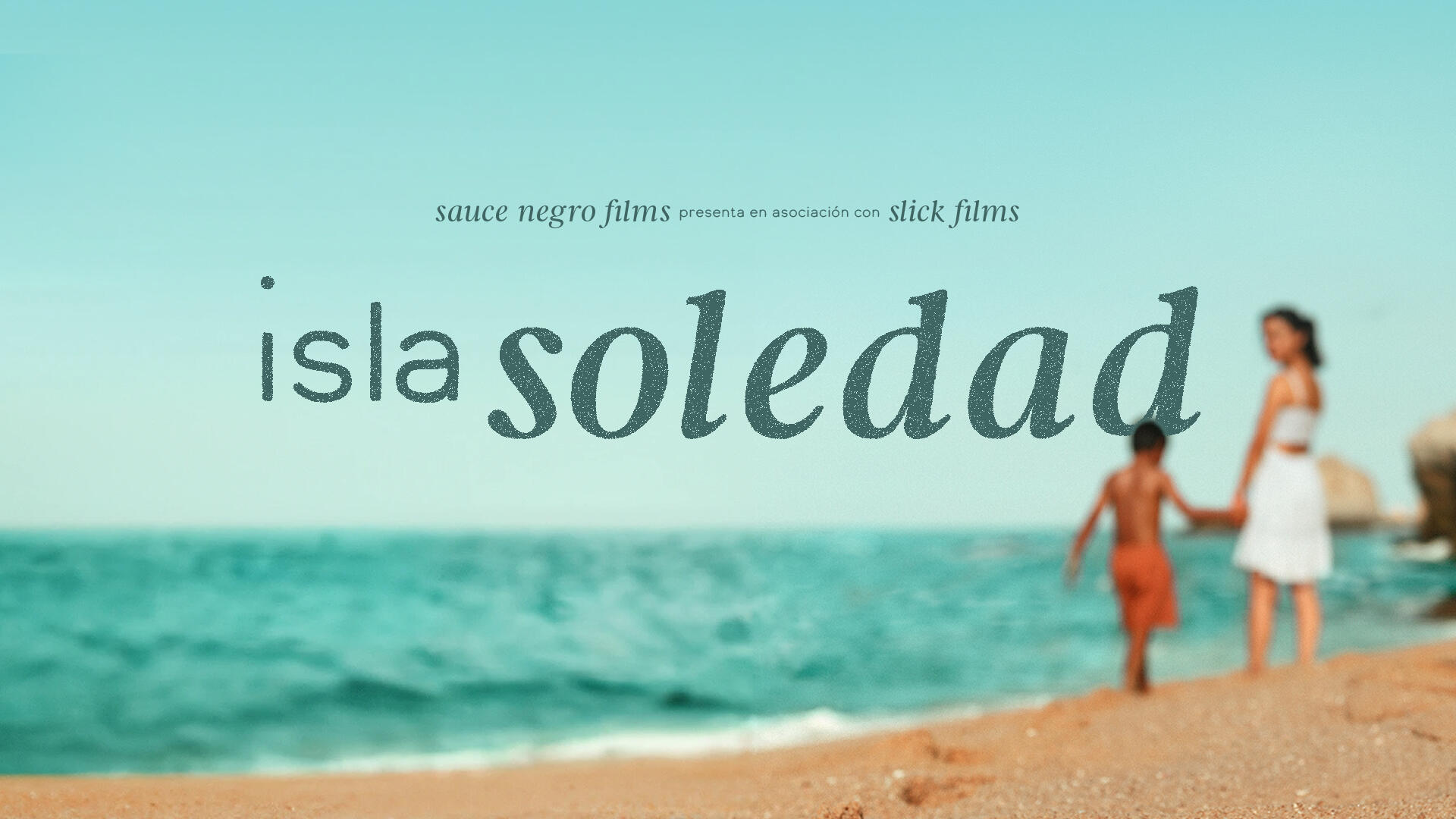
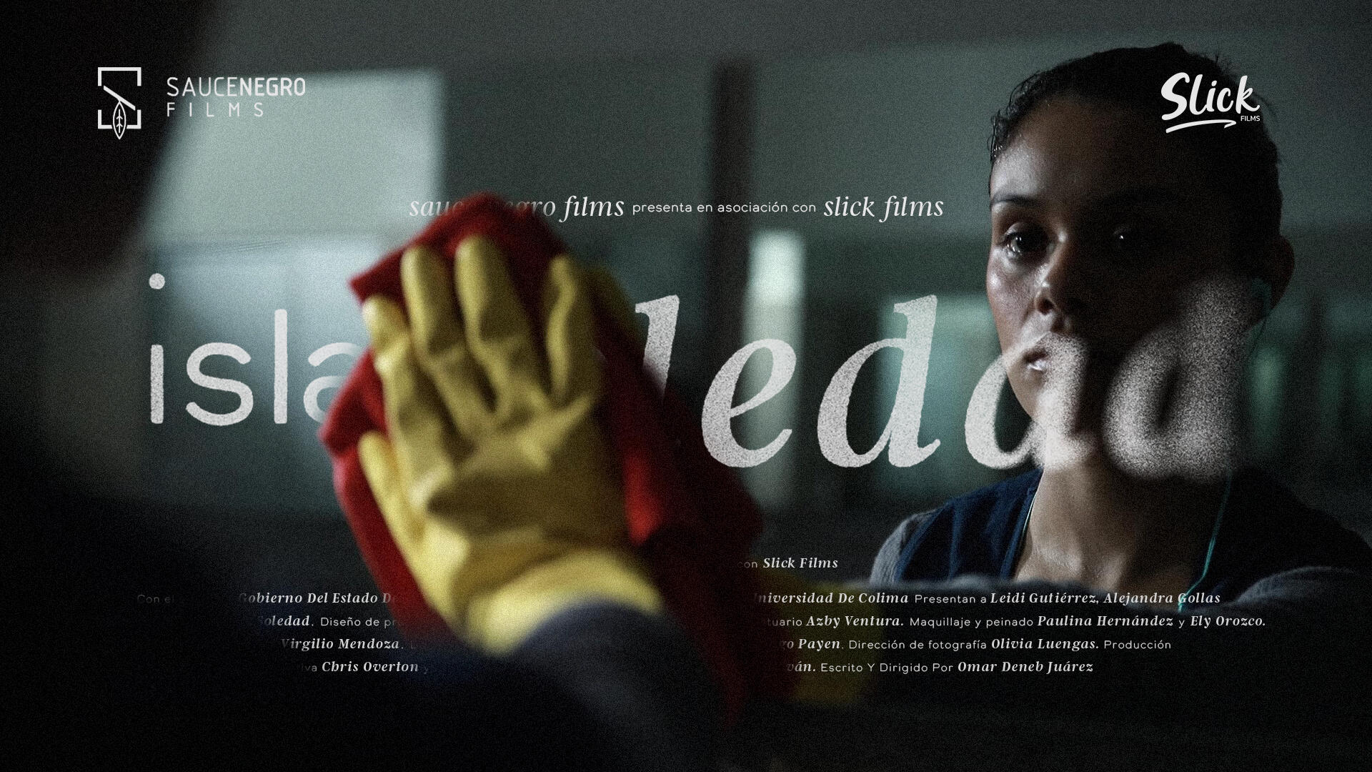
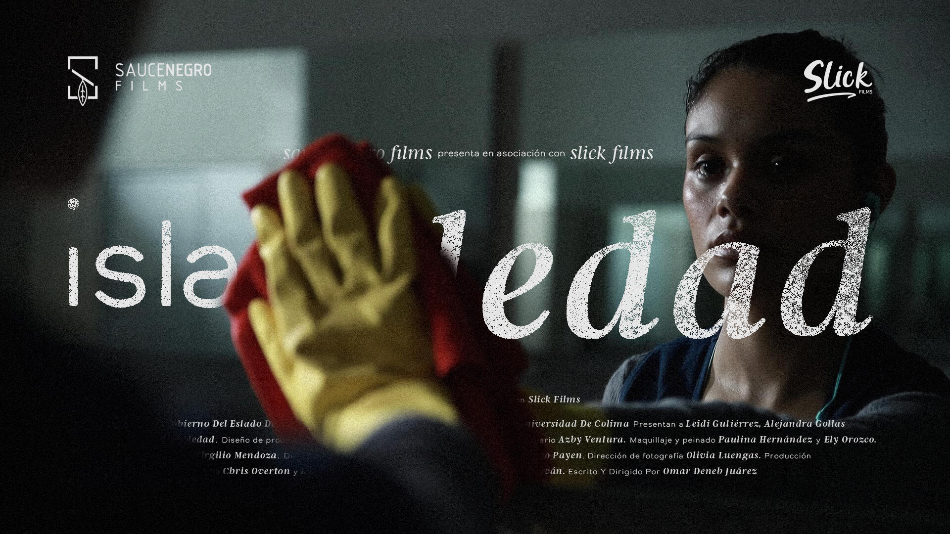
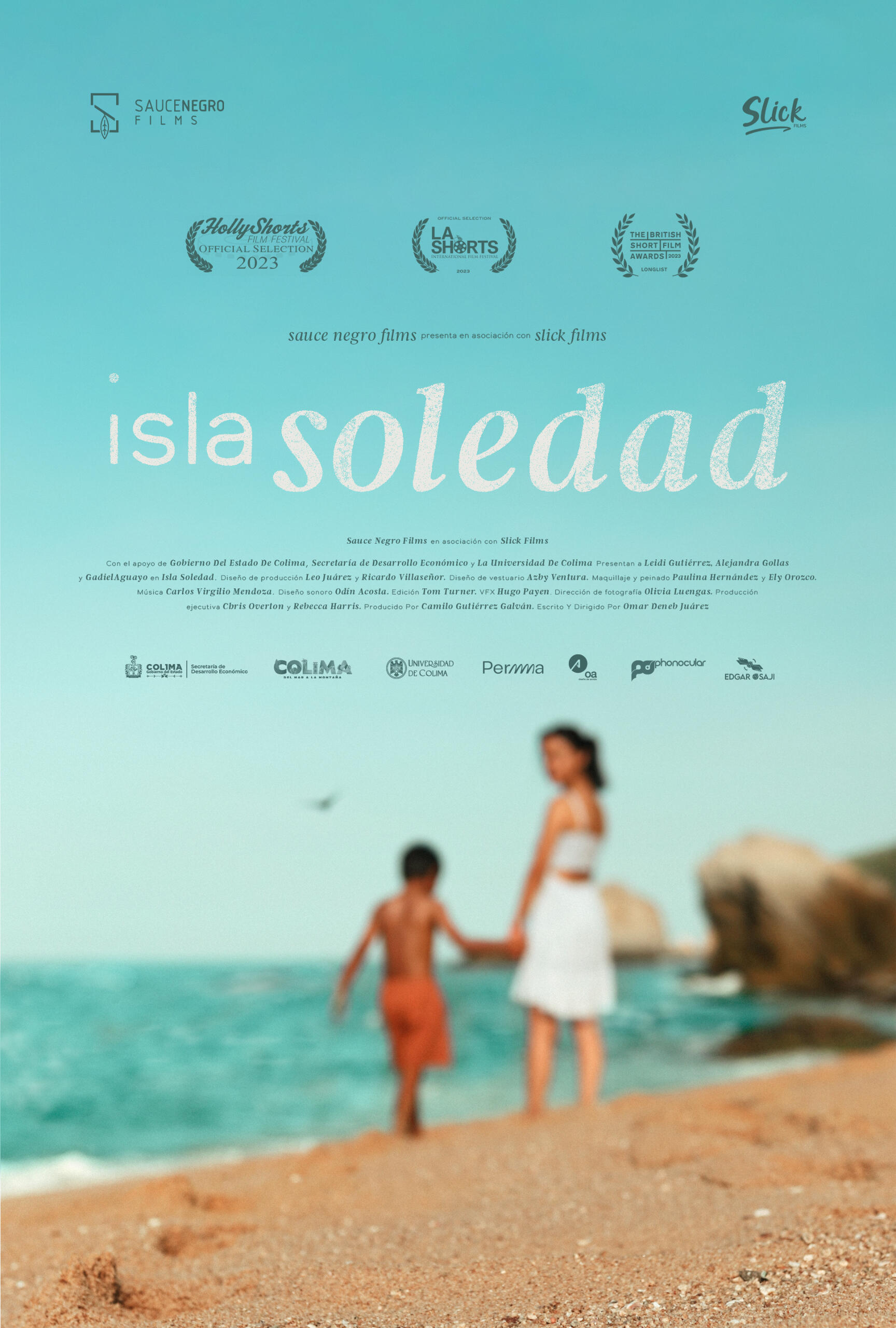
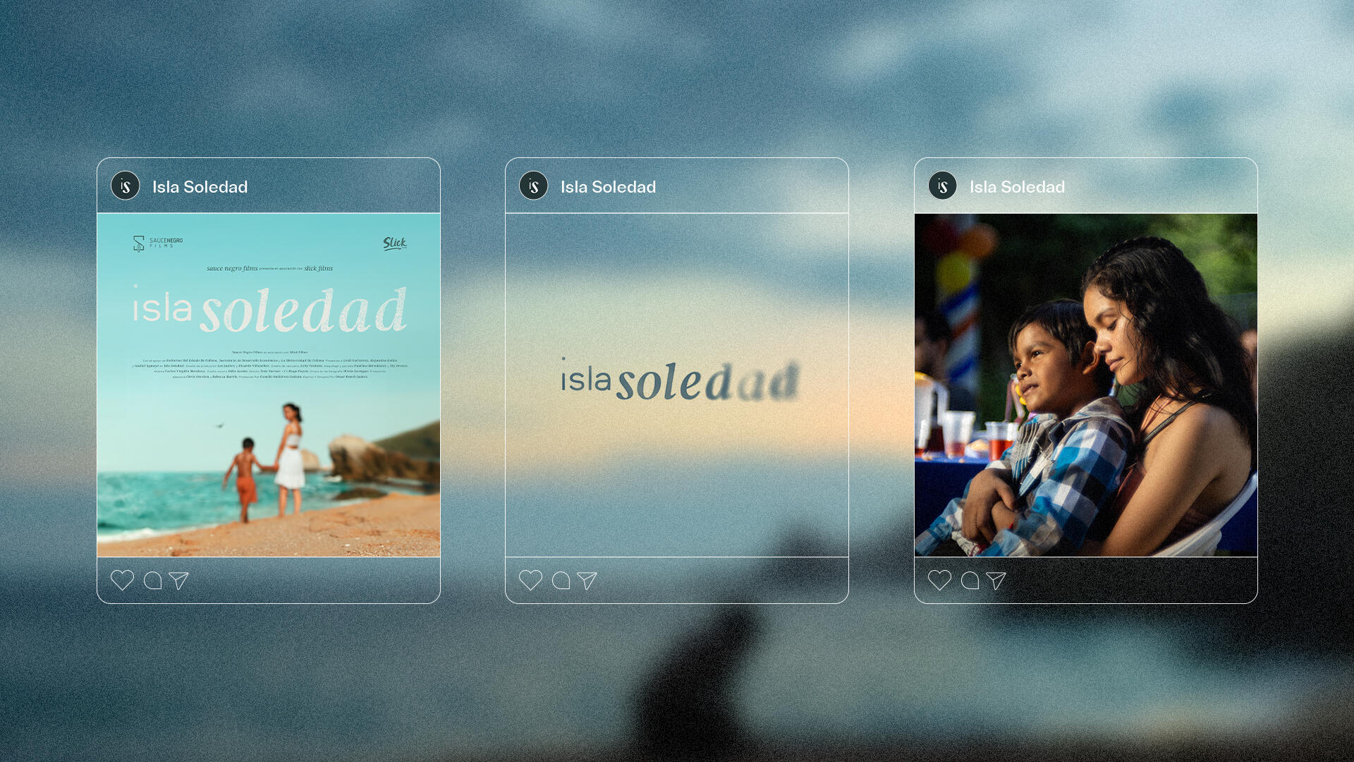
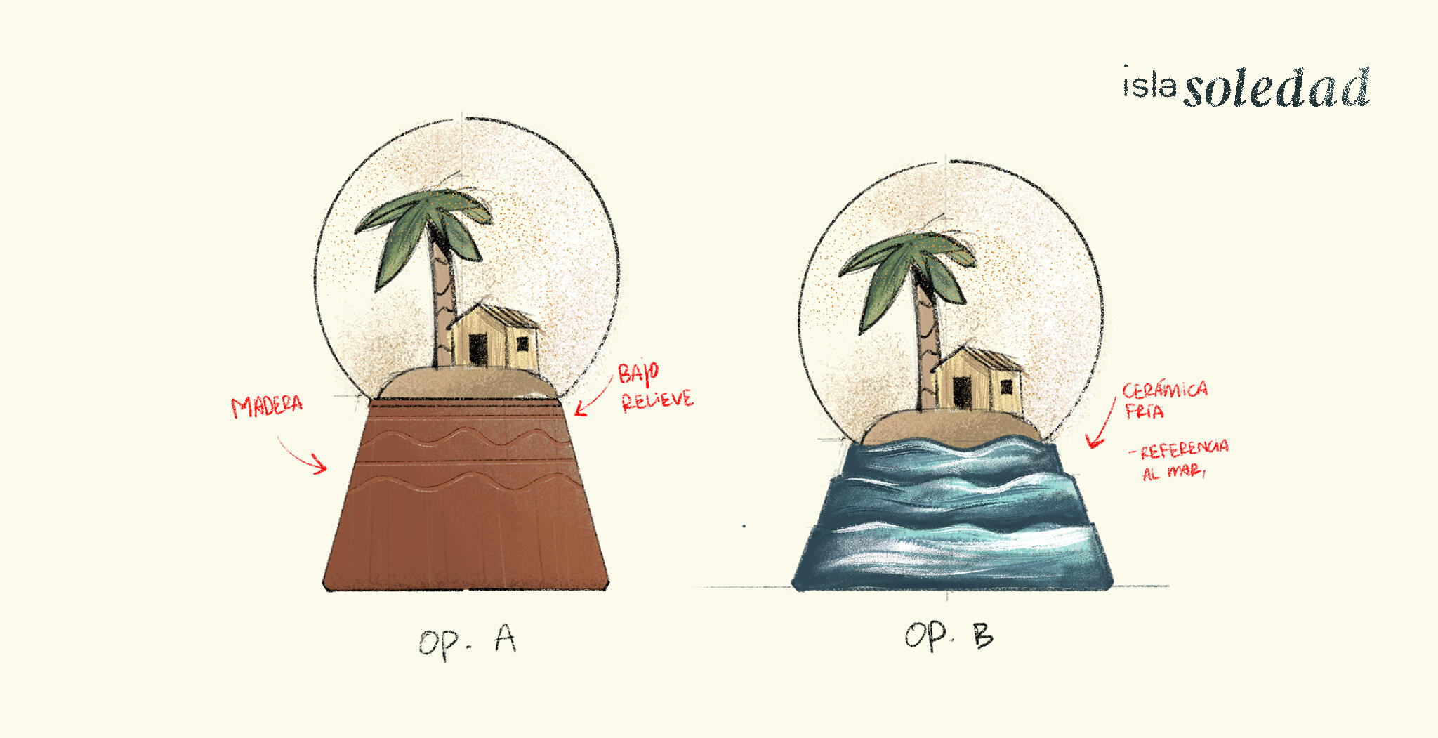
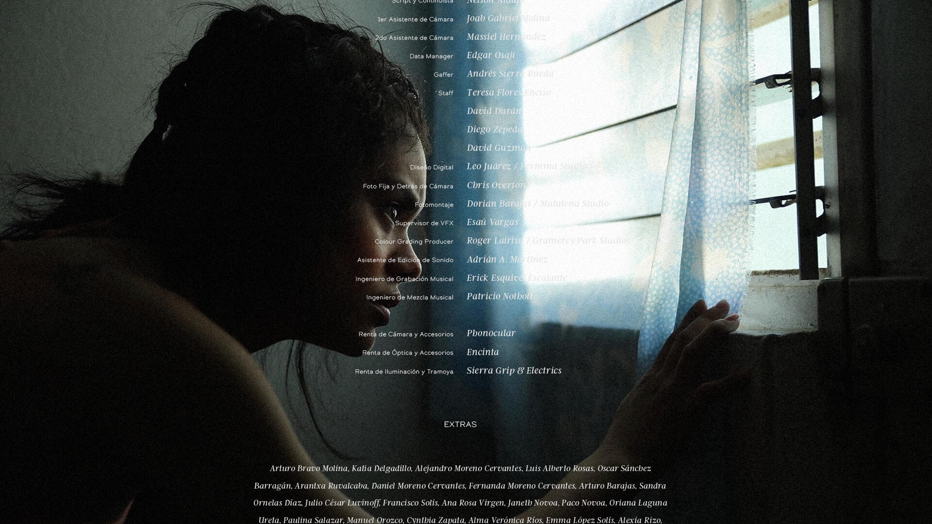
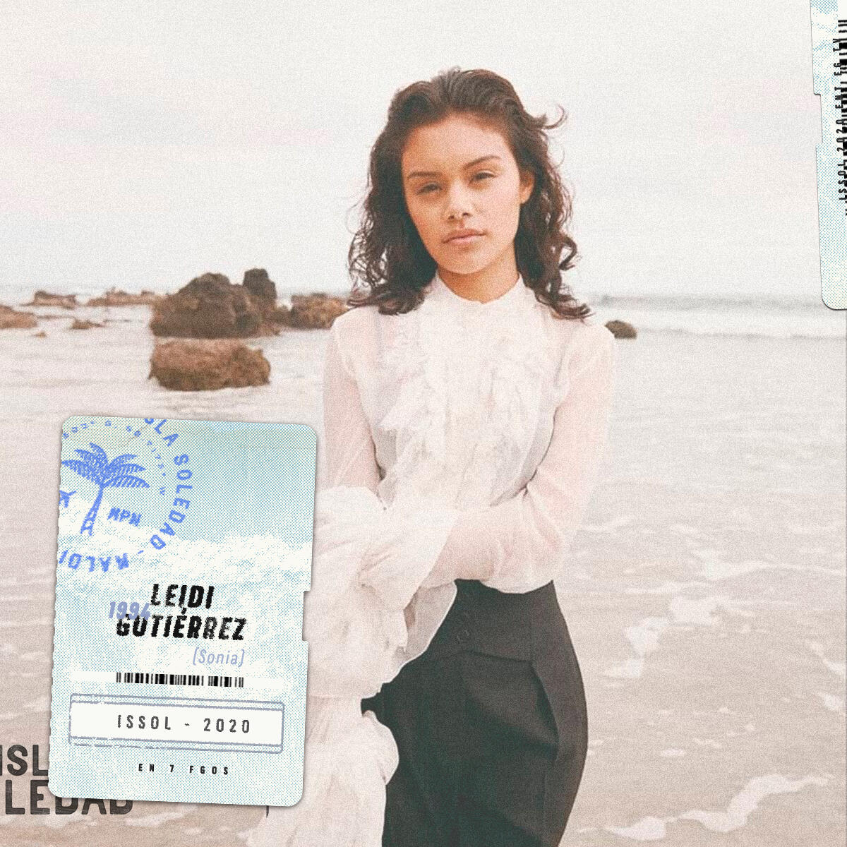
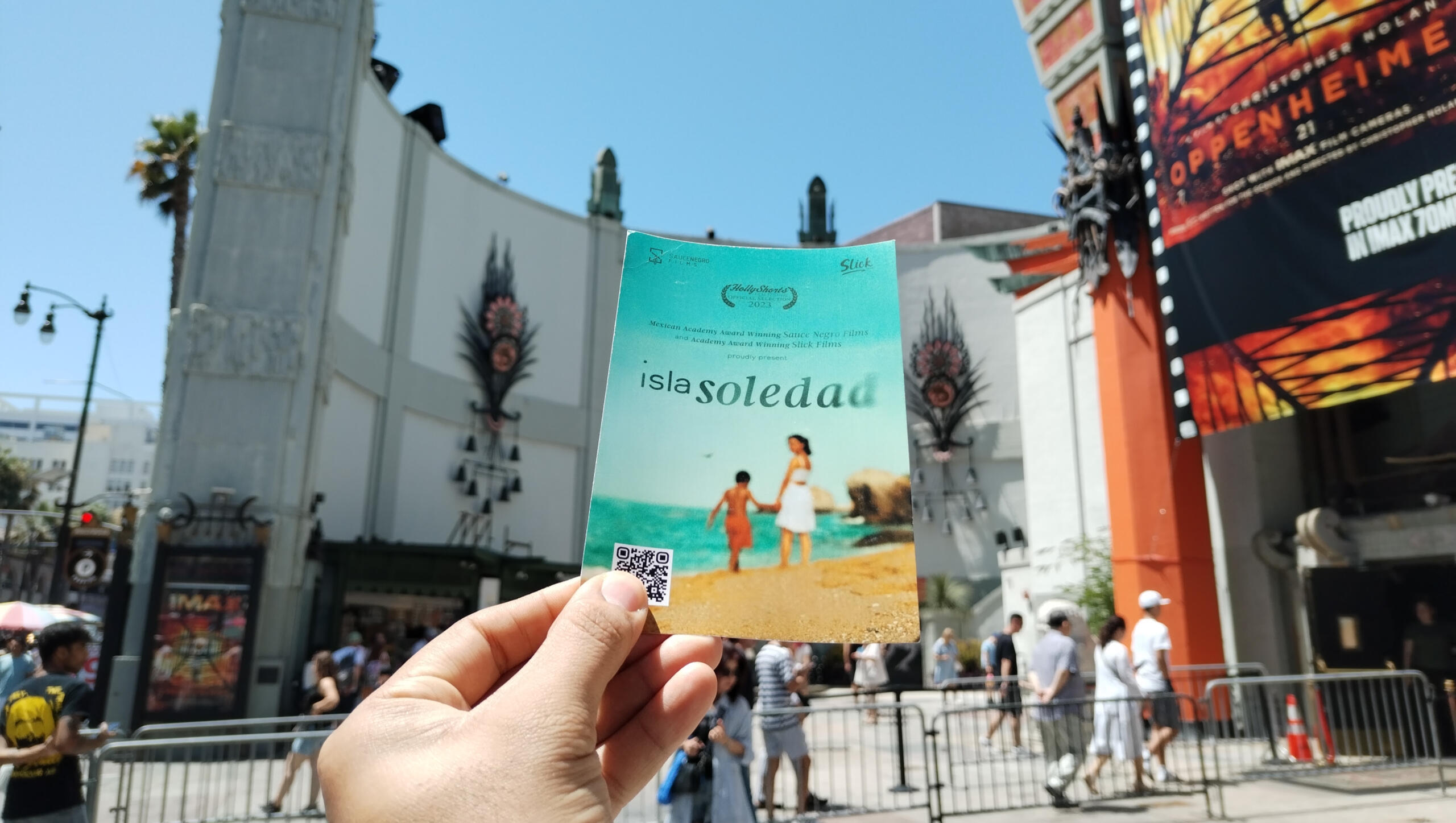
Visual identity, poster design, and title sequence for Isla Soledad, a Mexican–UK short film directed by Omar Deneb Juárez and produced by Sauce Negro Films and Oscar-winning Slick Films. The story follows a single mother’s journey to reunite with her son, set against the backdrop of coastal Mexico.The design approach centered on themes of distance, longing, and resilience—balancing warmth with restraint. The custom wordmark and title sequence were crafted to echo the film’s emotional tone, while the poster and promotional materials extended the visual language across digital and festival platforms.Creative Direction: Leo Juarez / Permma
Aura
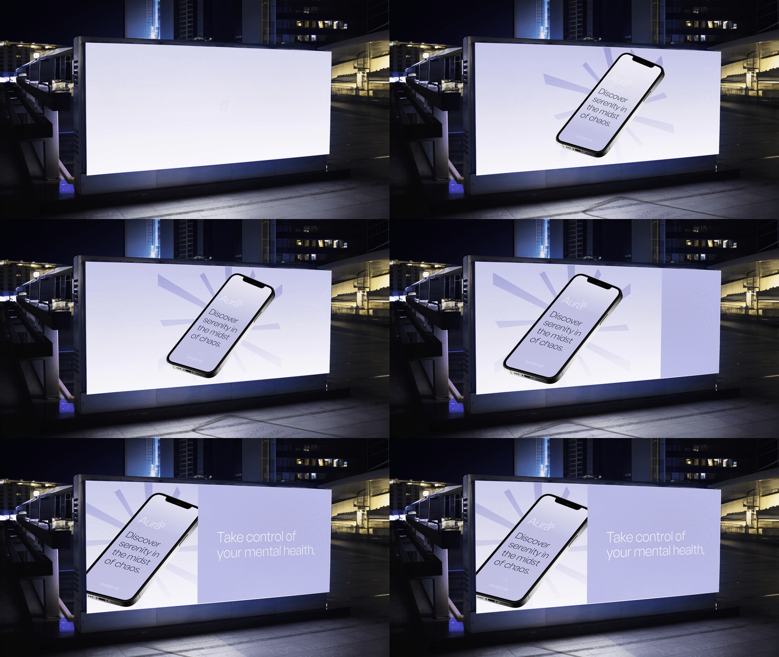
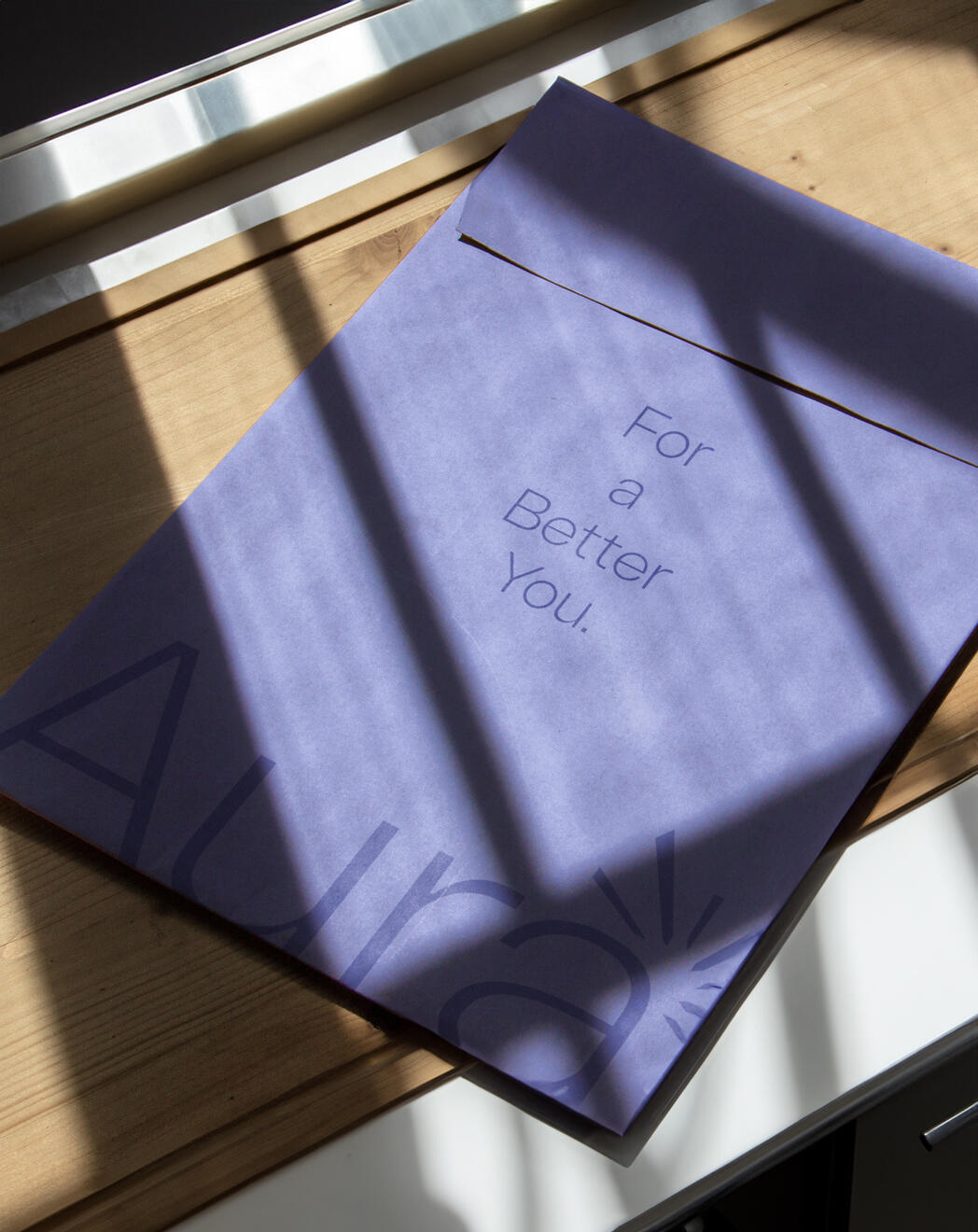
In an increasingly noisy digital world, Aura set out to create a space for quiet reflection and mindful daily rituals. The app was designed to support mental well-being through breath-work, guided exercises, and gentle reminders to pause.My role was to translate that vision into a brand identity that felt calm yet contemporary, one that could earn trust while standing apart in a crowded wellness market. The visual direction combines soft gradients, open typography, and minimal interfaces to invite clarity and ease.
Creative Director: Leo Juarez / Permma
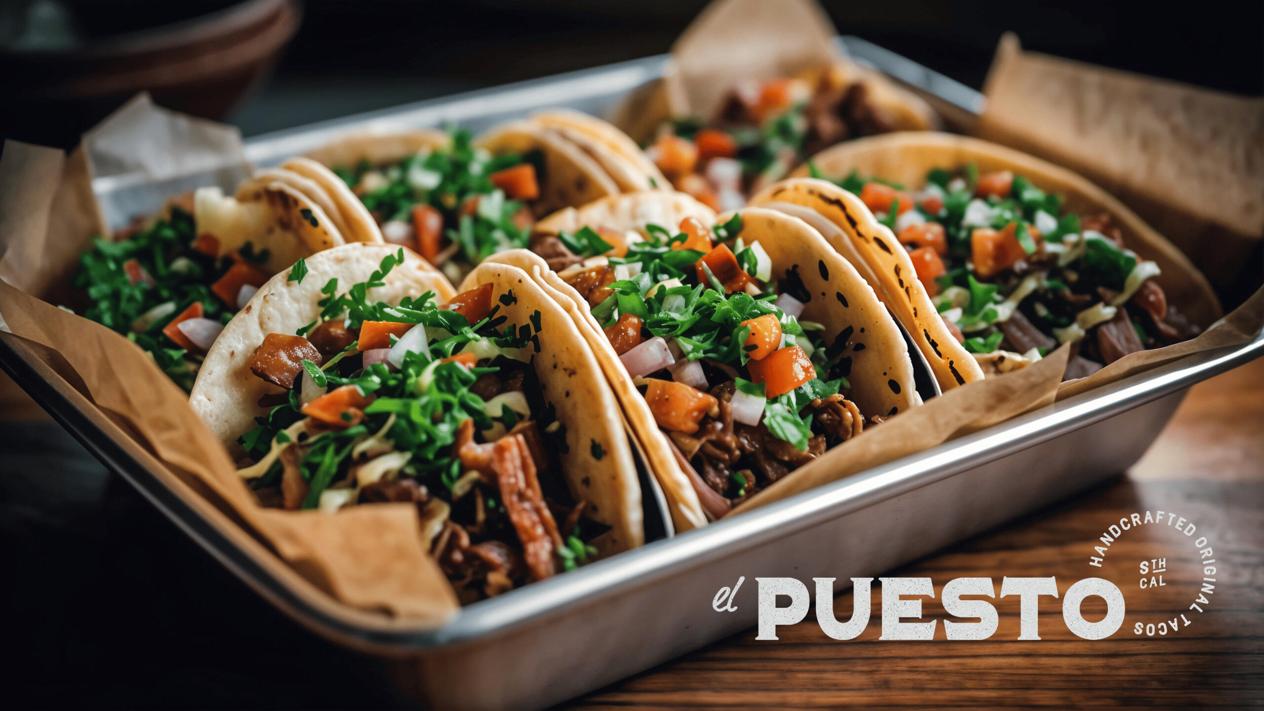
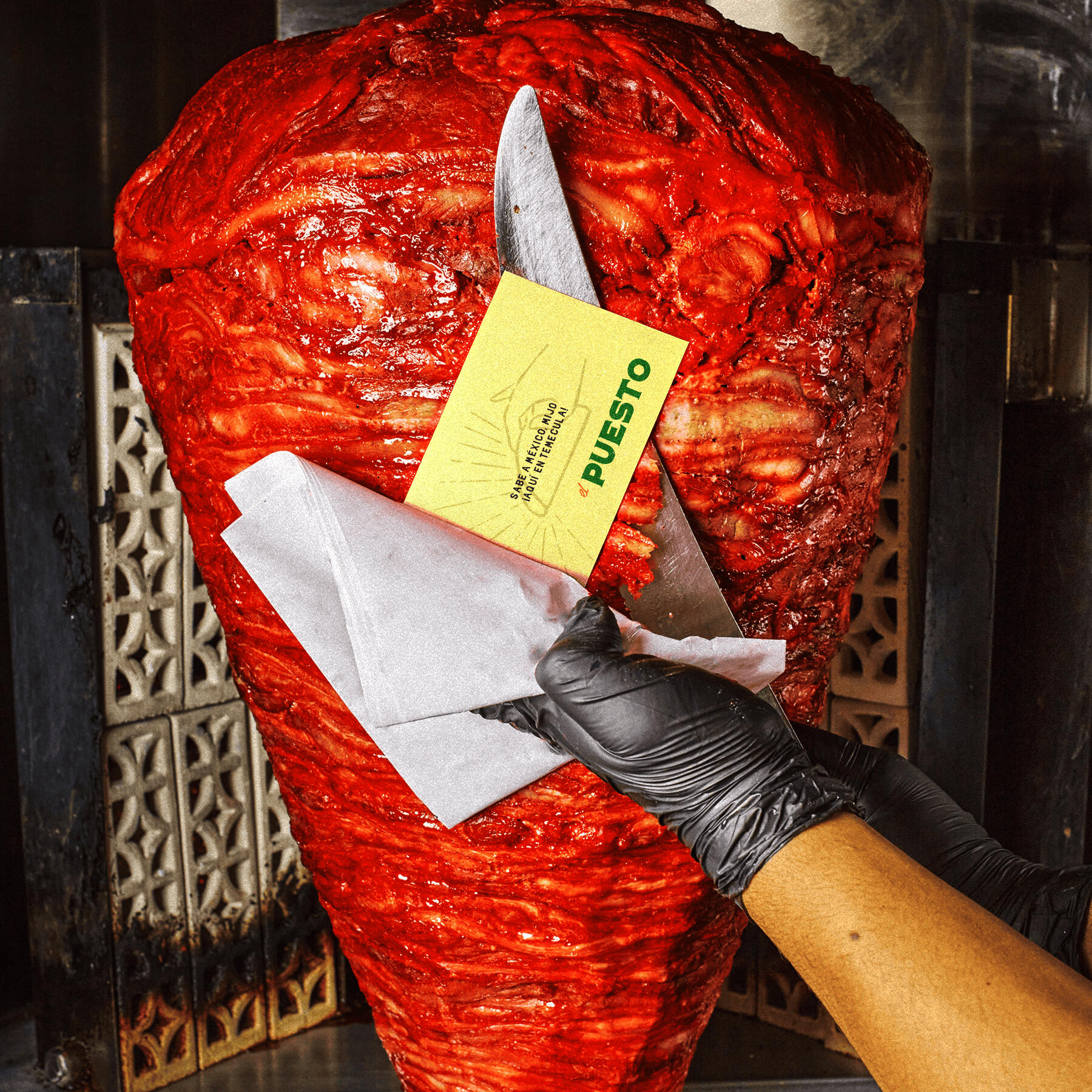
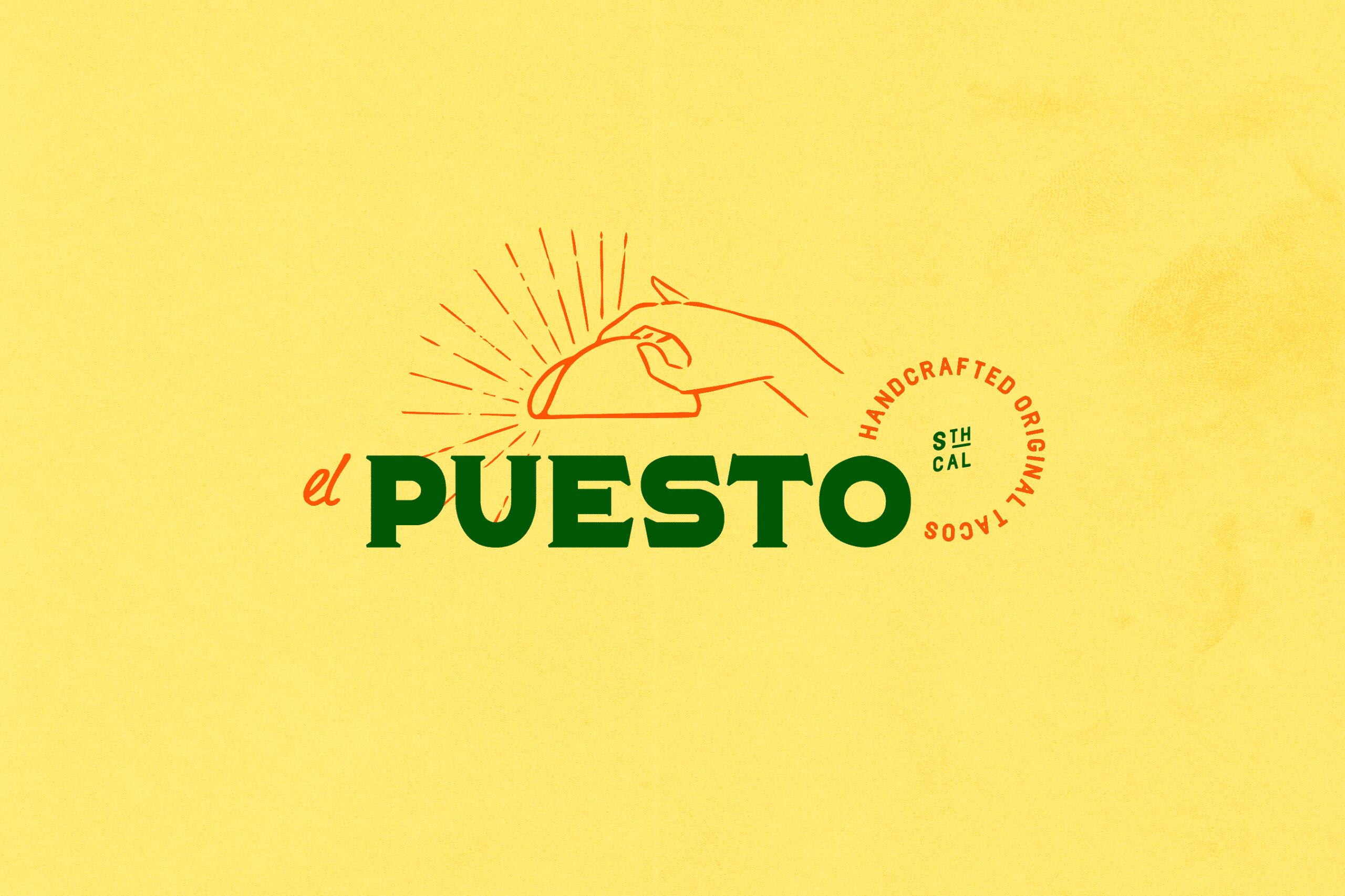
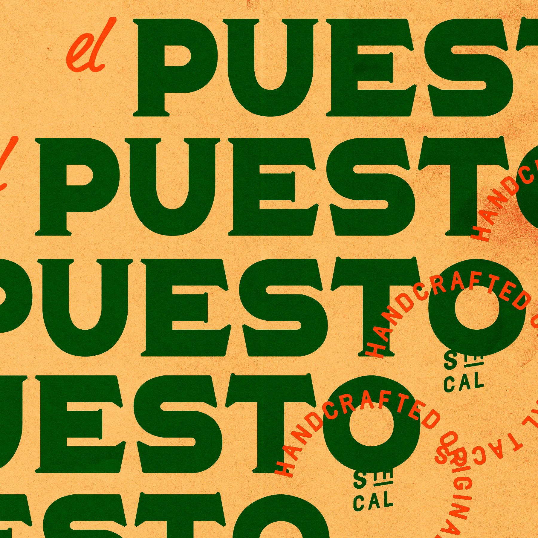
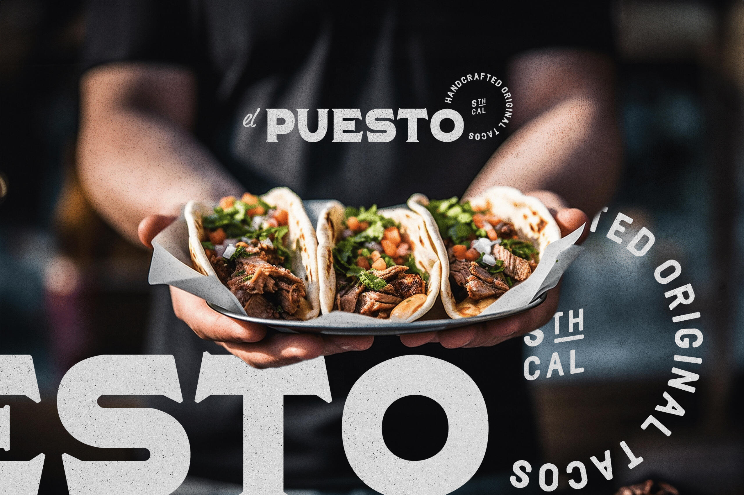
El Puesto truck
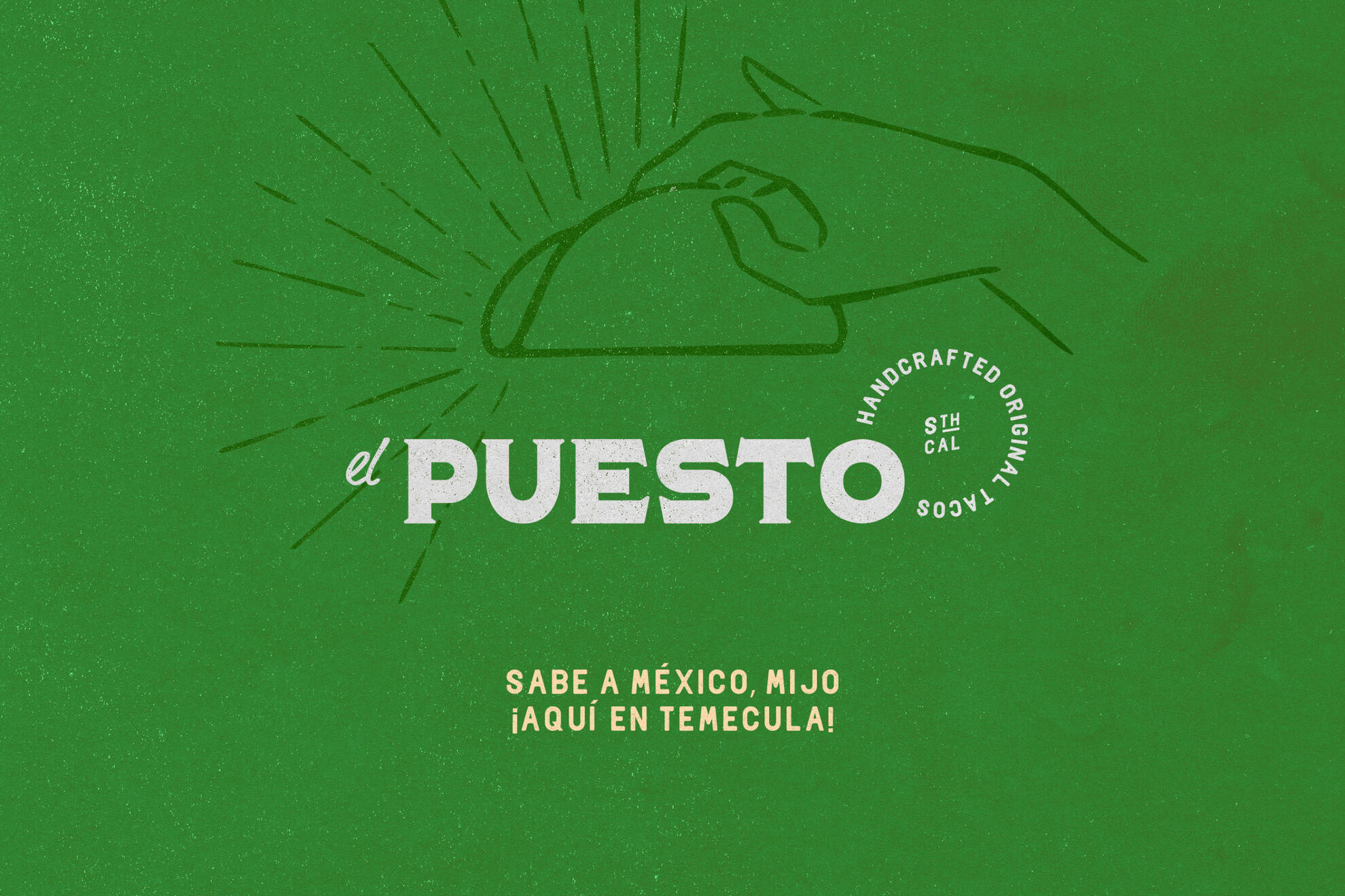
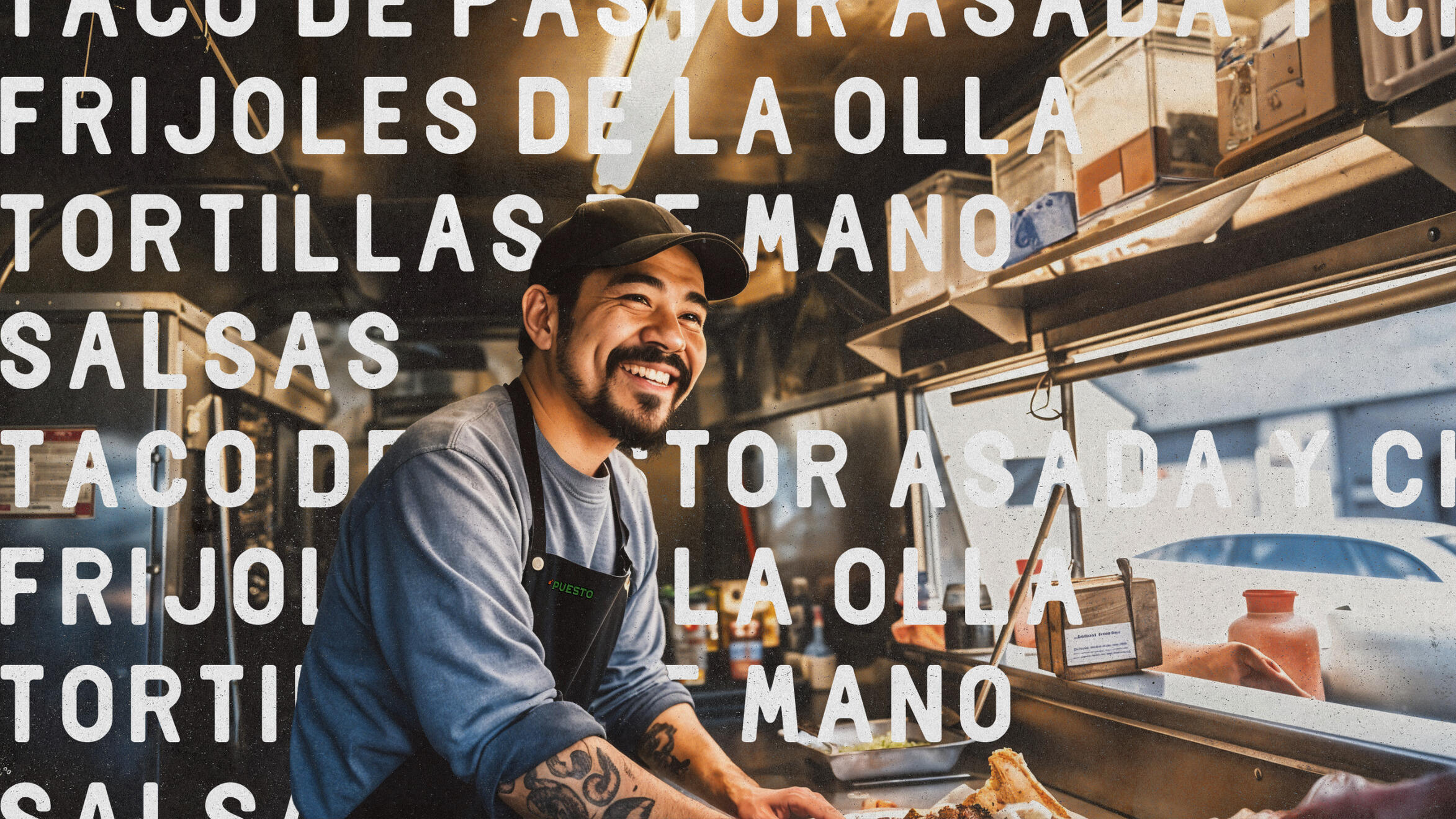
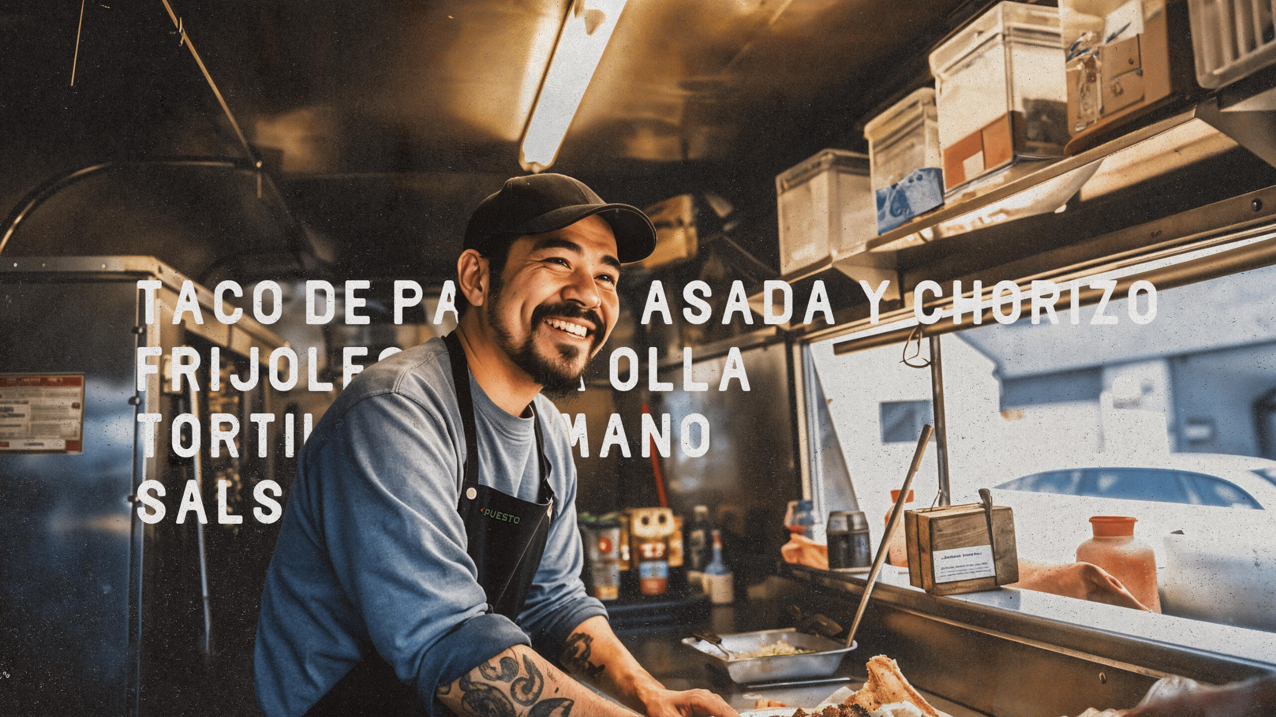
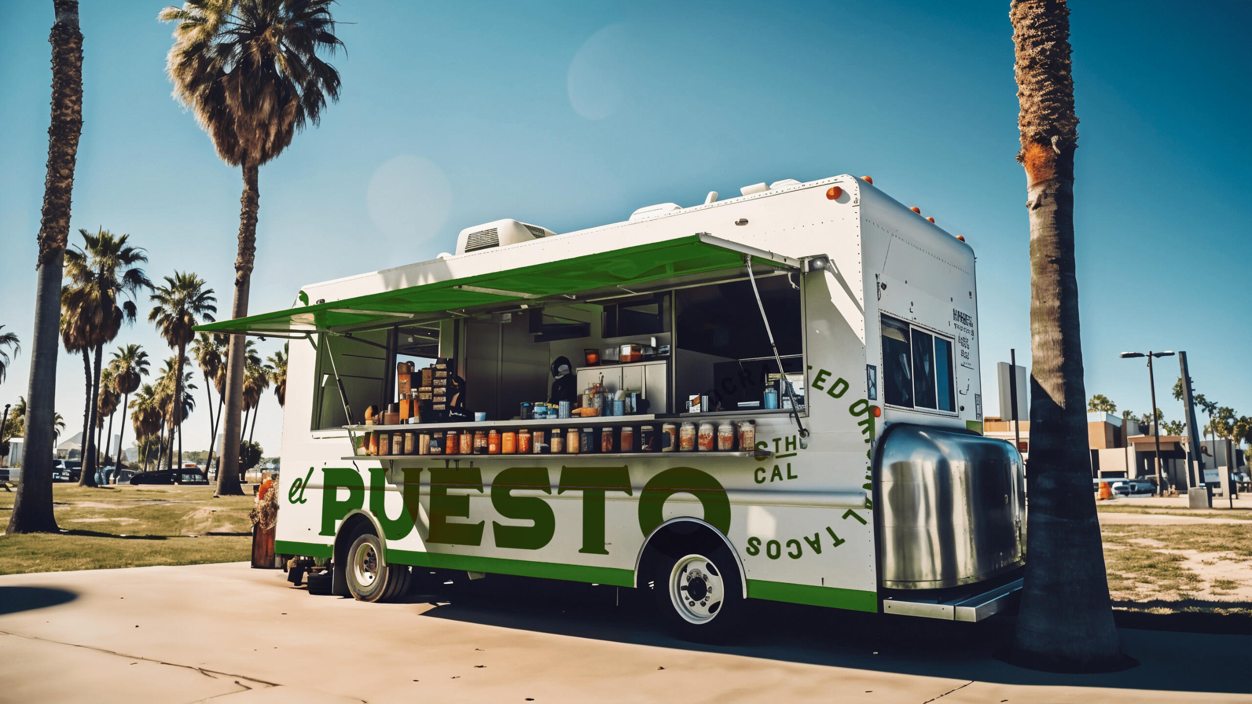
Brand identity for El Puesto, a Southern California food truck serving handcrafted tacos with bold, authentic flavor. The design leans into visual cues pulled from Mexican street food culture—vibrant colors, rough textures, and hand-drawn gestures—reframed with structure and clarity for a modern context.Every detail was created to help El Puesto stand out on the streets—and stay memorable long after the last bite.Creative Direction: Leo Juarez / Permma
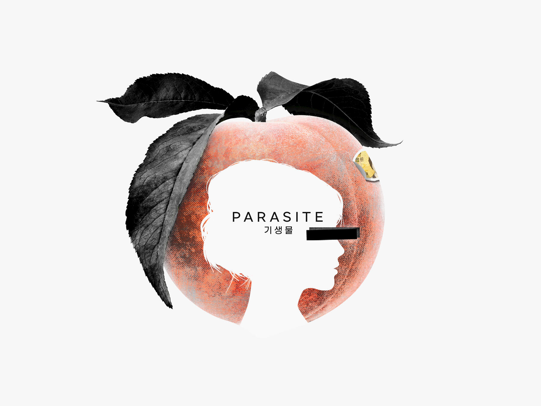
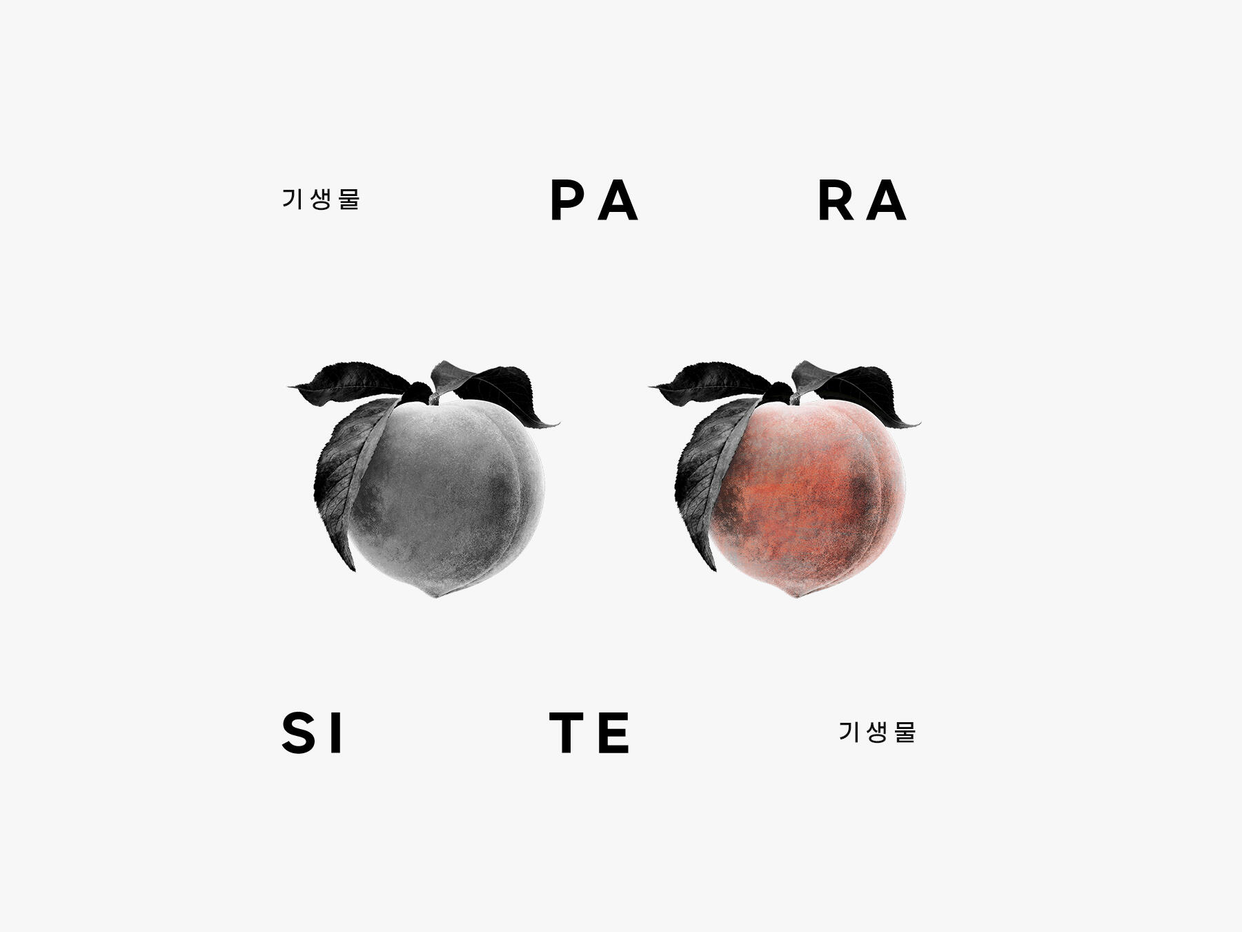
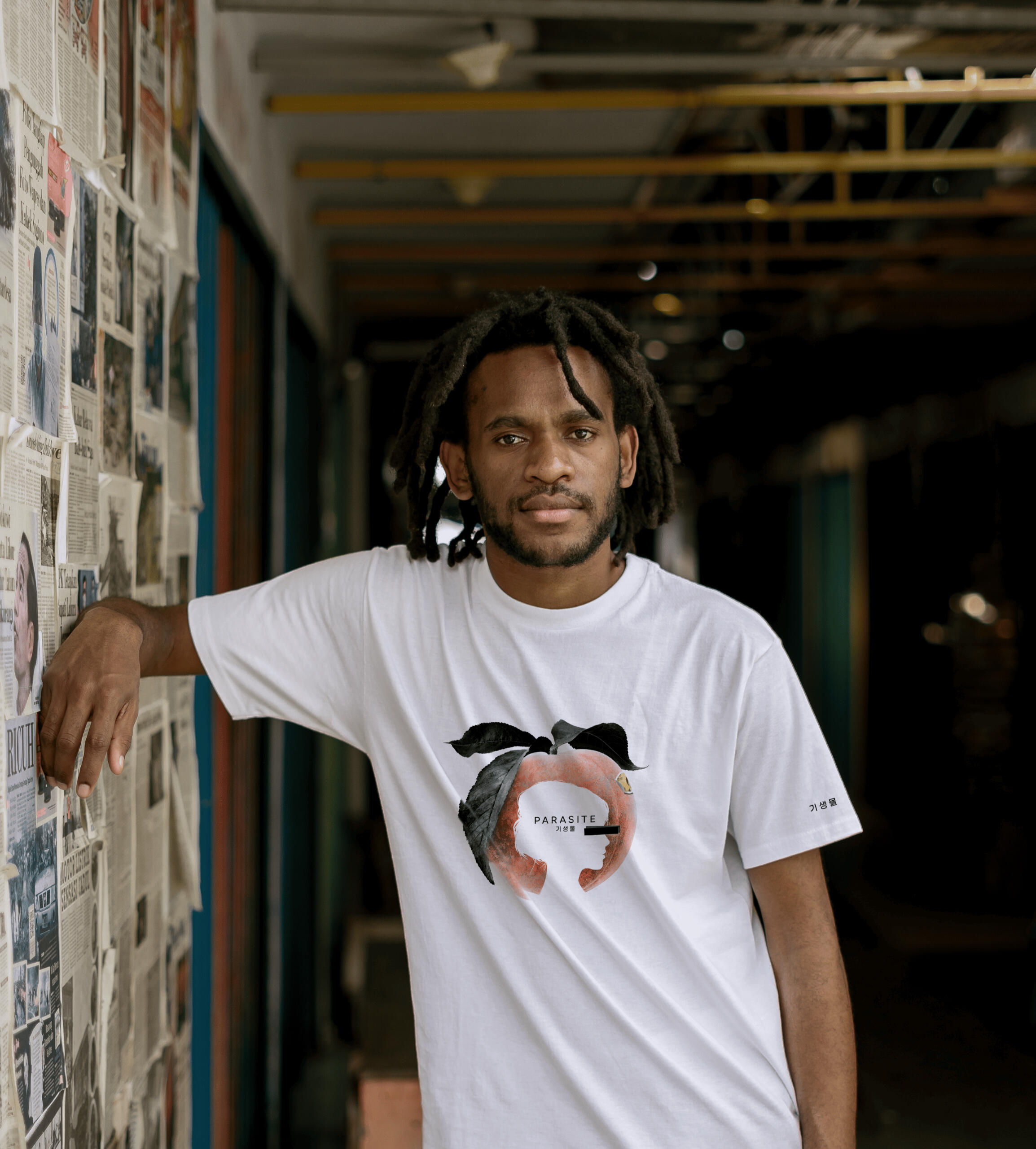
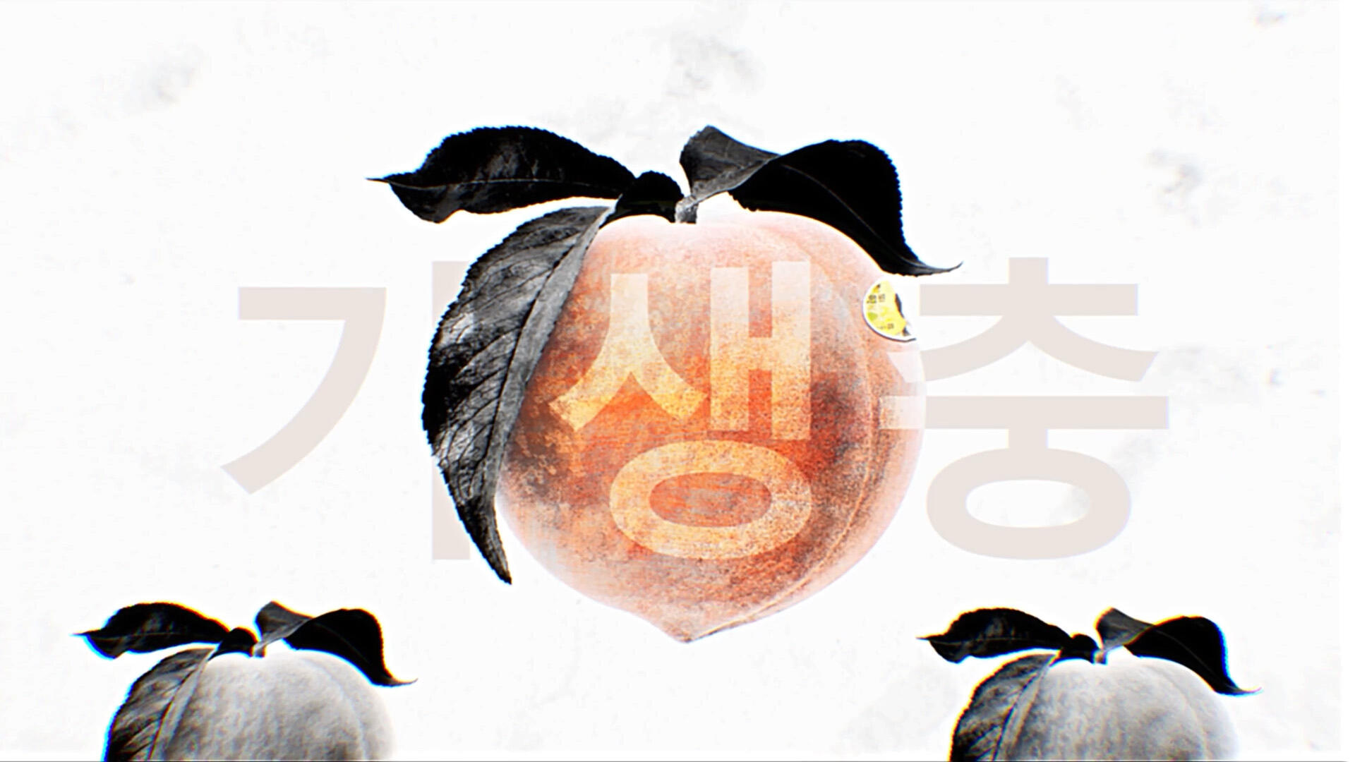
Parasite
A personal tribute to Bong Joon-ho’s Parasite, exploring the film’s layered storytelling through a minimal yet symbolic visual language. The peach—an iconic plot device—becomes the central element, contrasted with silkscreen textures, stark black shapes, and precise type to reflect themes of class divide, invisibility, and tension.Creative Direction and Motion: Leo Juarez / Permma
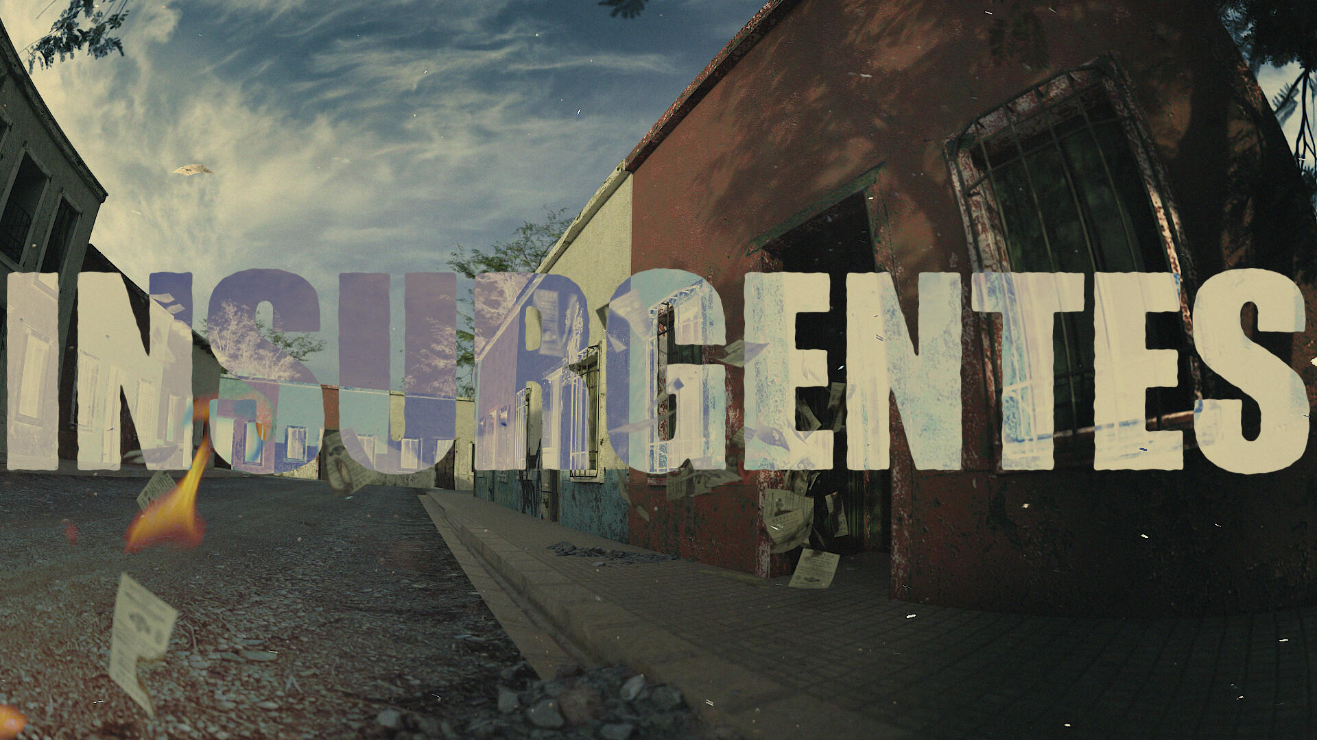
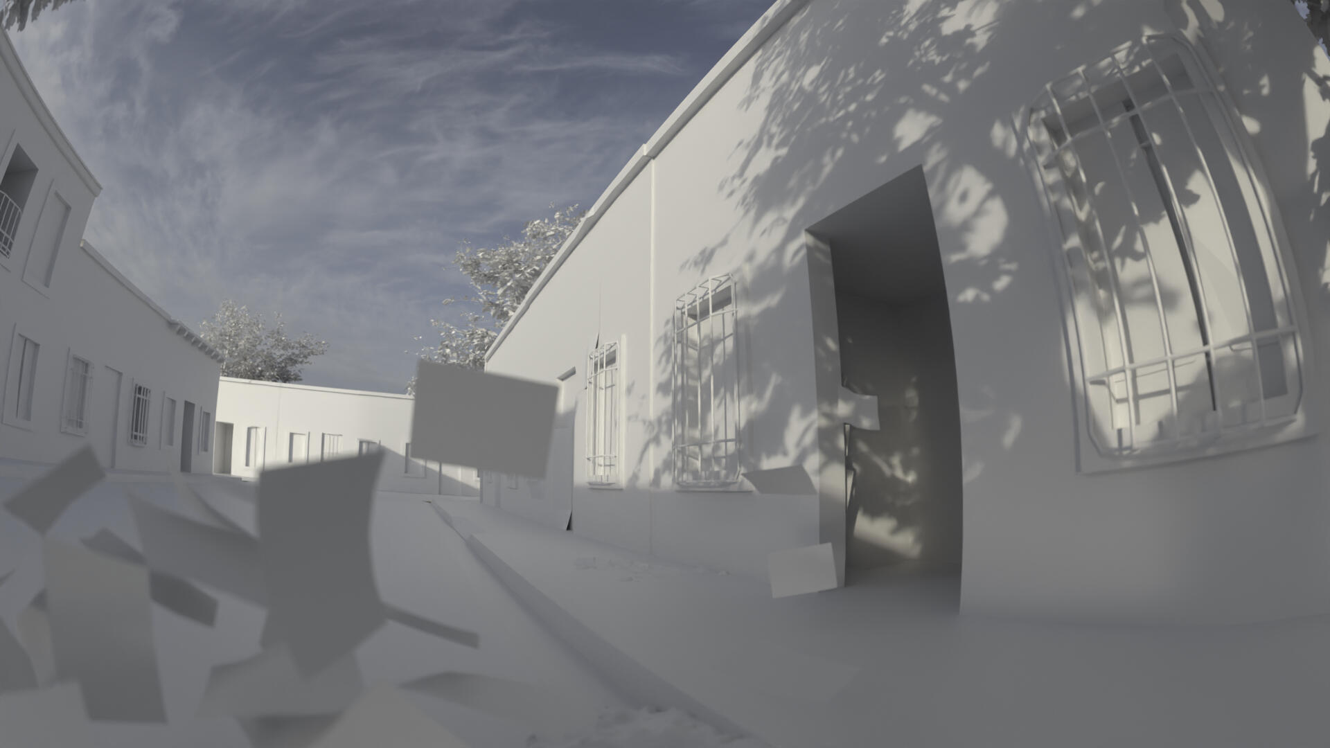
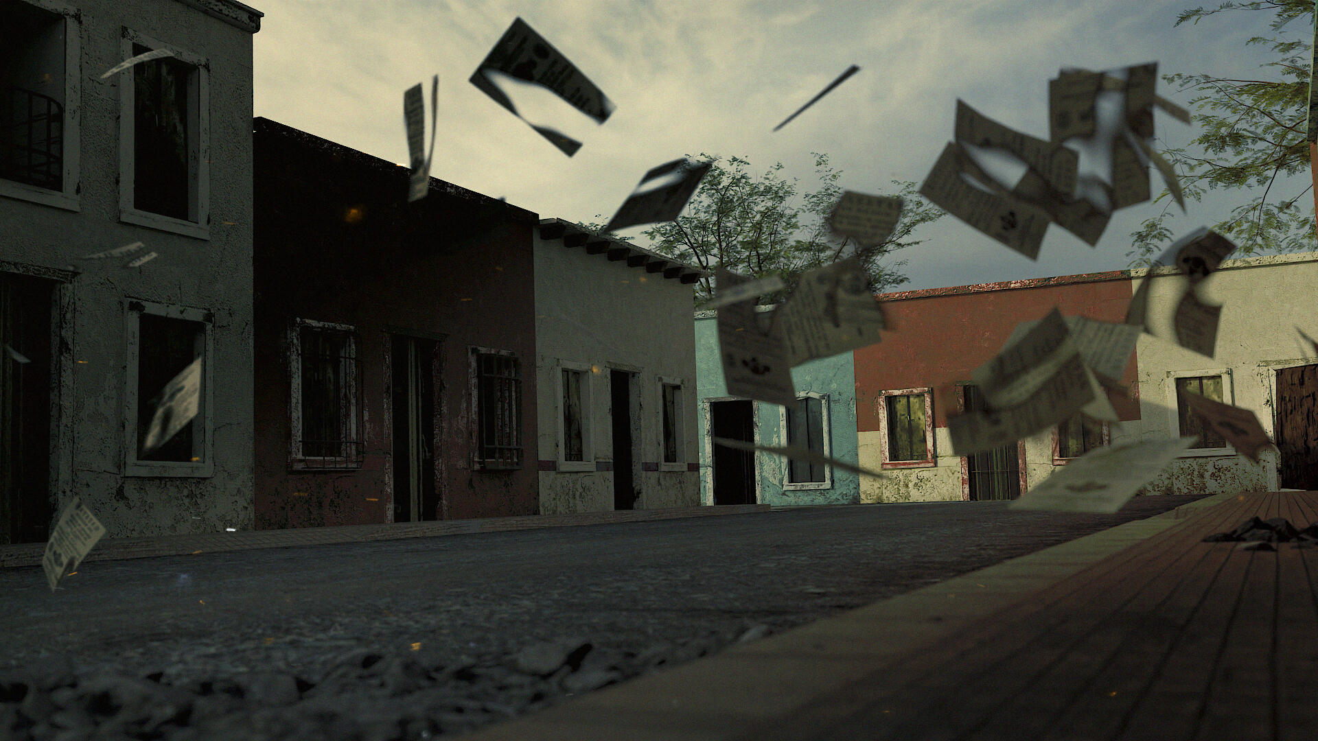
Insurgentes 1800
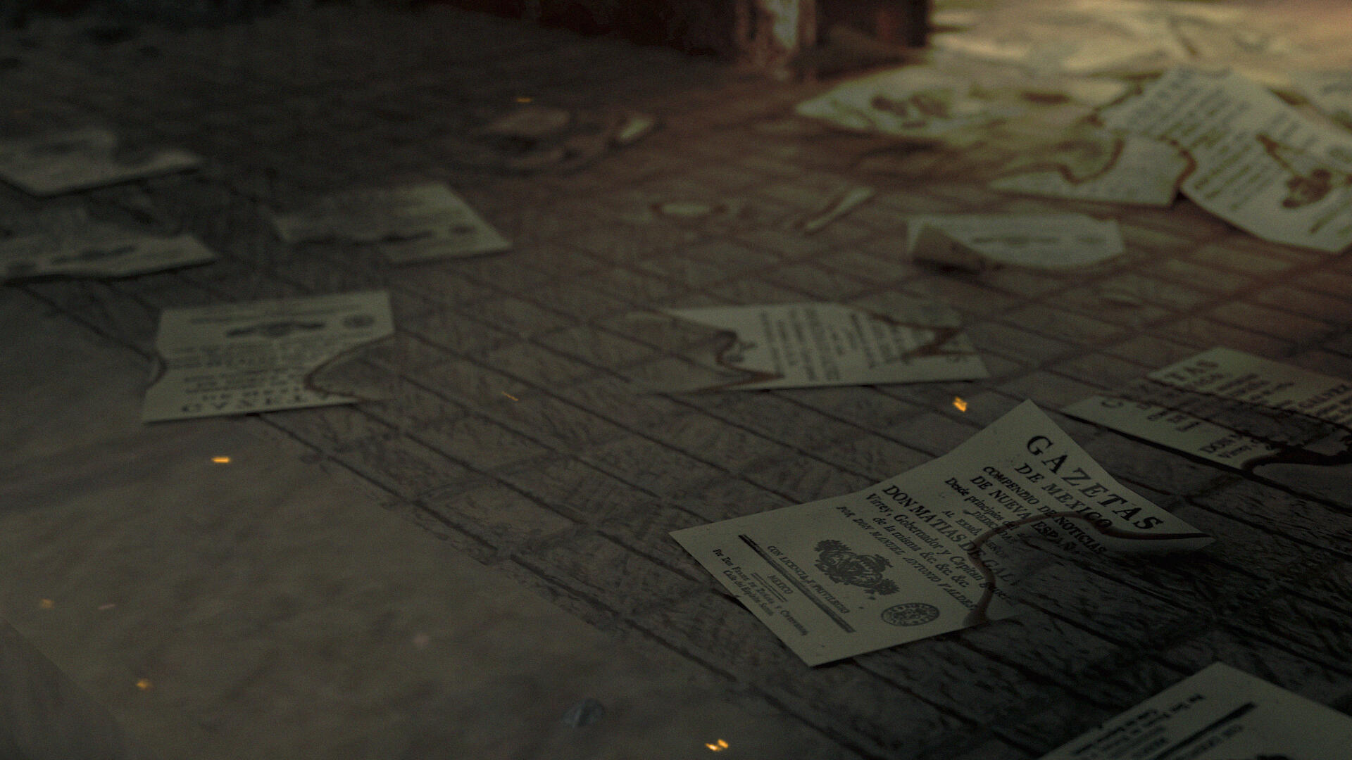
A personal experiment in historical storytelling and visual tension. Insurgentes 1800 reimagines a moment of rebellion during Mexico’s War of Independence—just as insurgents are ambushed in a colonial street. Built entirely in 3D, the scene blends soft-body physics, textured typography, and a hand-held camera approach to create a sense of unrest and immediacy.Dust, propaganda, and silence—until it breaks. A study in memory, resistance, and how space holds conflict.Creative Direction and Motion: Leo Juarez / Permma
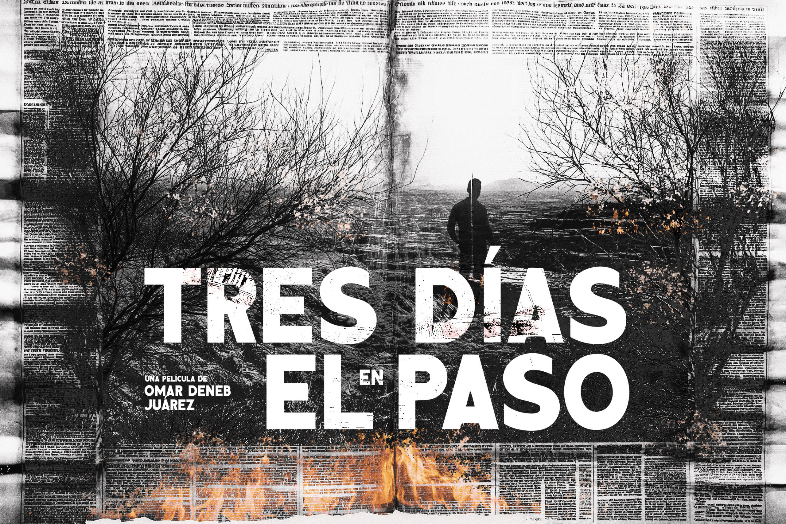
Tres Días en El Paso
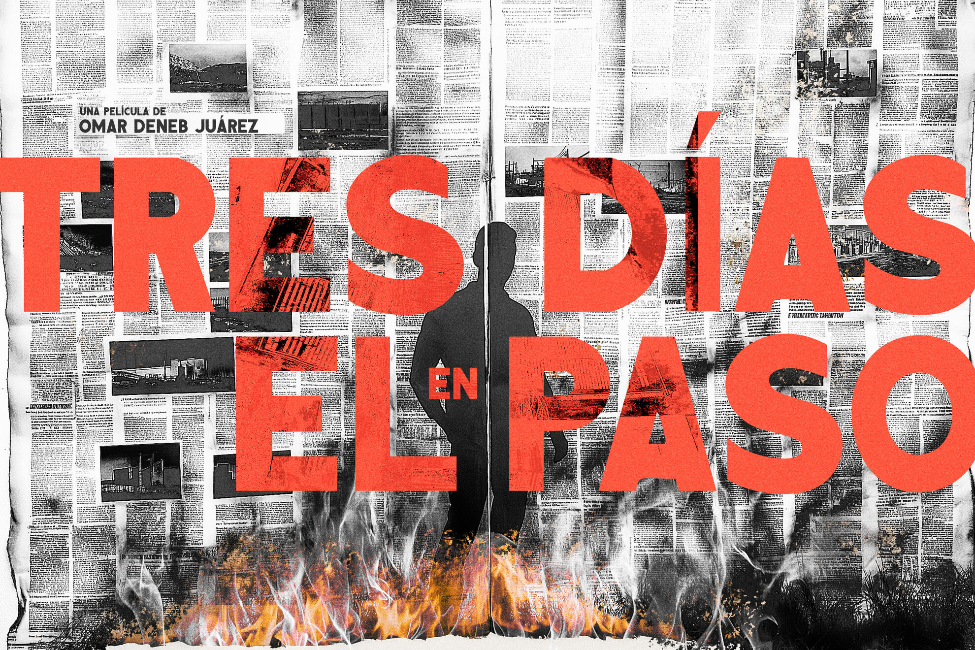
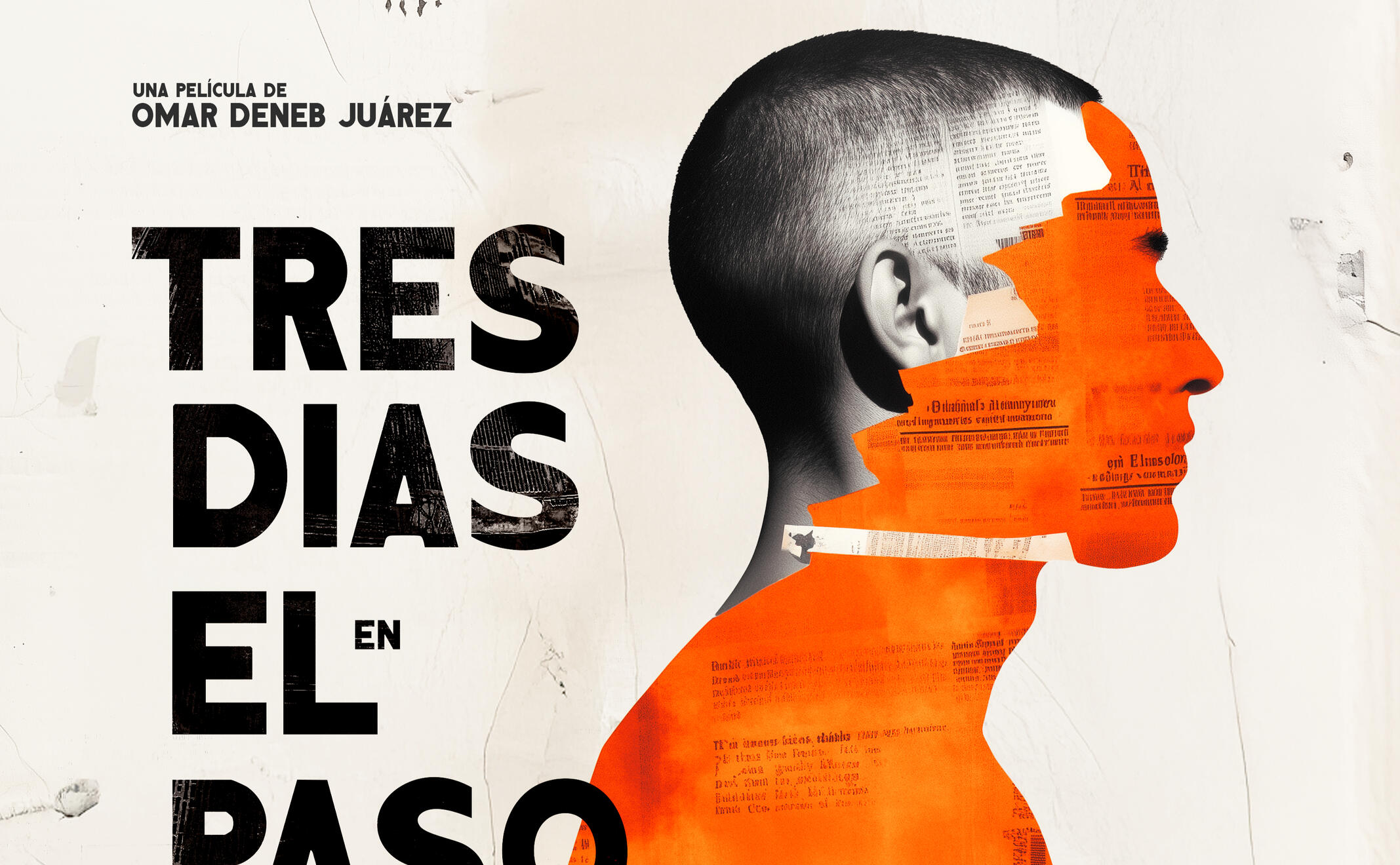
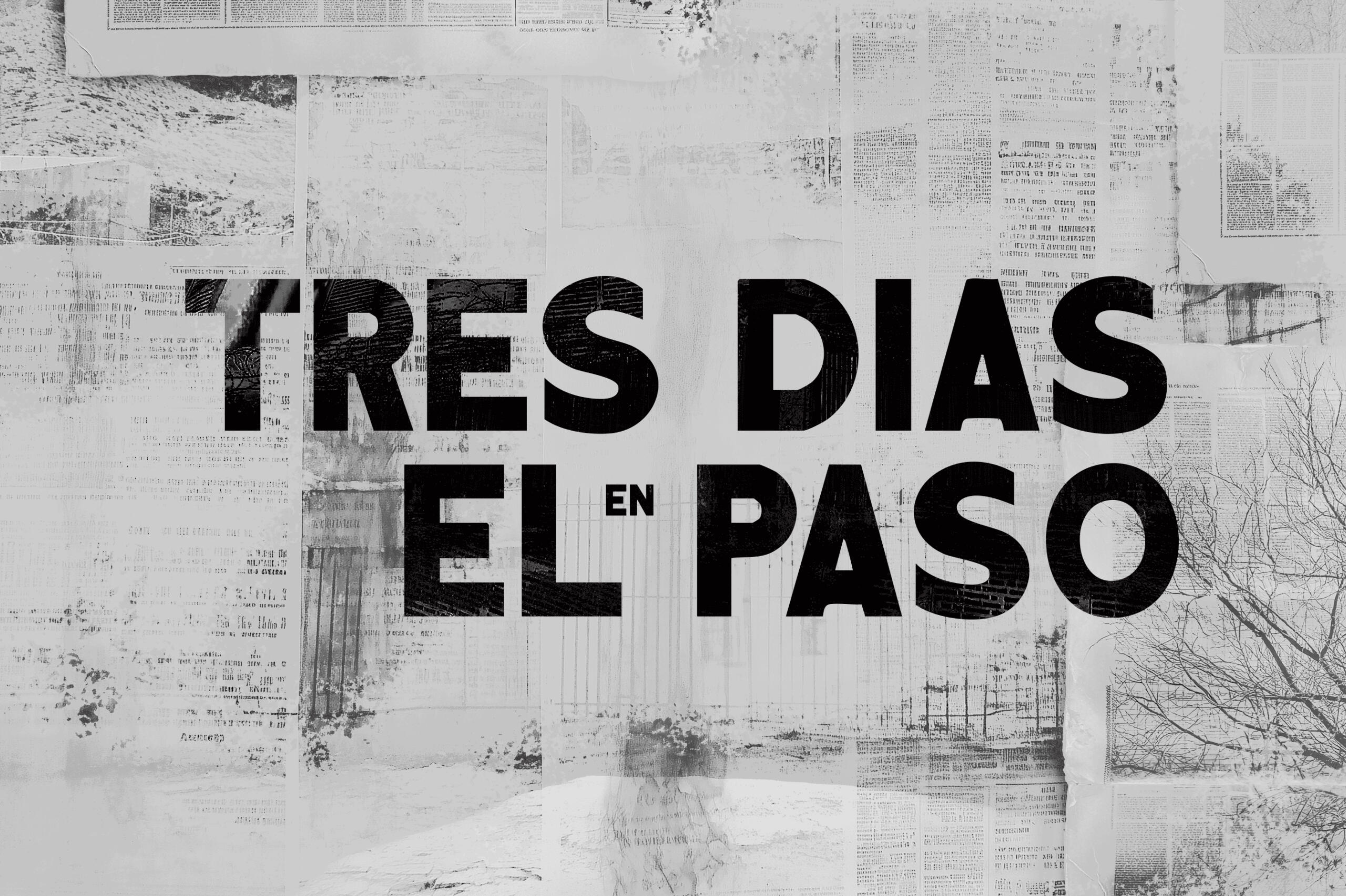
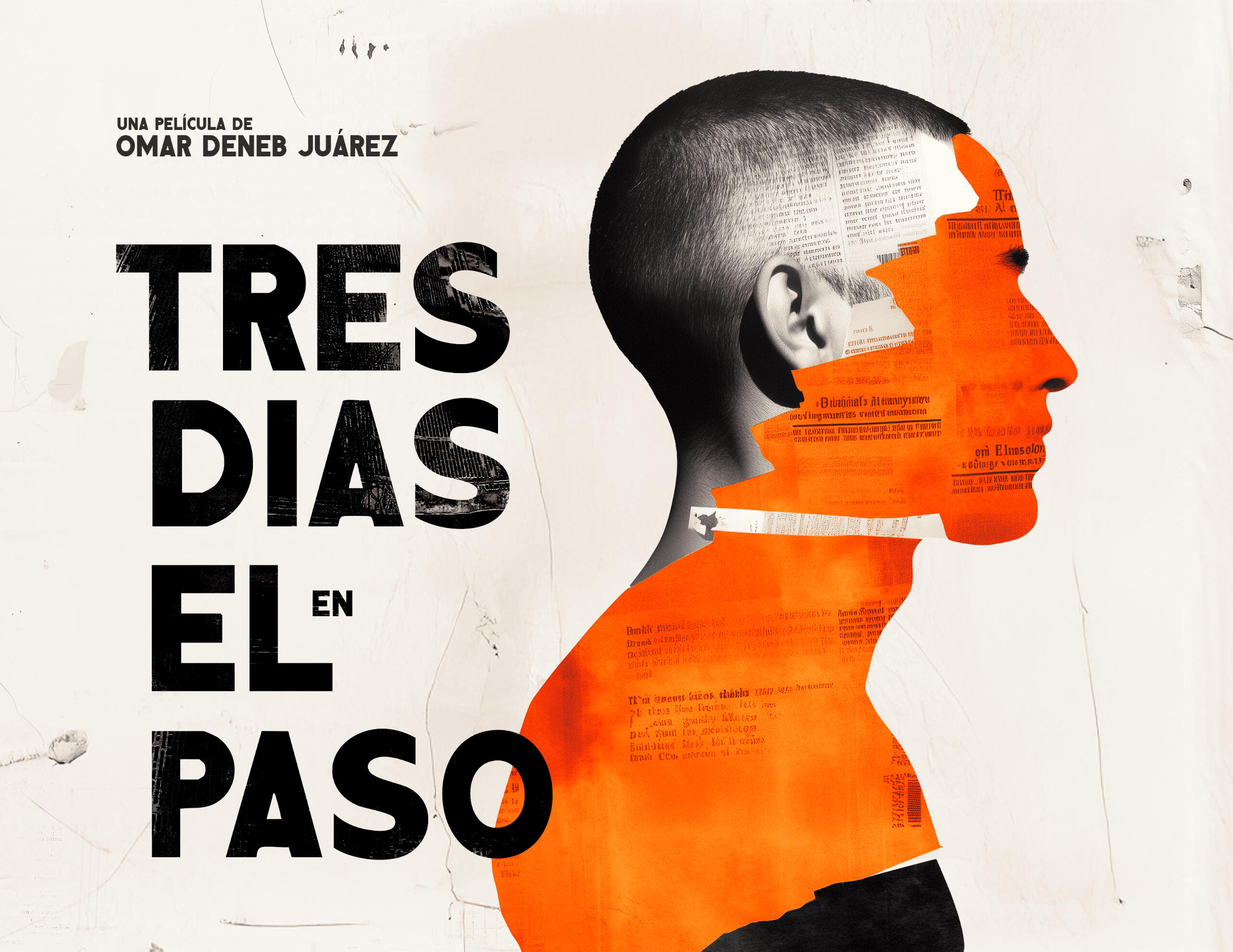
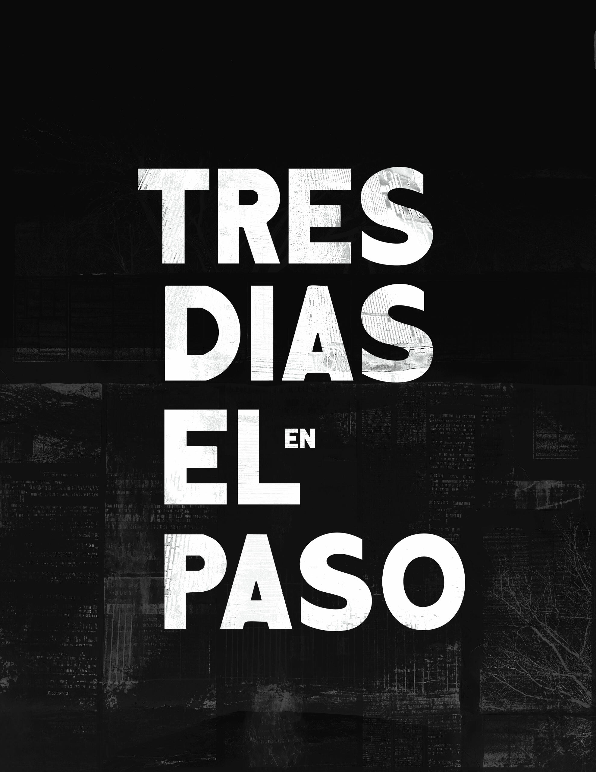
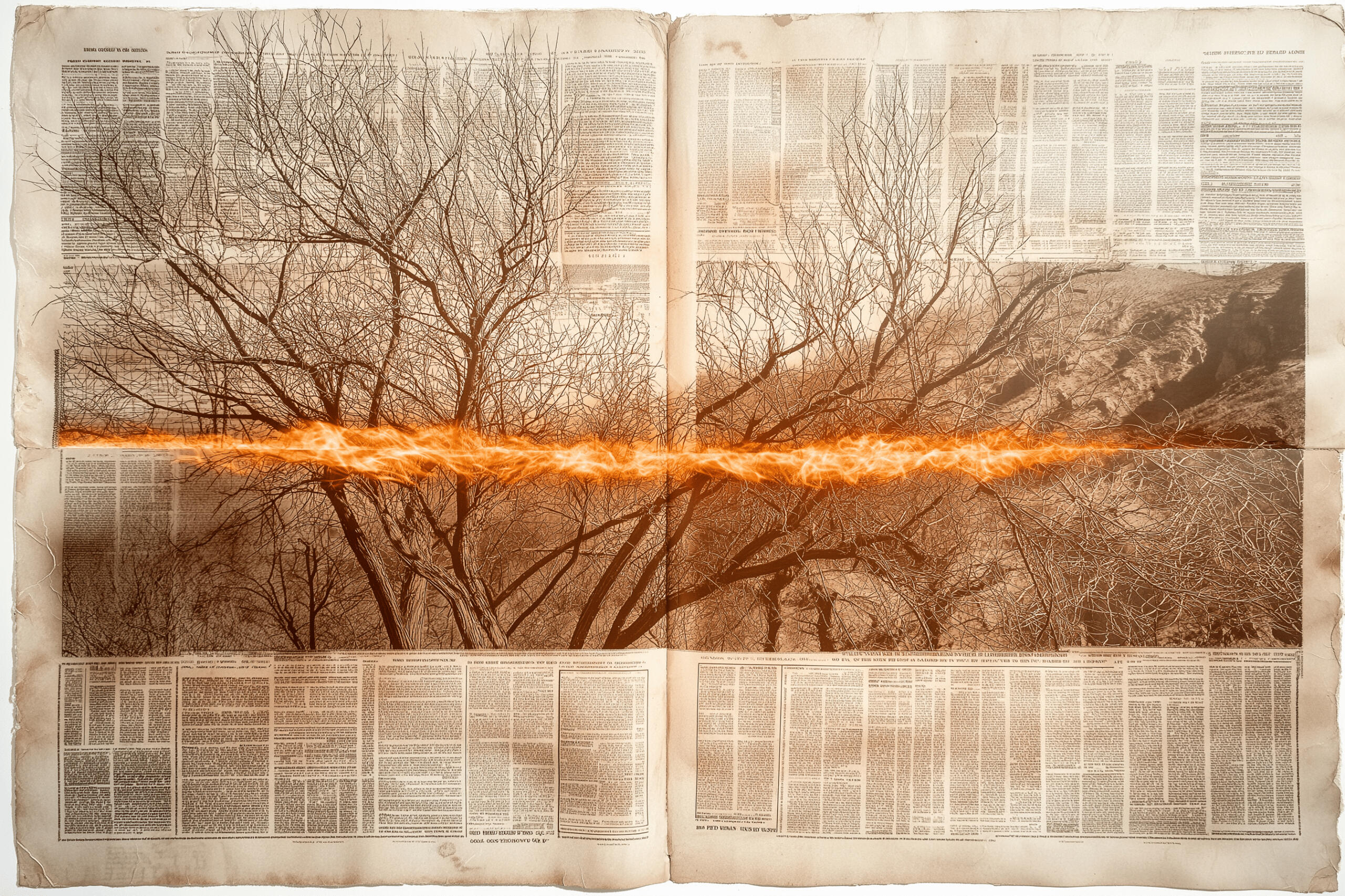
Poster design and visual direction for Tres Días en El Paso, a Mexican feature film based on the true story of a young man who survives a brutal cartel abduction and is forced to navigate the thin line between victim and accomplice. Told through the lens of investigative journalists covering the case, the film exposes the systemic violence and moral complexity at the U.S.–Mexico border.
The graphic language blends documentary textures with expressive typography and silhouette-driven compositions to reflect the film’s raw emotional core and fractured identity.Creative Direction: Leo Juarez / Permma


